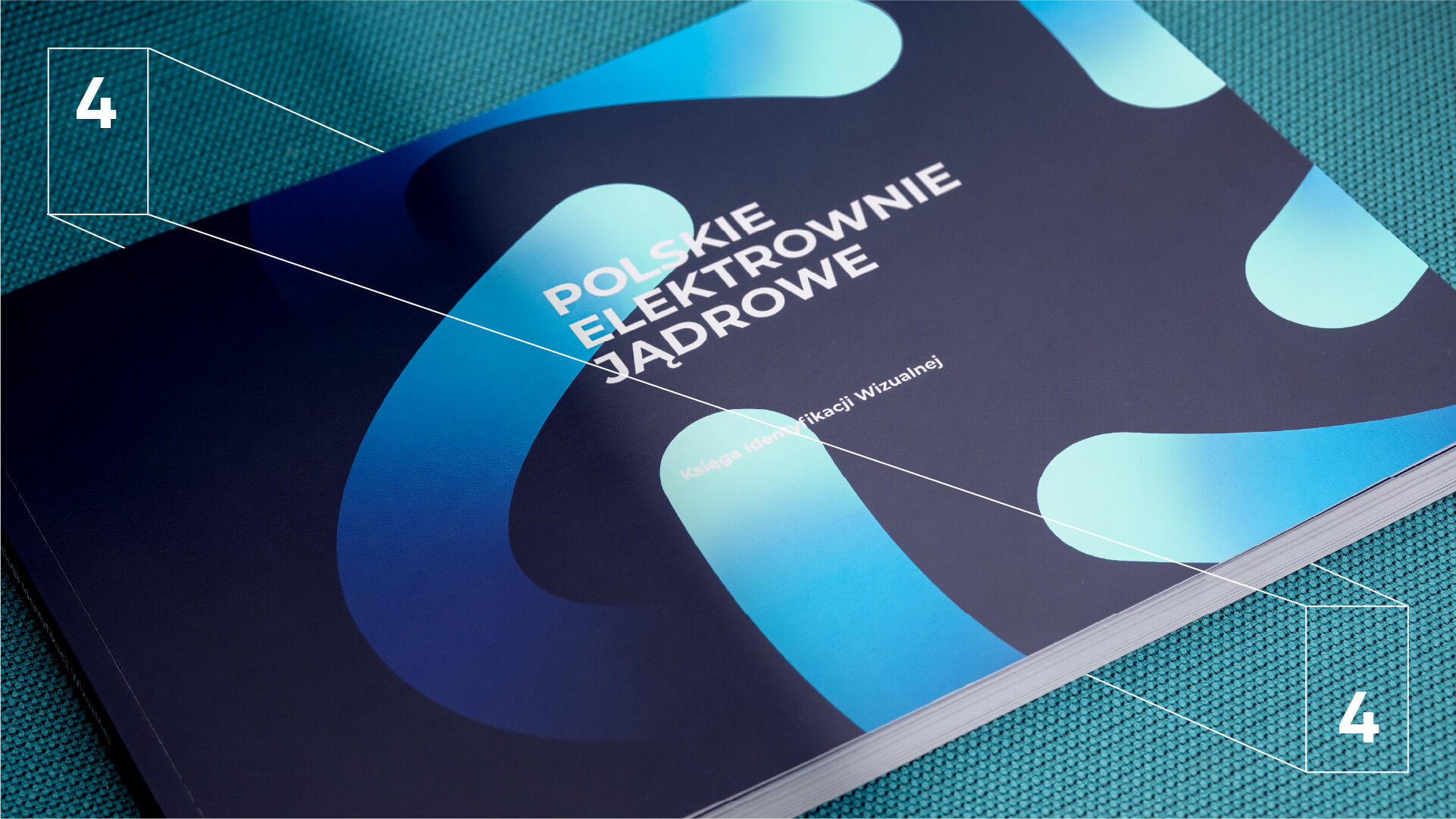
We captured the process of generating modern, clean energy in the brand’s logo, while creating a bold and dynamic visual identity system.
-
-
Hortex
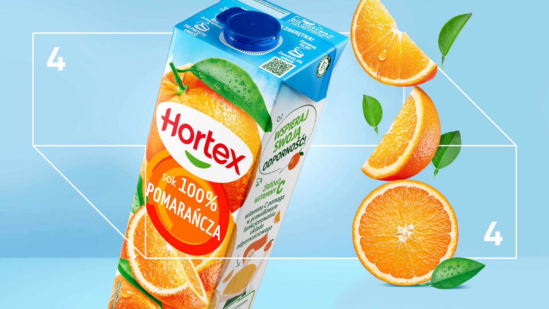
In the world of Hortex juices and nectars, everything naturally revolves around fruit and its flavor. We made sure it spins even more…
-
Dolina Dobra
What does a rebranding that delivers real business results look like? Just like Dolina Dobra, the brand behind our Silver Effie 2023 award.
-
VIENNA LIFE
Vienna Life in our visual identity? Aesthetic, energetic, flexible – and most importantly, close to people.
-
Time Trend
Time means change? For us, change means rebranding: making time work in favor of the brand.
-
Bakalland
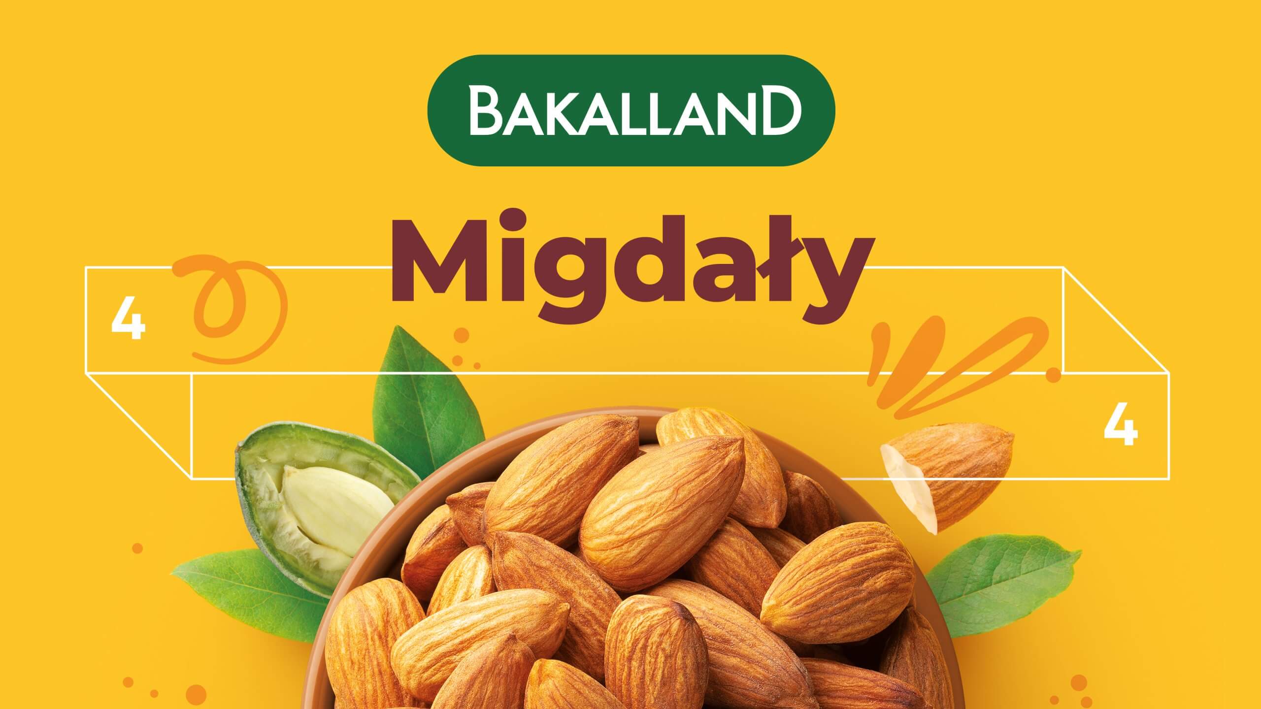
How to create a fresh, distinctive design, and at the same time maintain the brand’s DNA? When working on Bakalland’s new visual identity, we opted for an impactful rebranding, in which the reinforcement of color codes and a distinctive graphic theme play an important role.
-
-
ANWIL plastics – organizing the product brands portfolio
To build a coherent image that conveys the size and scale of the actions of an enterprise, one needs a clear and well-thought-out product strategy. We were tasked with its creation by the most prominent Polish producer of plastics and fertilizers.
-
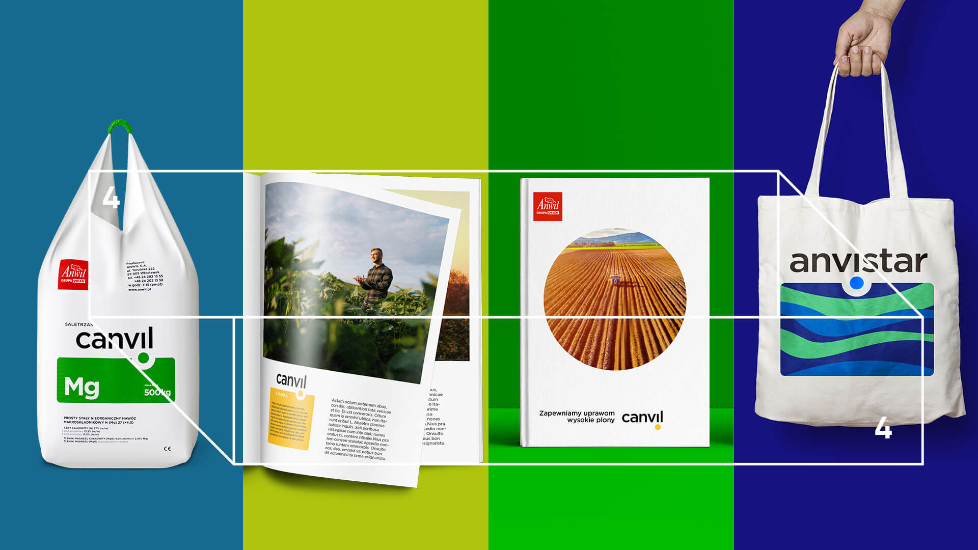
ANWIL fertilizers – organizing the product brands portfolio
The most crucial fertilizer in agriculture deserves a good, non-generic name. However, creating the name Anvistar is only a part of the enormous strategic and design process carried out by Czteryczwarte for Anwil S.A.
-
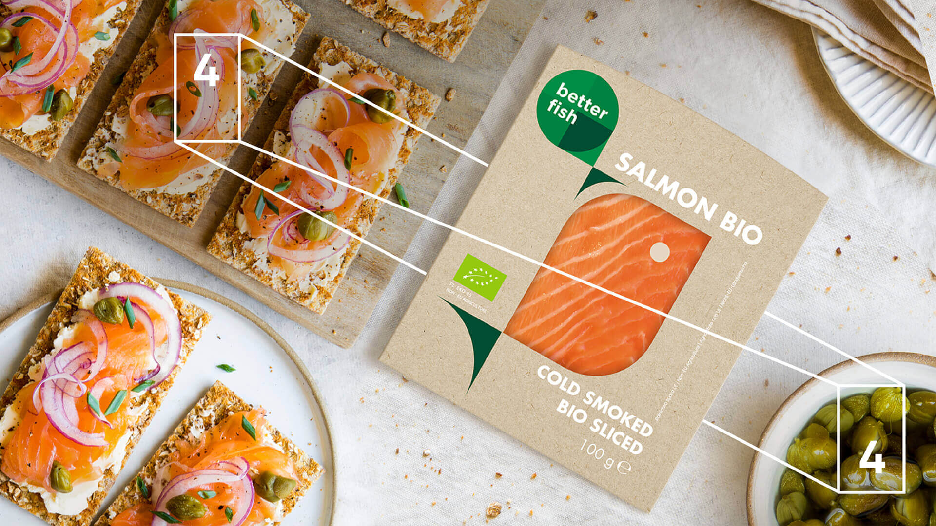
Better Fish
Here swims in a better fish. We made sure that it was presented proudly on the shelves in stores. Ecological, of course.
-
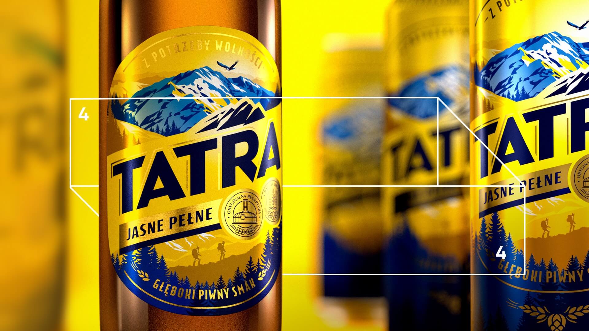
Tatra – rebranding
How to map the new brand strategy onto a new image? What to do to make the brand meet expectations of a modern end user?
-
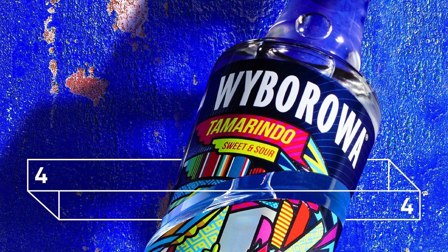
Wyborowa Tamarindo
Is there any chance that out feathered snake gets every party in Mexico started? We and Pernod Ricard truly believe it happens.
-
Polana/Glade – branding
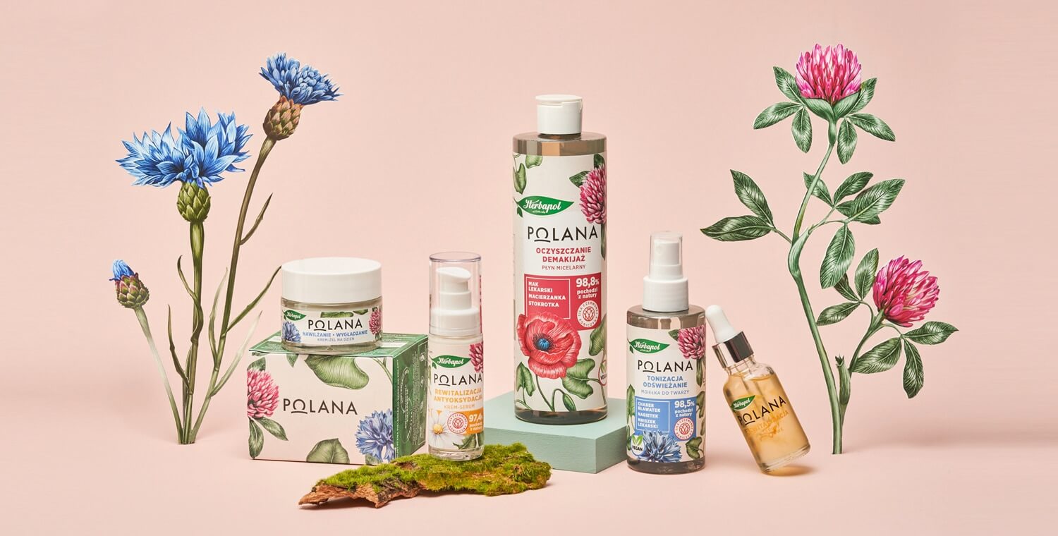
Wading through the bush of cosmetics, now you have an opportunity to come across our naturally beautiful, semi-wild Polana/Glade.
-
Little While Films – identyfikacja
Taśma filmowa. Mrok sali kinowej. Wciągająca opowieść i oczekiwanie na część dalszą… Wszystko to uchwyciliśmy w stworzonym przez nas systemie identyfikacji wizualnej.
-
Krakus – corporate identity
Dress up in a noble navy blue. Sprinkle with gold. What else can we do to show everybody that Krakus means not only over 60 years of tradition, but also top quality goods?
-
Unicorn Association – brand model
Designing for a good cause is always satisfactory. This time we could have dealt with visual identification of the Unicorn Association, one of the pioneers of psycho-oncological care in Poland.
-
Piątnica “Twój Smak” – redesign
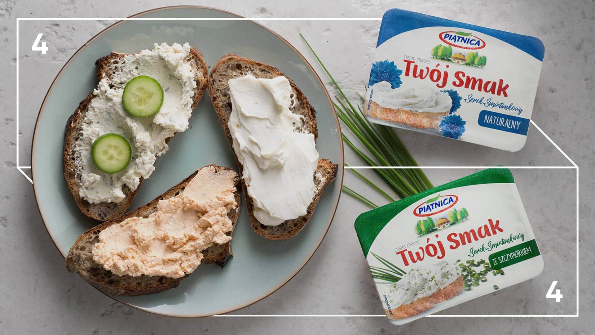
Where does the new Piątnica come from? From Czteryczwarte, where else it could be… We consider it obvious. The branding-related services provided to Piątnica mean numerous projects having been completed. One of them is the redesign of Twój Smak (Your Taste) brand.
-
Menavitin – branding
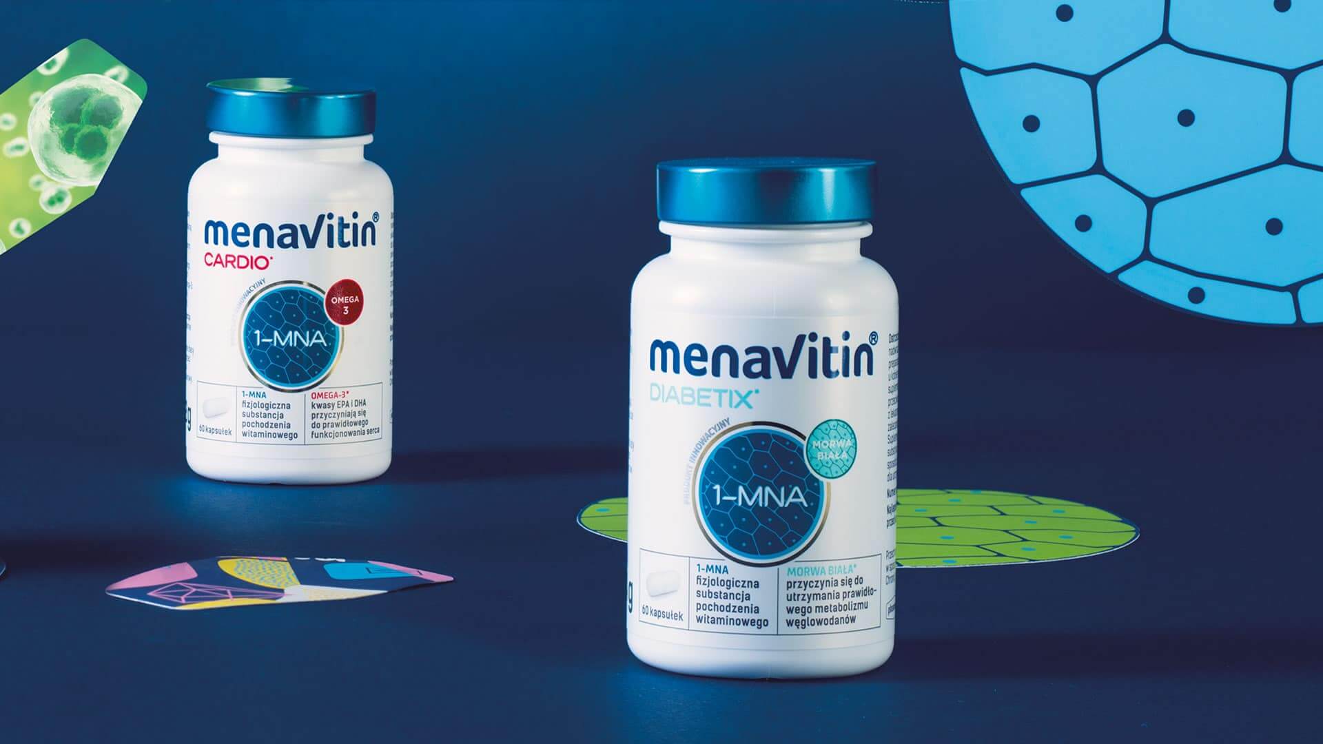
First, we had taken our hats off to the Polish scientists. Then, we pitched up and got down to hard work to create a new brand of dietary supplement.
-
Kijafa – rebranding
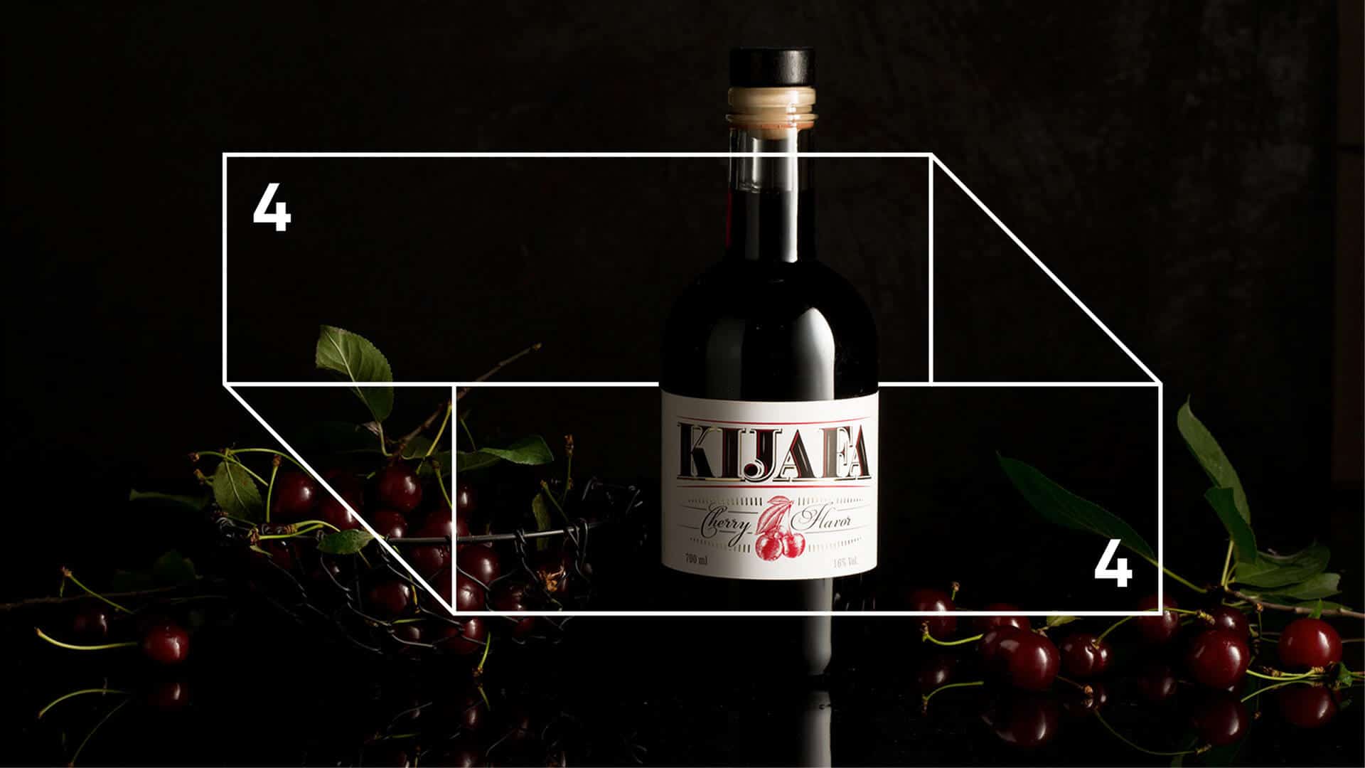
Sipped from crystal glasses… Highly appreciated by our aunties and grandmas… Witnessed afternoon gossiping… Led young people into the world of liquors…
This might be an intro to the puzzle about the brand, we were ordered to apply rebranding to.
-
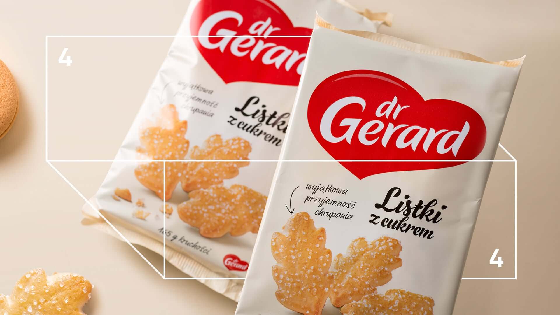
Dr Gerard – redesign
Let’s face it: we put our heart into this rebranding. Results? It fills our hearts with joy to see how well it looks on shelves.
-
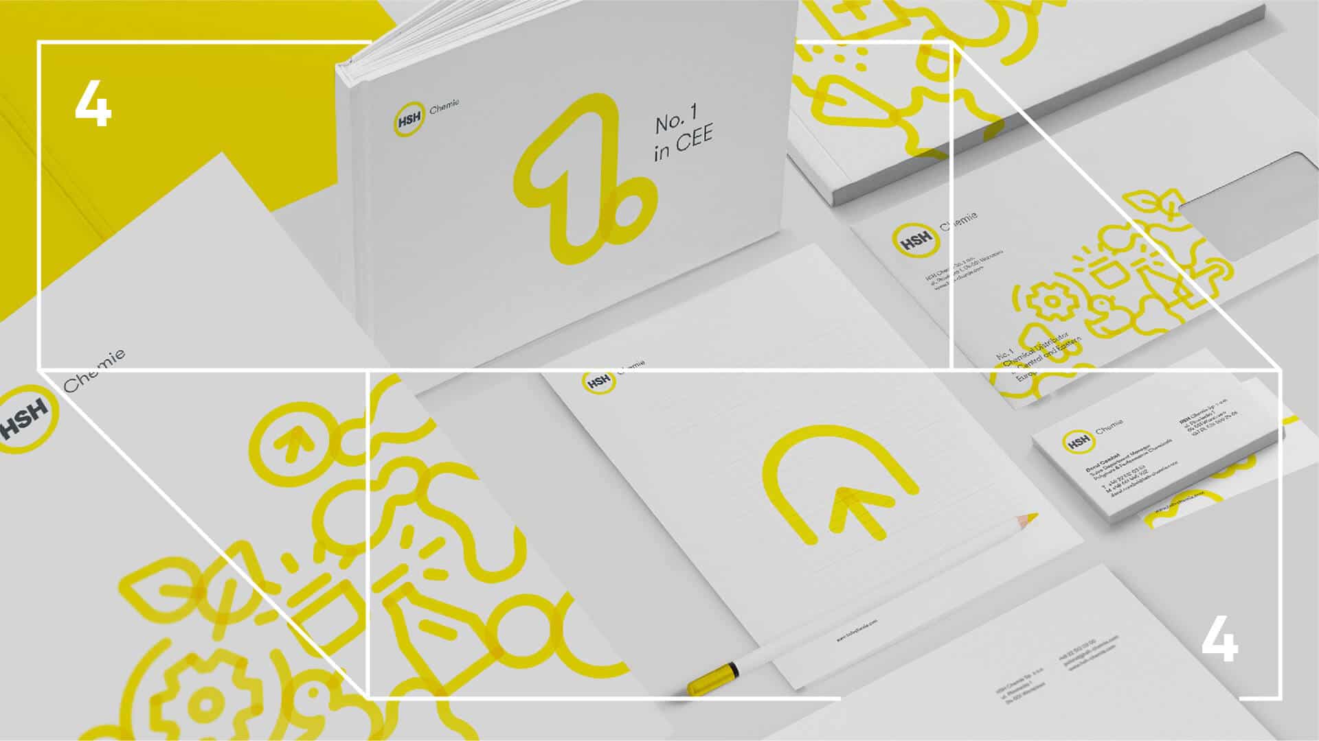
HSH Chemie award-winning rebranding
With this rebranding our agency has won Bronze at the 2019 KTR Awards and a distinction at the Polish Graphic Design Awards. Our client has gained a whole new visual language to communicate their brand.
The previous sign of HSH Chemie was set up 20 years ago and it has survived in a nearly unchanged form until today. A multi-element and complicated logo no longer reflects brand identity. It is high time for the brand to become state-of-the-art, tailored to the rising demands of the market and to express the company’s value in a more efficient way.
-
Gamma Funds – corporate identity
The project is an answer to the new brand that has emerged within the PKO Bank Polski Capital Group after taking over the KBC TFI.
-
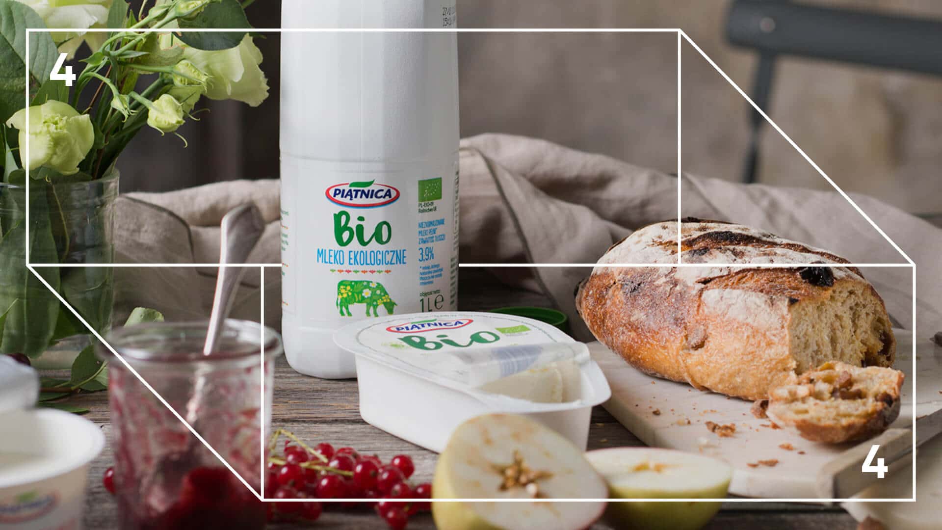
Piątnica Bio – branding
All the happy cows are flowery …
How to render pro-eco and pro-health ideas using simple means? This is the question we asked ourselves when we were about to start dealing with the task of the new BIO Piątnica line.
-
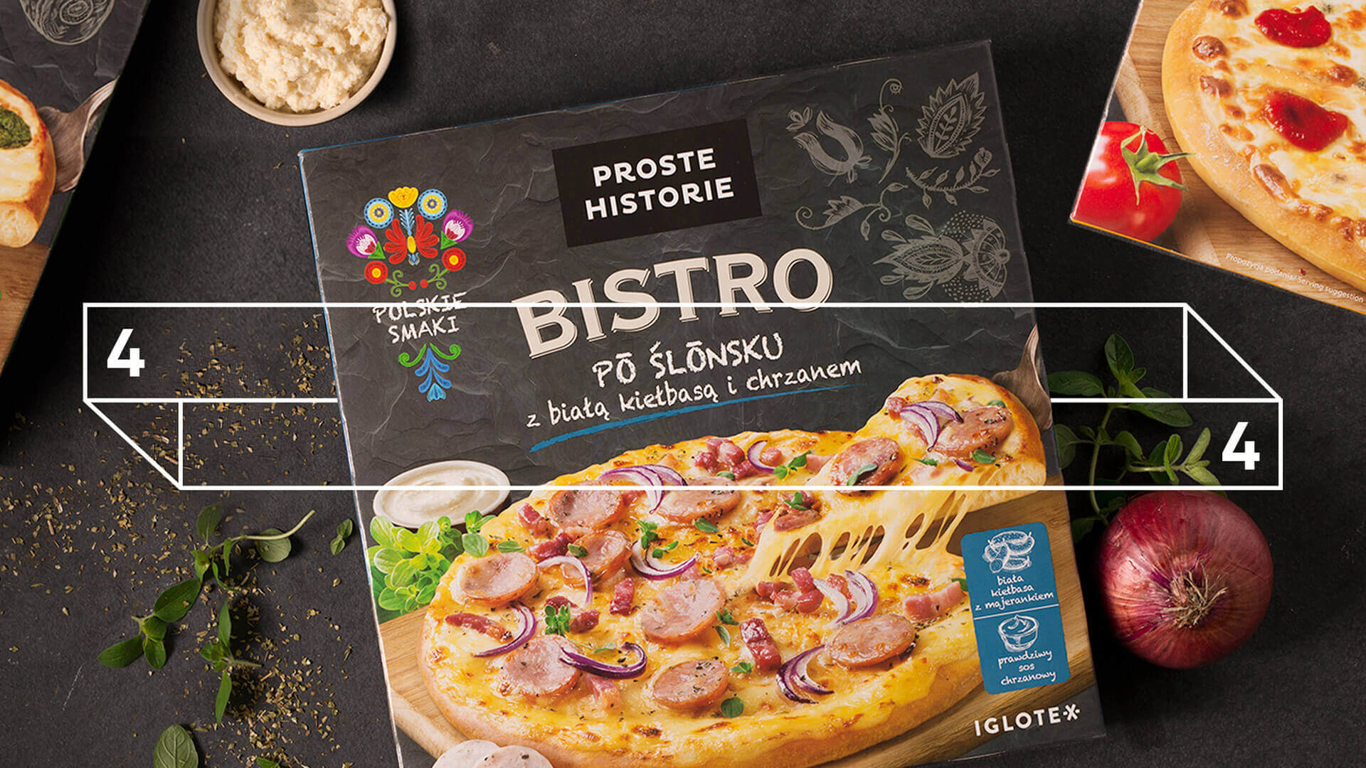
The Simple Stories BISTRO – subbrand design
… Or what happens when the spirit of fast and tasty dishes speaks to us ….
-
Żywiec Zdrój – rebranding
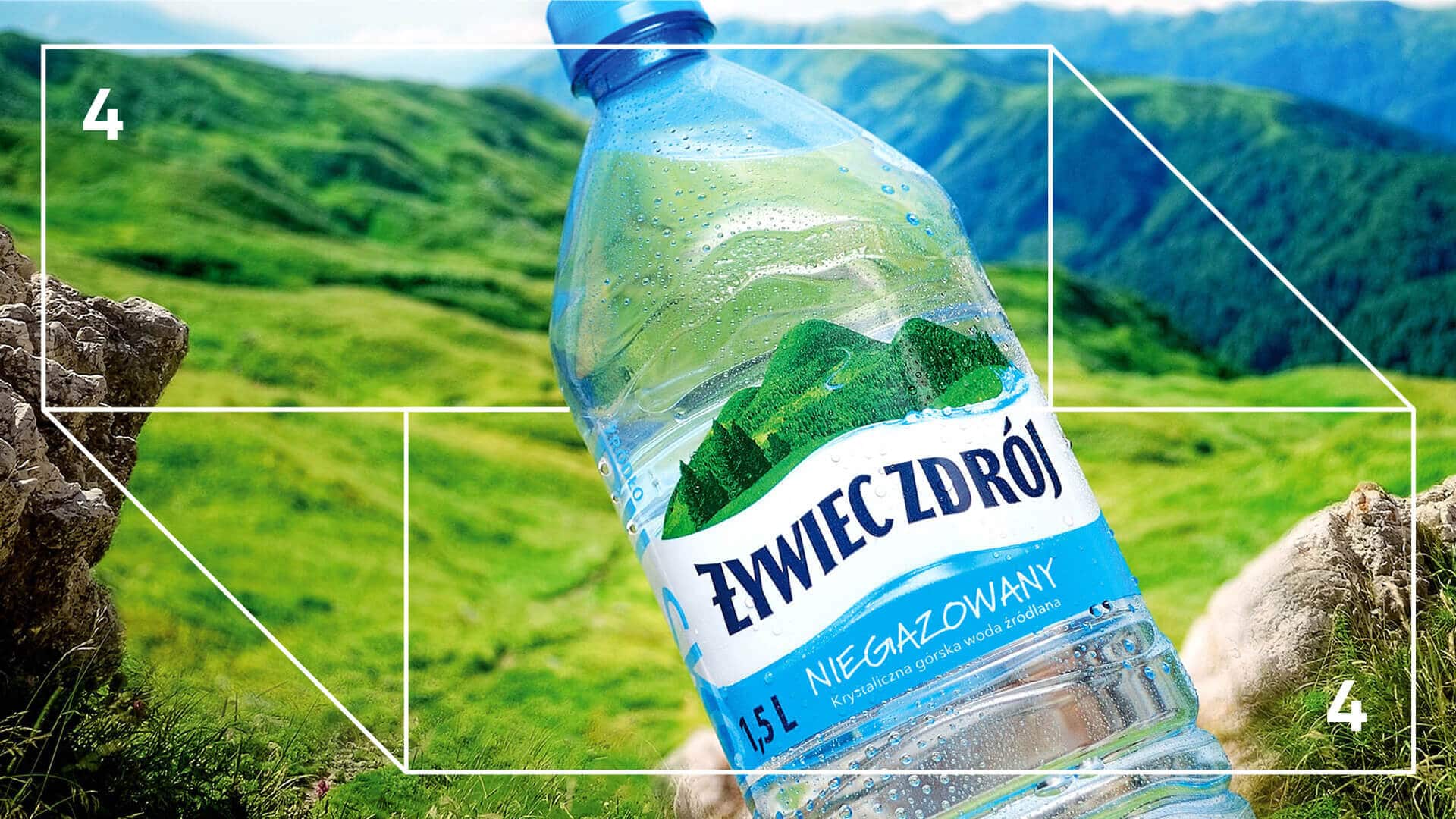
Żywiec Zdrój is the leader in the category of waters and finds it essential to take care of nature and popularise a healthy lifestyle and the importance of water in everyone’s life.
-
Proste Historie – redesign
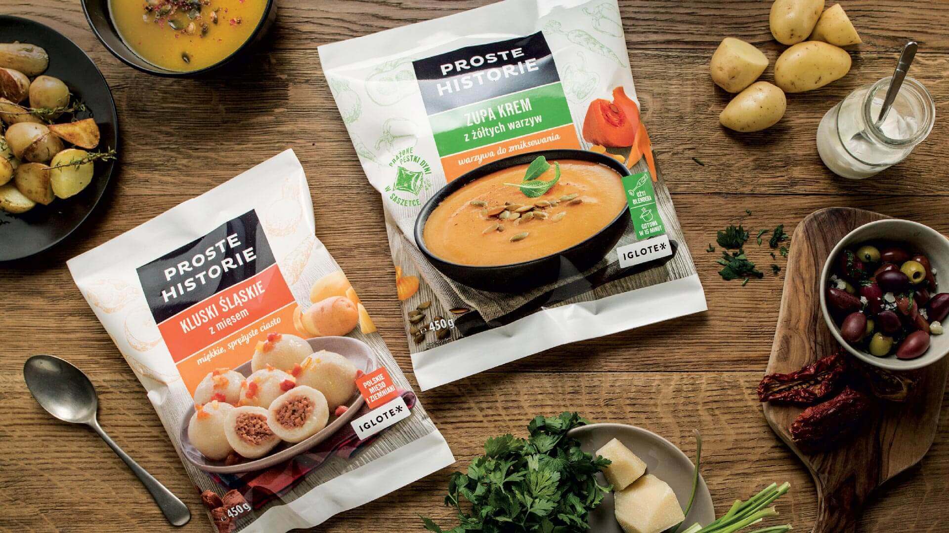
Our goal was to create a brand identity system for the new culinary brand of frozen food. The proposed system was to reflect the new brand positioning which is the underlying ingredient of the delicious daily meals that make people gather round the table, tighten the human ties and create a pleasant and casual atmosphere.
-
Kwaśne Jabłko – branding
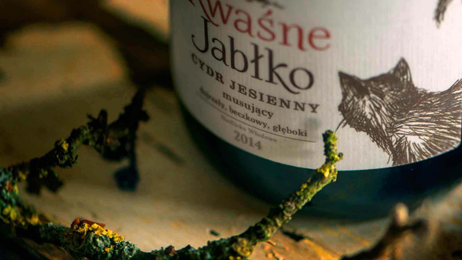
Kwaśne Jabłko is a craft cider, the fruit of love and passion to the land of Warmia and its orchards.
-
Melo Radio – corporate identity
Imagine a space that lets you rest and relax. Time for a deep breath. For your favourite song. A simple pleasure. What colour is it? What does it sound like?
