ANWIL fertilizers - organizing the product brands portfolio
The most important fertilizer in agriculture deserves a good, non-generic name. However, creating the name Anvistar is only a part of huge strategic and design process carried out by Czteryczwarte for Anwil S.A.
The company is the largest Polish producer of fertilizers and plastics. Some of them have their own proper names, and others exist only as a category product (e.g. ammonium nitrate). New trends in the industry, including straying from generic names, encouraged our client into changes in their portfolio.
Design works included a wide range of actions: consumer research, category and competition analysis, portfolio organizing strategy, naming, projects for brands and creating visual identification systems for specific categories.
Our research showed that Anwil has an excellent reputation in both the fertilizer and plastics industries. This was an impulse to create product brand names referencing the company name.
That’s why the final naming model for fertilizer brands uses the “Anvi” prefix. This solution highlights the product’s origin and higher credibility.
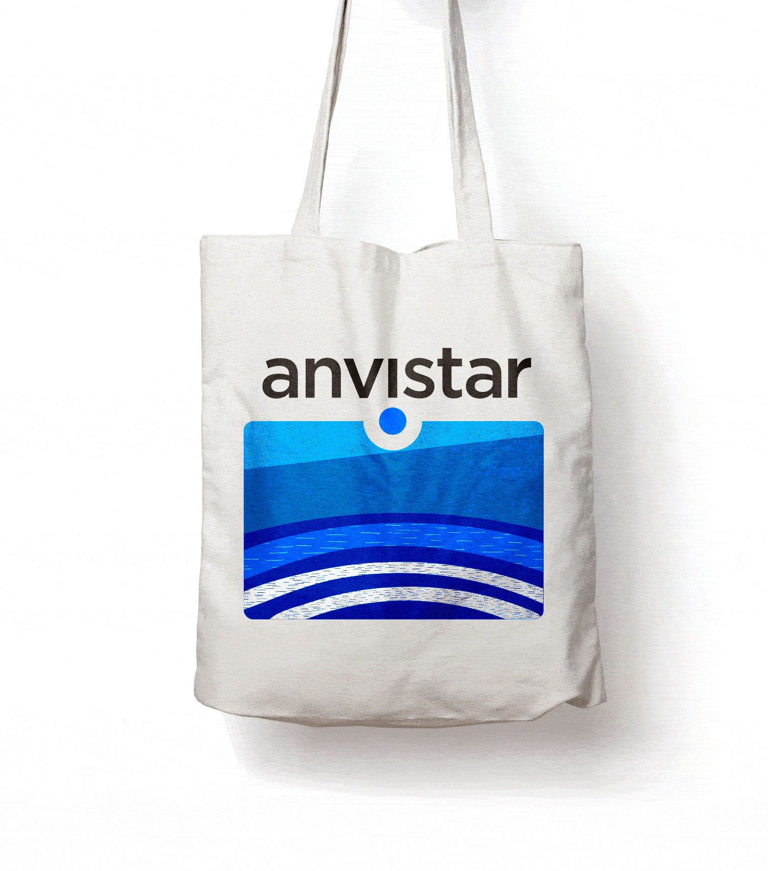
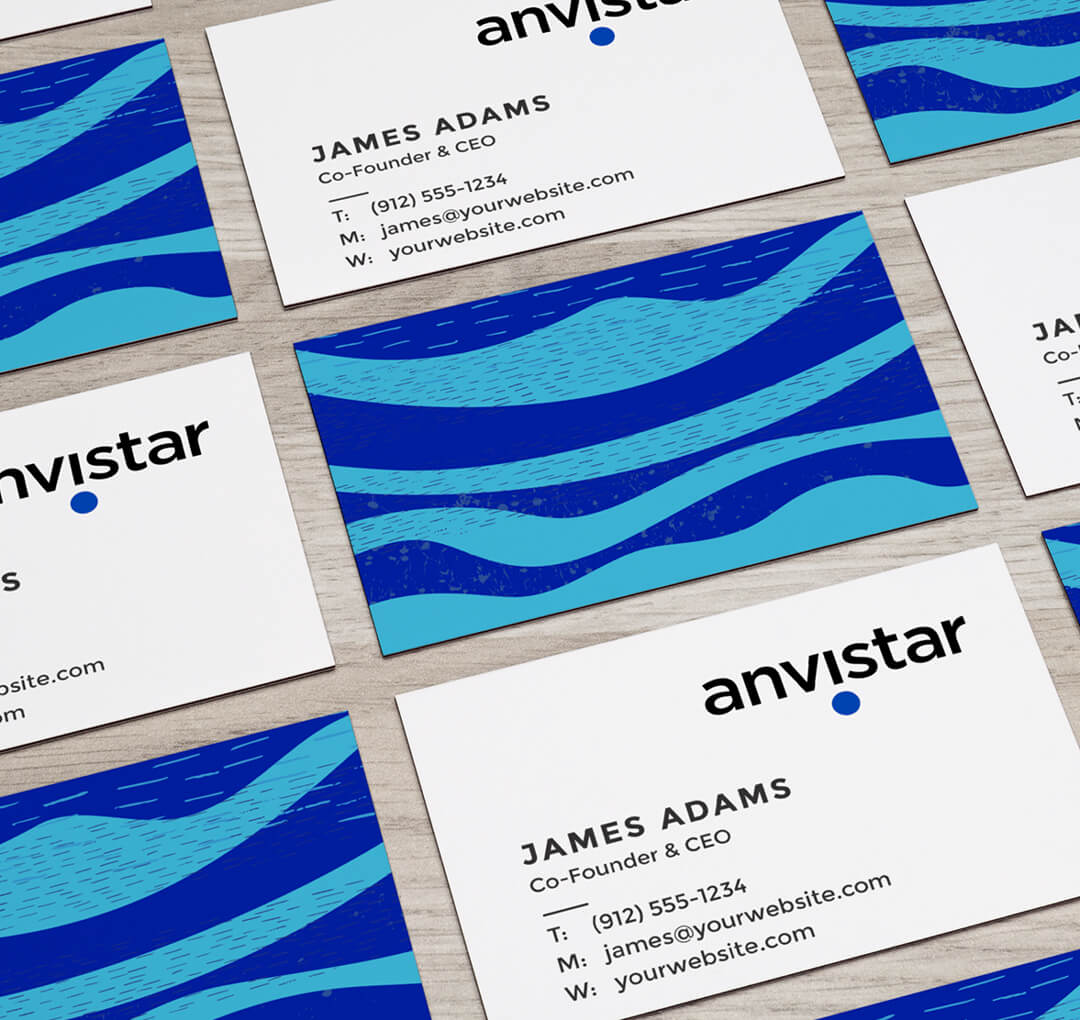
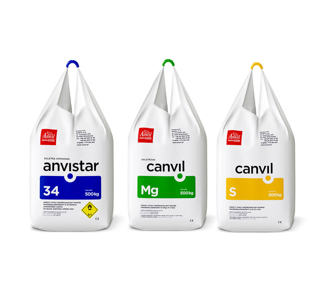
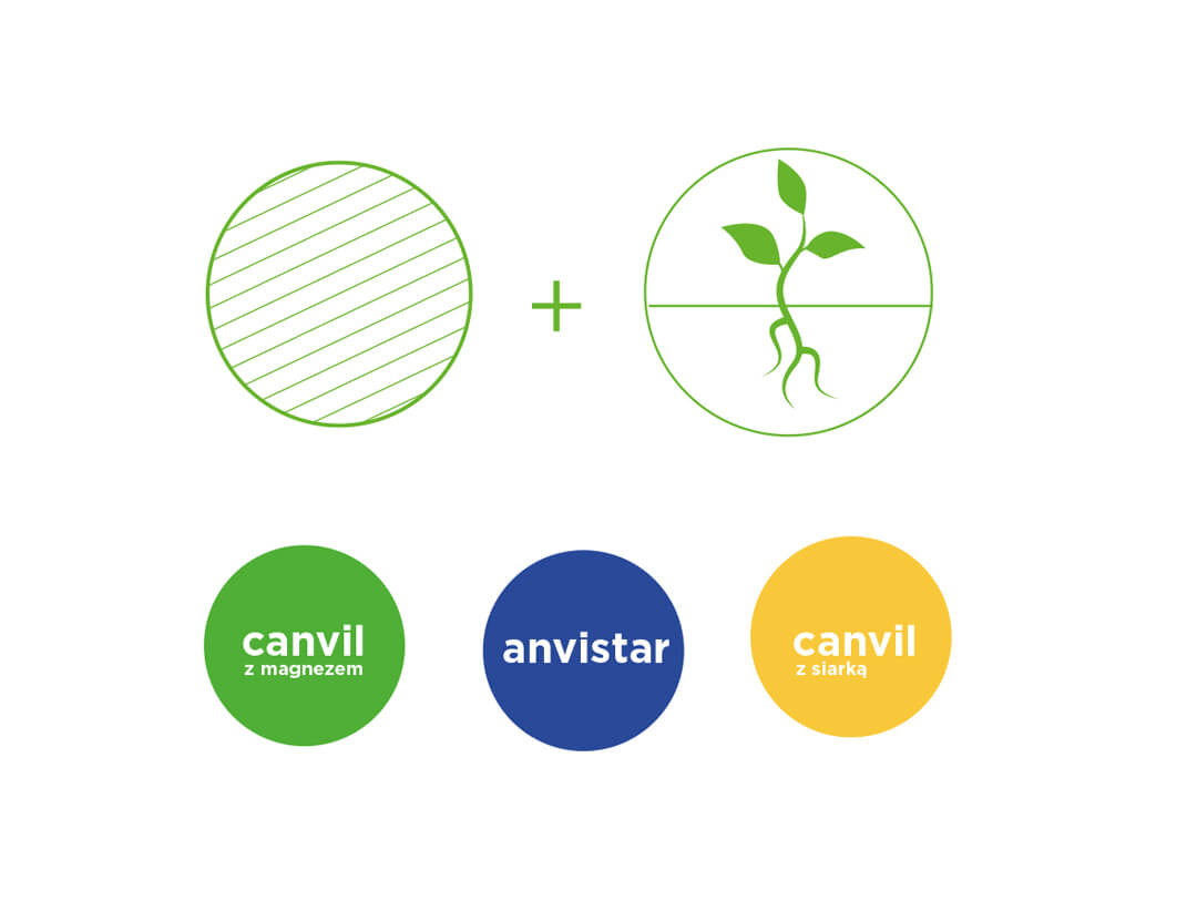
In the case of the essential fertilizer, ammonium nitrate, we suggested the name Anvistar, created from combining the „Anvi” prefix with the English word „star.” In this approach, the nitrate produced by Anwil is a star among fertilizers!
How to design crops?
Fertilizers are a specific category of products because small farmers and big agricultural enterprises buy them. We decided the design should be clear, legible, aesthetically pleasing, and neat.
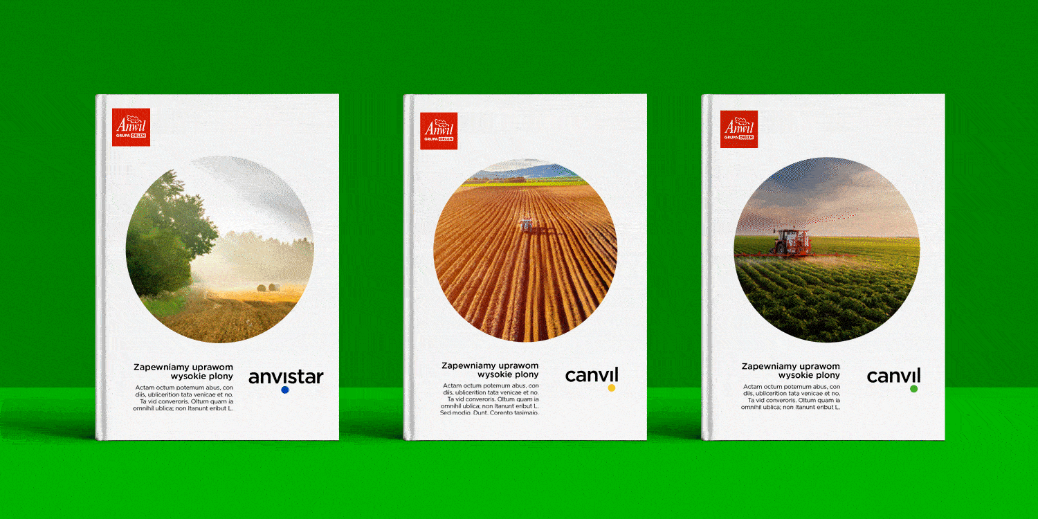
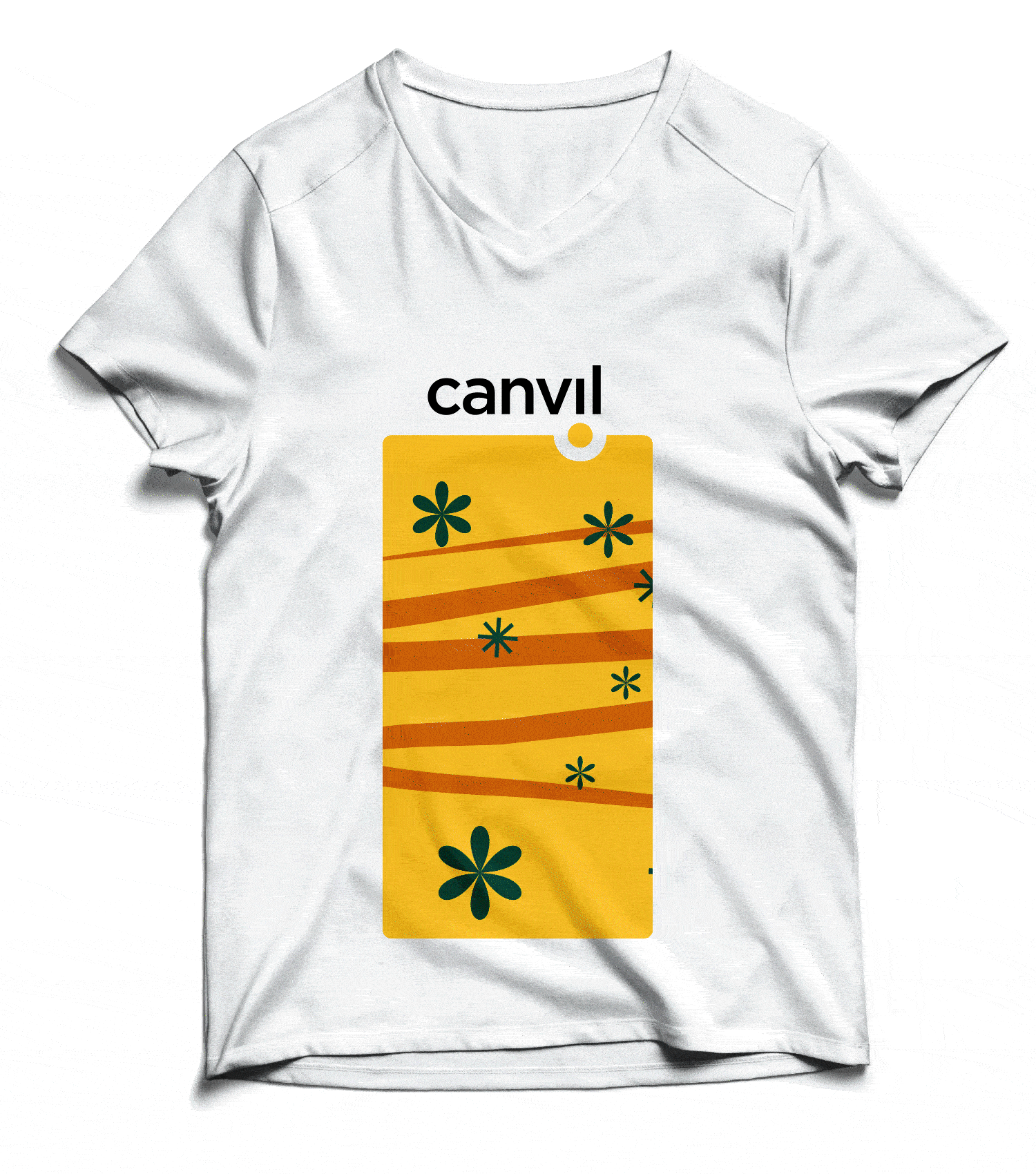
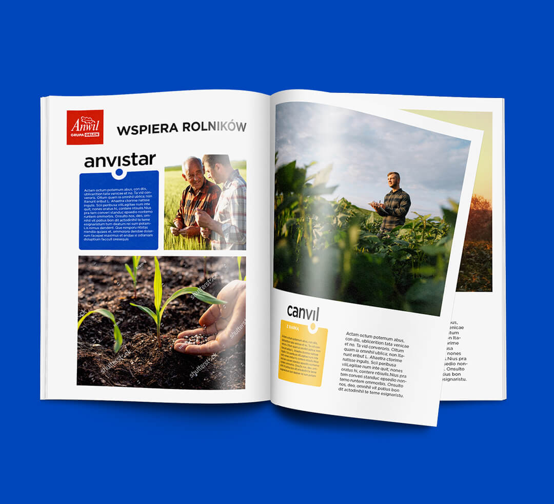
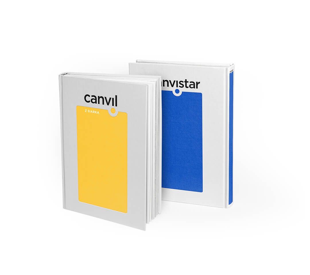
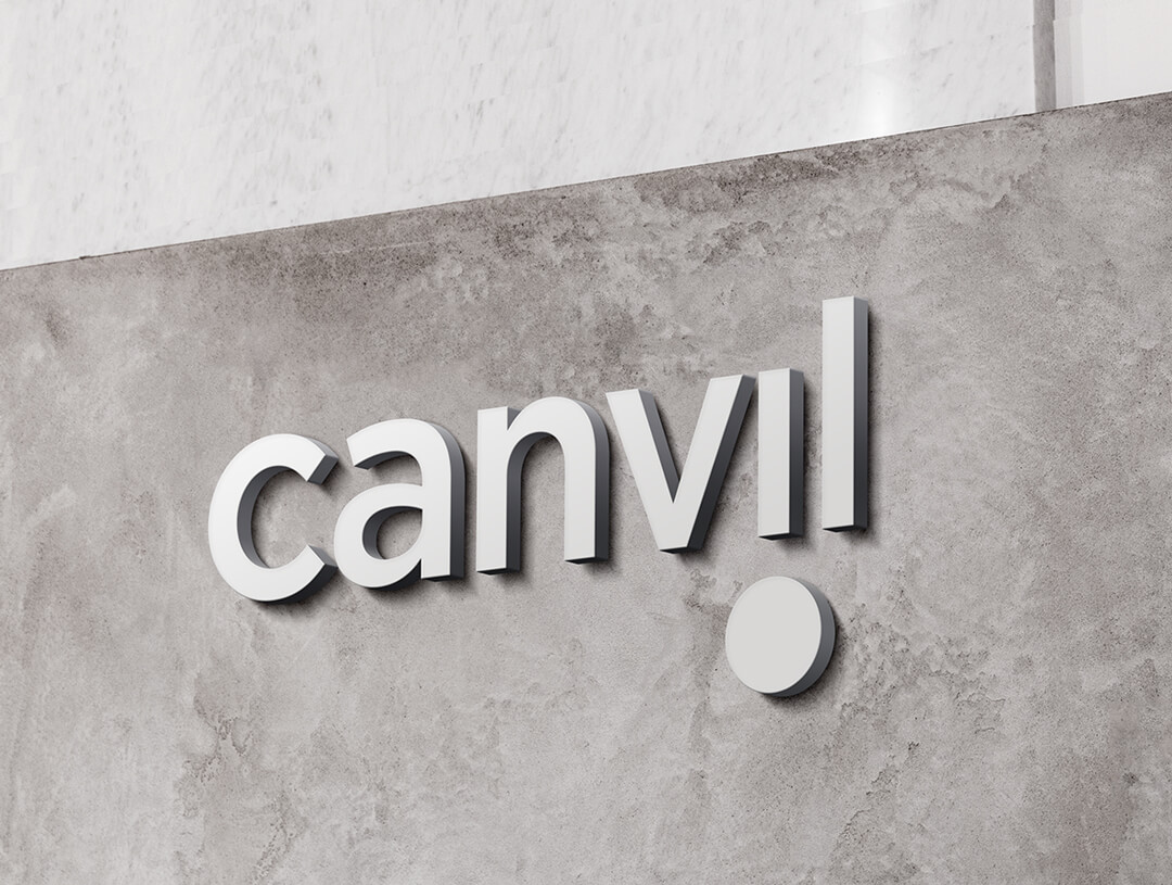
By choosing a specific fertilizer, we are not buying an unspecified promise but a guarantee that the harvest will be fruitful. Farmers expect that, and because of that, our creative concept is based on a simple scheme. The central point of the logotypes and the identification system of fertilizers produced by Anwil is a dot symbolizing a granule falling into the soil. This round form is simultaneously a metaphor for something ideal, perfection, and fullness – combined with the ground, the granule of fertilizer gives life because it stimulates growth.
For all the product brands of Anwil, we chose one carefully selected typography that gives them a modern character.
We could fluently implement the product by creating an ordered and clear strategy complemented by impactful brand design. Among the materials we designed within the implementation works were logotype brand books for eight brands, identification system manuals for each sector, and around 40 fertilizer packaging layouts along with their standards manual.