Our task was to redesign the Lech packaging. The objective behind the new design was to communicate the brand’s image qualities, i.e. being modern, premium, refreshing, invigorating, optimistic, confident, inspiring.
The existing design of the product has remained unchanged since 2011. As a result, it needed a touch of refreshing novelty to fit into the communication platform and incorporate the present trends in packaging design.
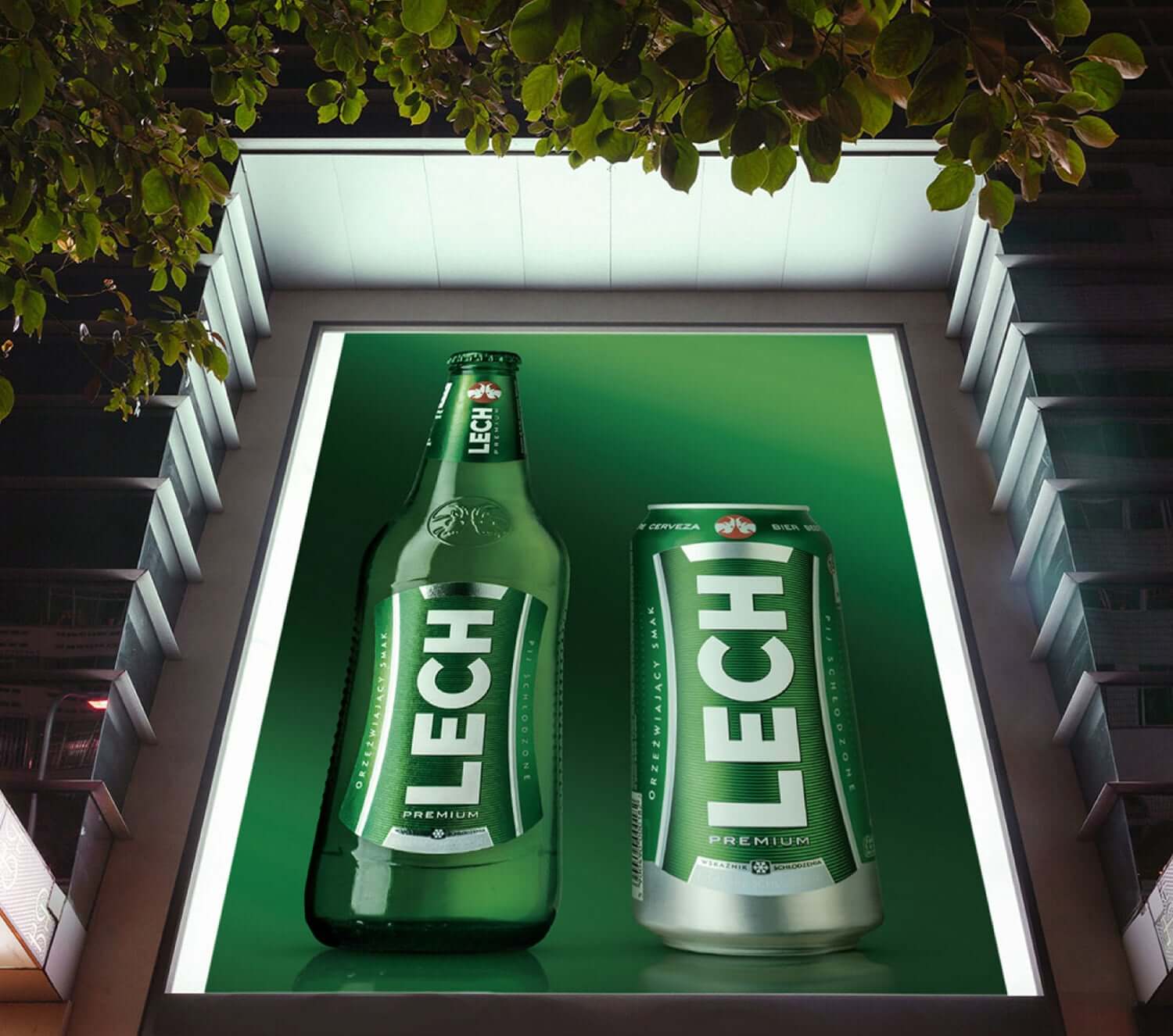
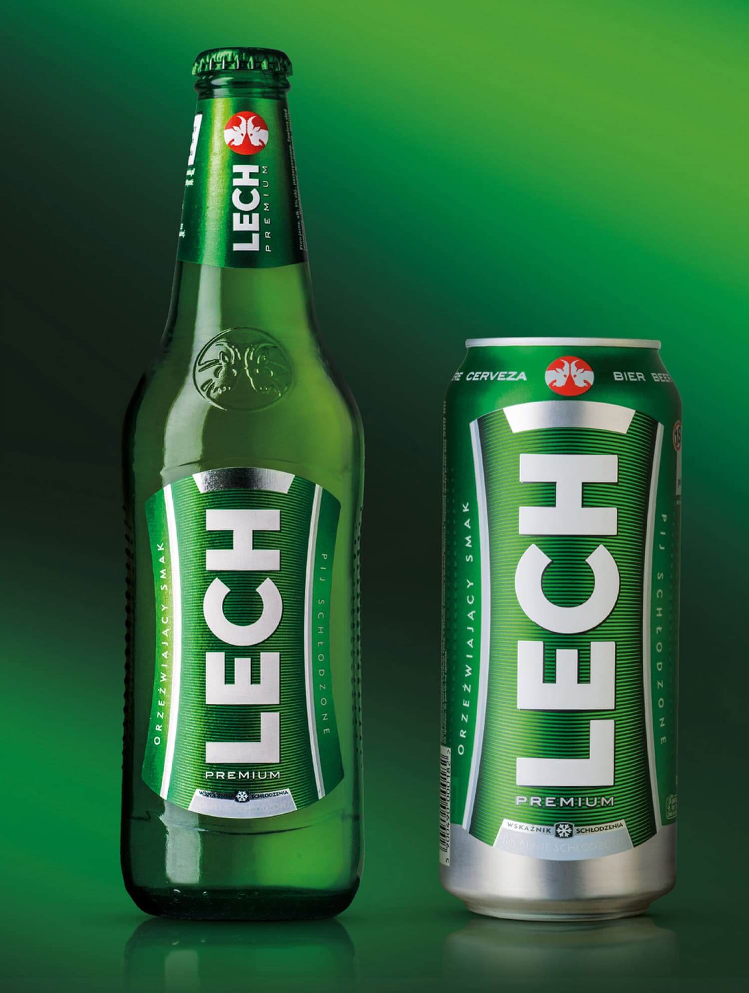
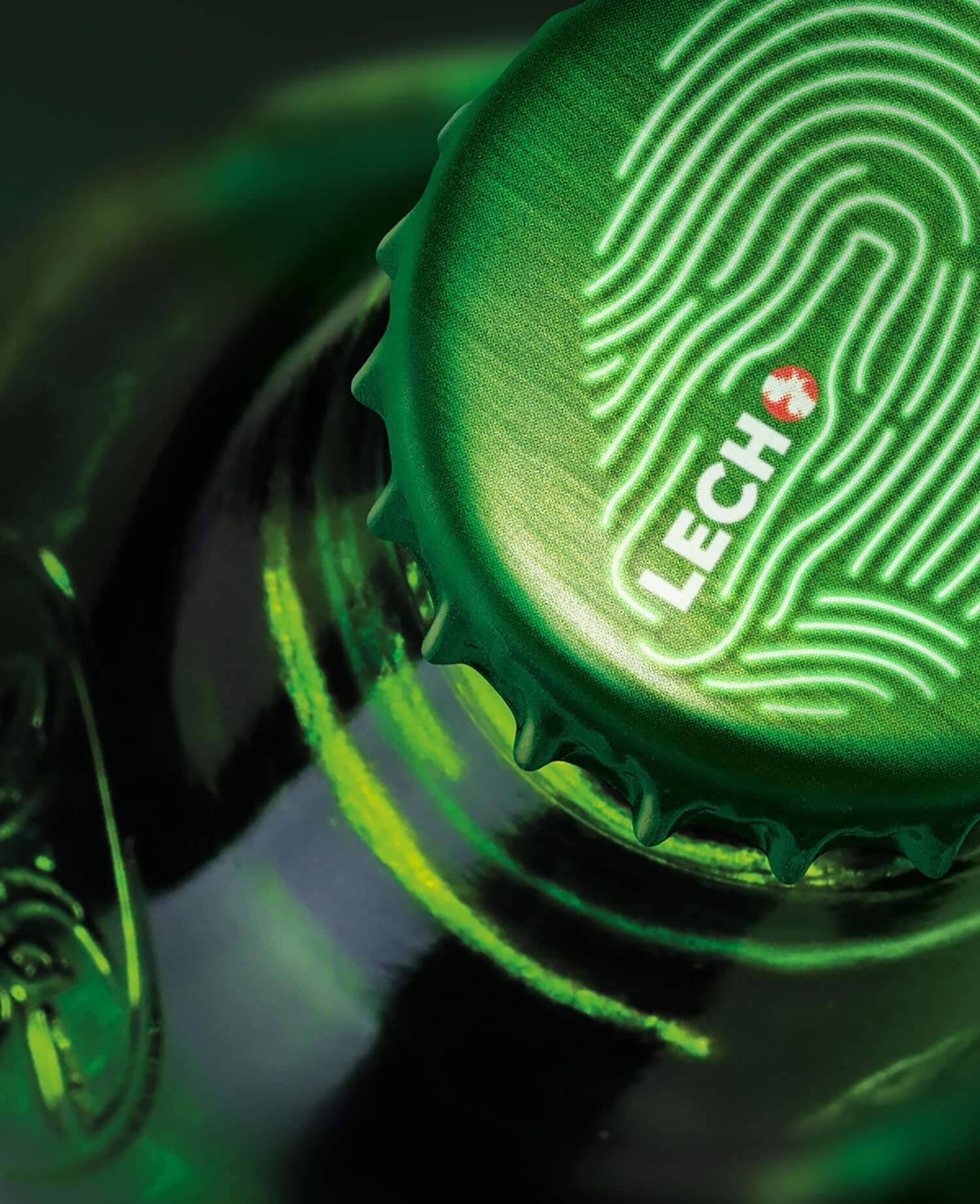
Our task was to design new packagings for the whole of the Lech Premium range, including bottles, cans and multipacks. We were keen to evolve the designs while maintaining the brand’s image capital, in particular the colours and the brand’s image fixed elements having the biggest impact on brand awareness (the tab with its vertical lettering of LECH).
While working on the project we employed the following graphics measures:
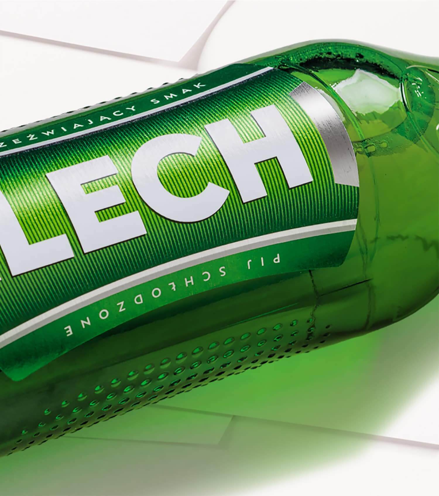
- livened up the colours, changed the saturation (lighter inside the tab, especially) and texture (from dots to horizontal stripes) – it results in refreshing energetic green,
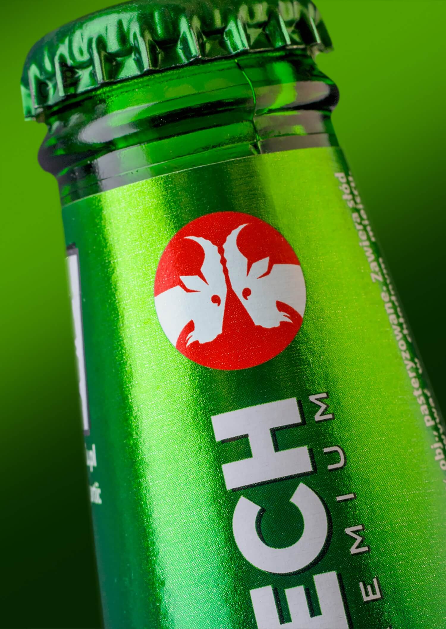
- moved the city of Poznań emblem featuring goats onto the bottleneck label, which provided optical enlargement of the tab – it boosted the package appeal and shelf visibility,
- simplified the brand’s logotype by removing the shading and visual concaves as well as by changing the lettering to newer and simpler – it resulted in achieving expressiveness (confidence) and raising the brand’s quality perceived by consumers (premium),
- restyled and upgraded the icon with the goats,
- the new form of informing of the temperature ideal for drinking: the lower “thermo ink” corresponds with the upper silver complement of the tab – it resulted in boosting the impression of cooling and refreshing qualities.