First, we had taken our hats off to the Polish scientists. Then, we pitched up and got down to hard work to create a new brand of dietary supplement.
Menavitin is a family of innovative formulation based on 1-MNA particle, being an output of dozen years
of work carried out by the scientists from the Łódź University of Technology and Medical University of Łódź. This very particle is a physiological substance of vitamin origin that declines in volume with age.
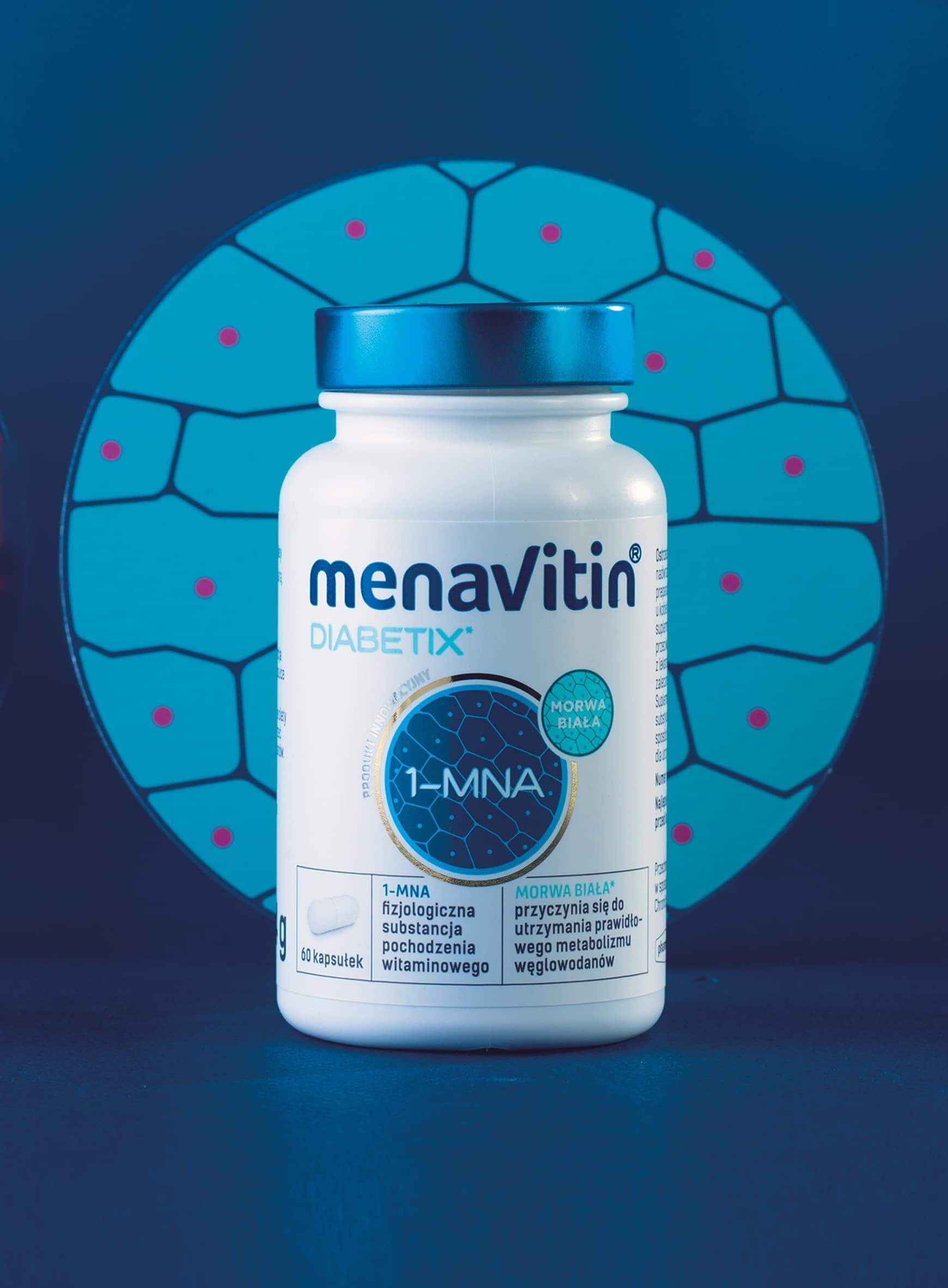
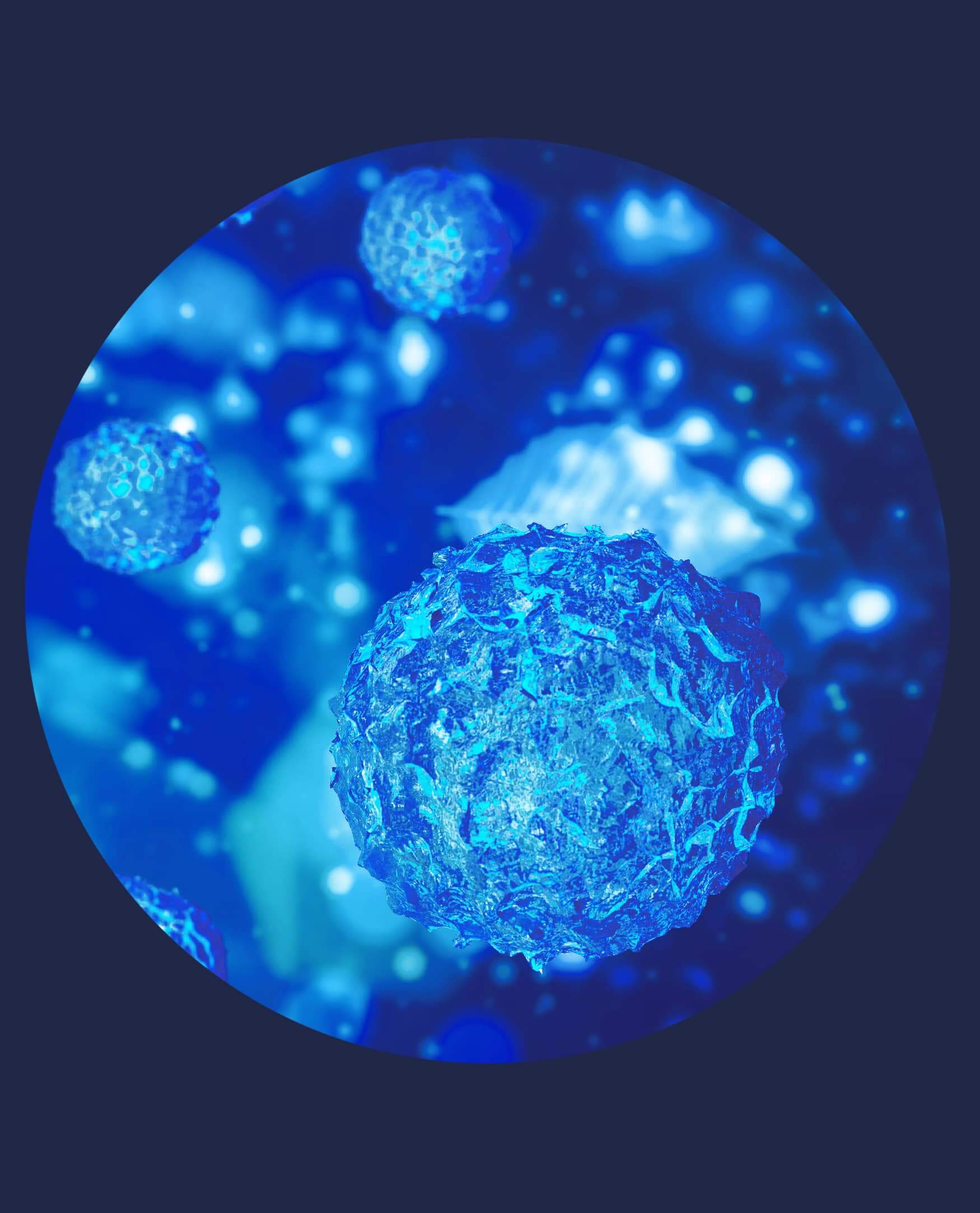
Our goal was to set up an umbrella brand comprising a wide array of products. While developing Menavitin, we were listening carefully to the stories of chemists, telling about a recovery impact of 1-MNA upon the cells, that inspired us to draw up a molecular design. Here, every particle matters. We strived for establishing a characteristic, one-and-only identification, simultaneously corresponding to supplements.
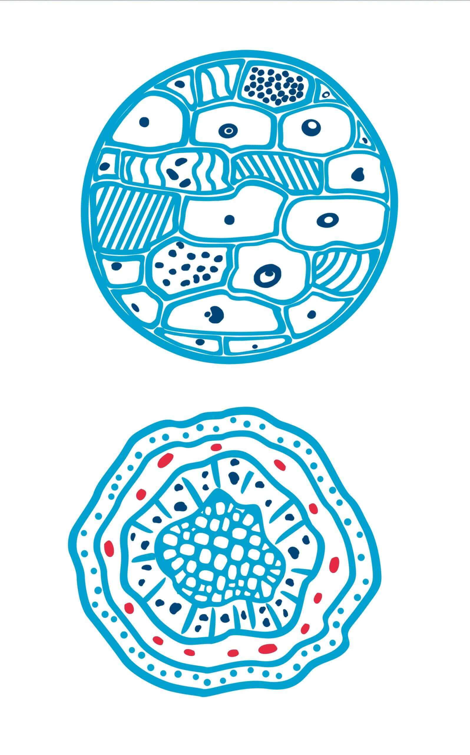
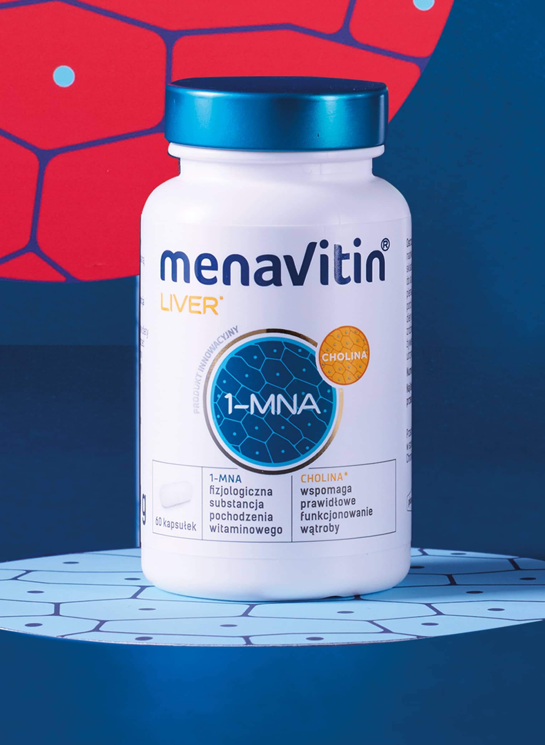
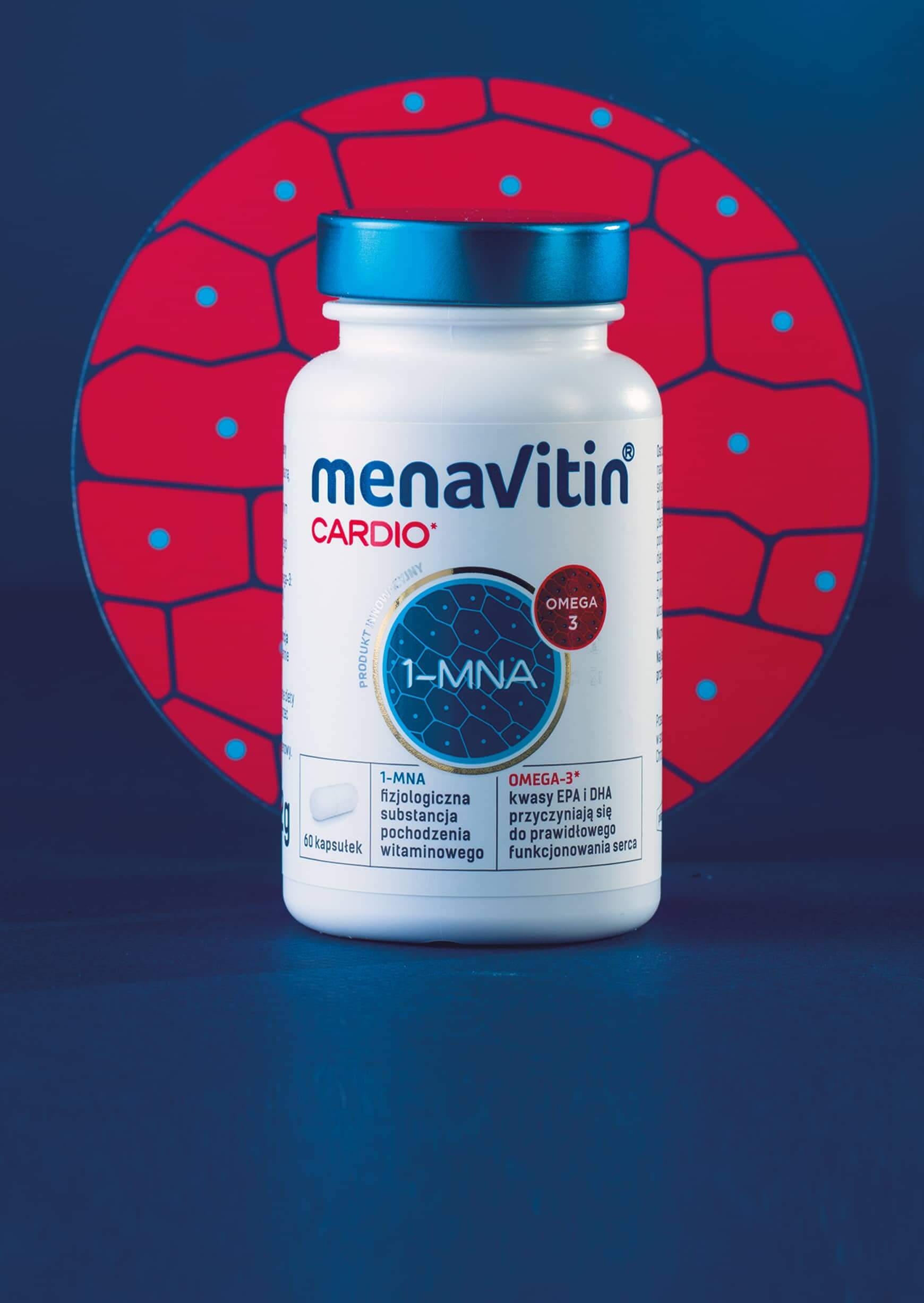
The core of the project is 1-MNA, enclosed in the brand icon. An essential component of identification is also an ultimately colorful illustration of the tissue structure with the style referring to the contemporary way of displaying cells and biological processes. An inspiration for the turquoise and teal colors of the 1-MNA icon was sea algae, as they are the richest natural source of this particle.
In addition, this is the logotype, designed so to emphasize the “v” letter, stressing vitality and vitamin character hidden in the brand’s name, that highlights how the product works. And what about the packaging itself? The shape of a tiny jar corresponds to traditional pharmacy-style drug containers and
is simultaneously simple, cutting edge and of high quality.
Moreover, the tiny jar is a crucial element of the whole design: we have developed its shape so to reflect traditional pharmacy-style drug containers, on one hand, and be simple, cutting edge and of high quality.
