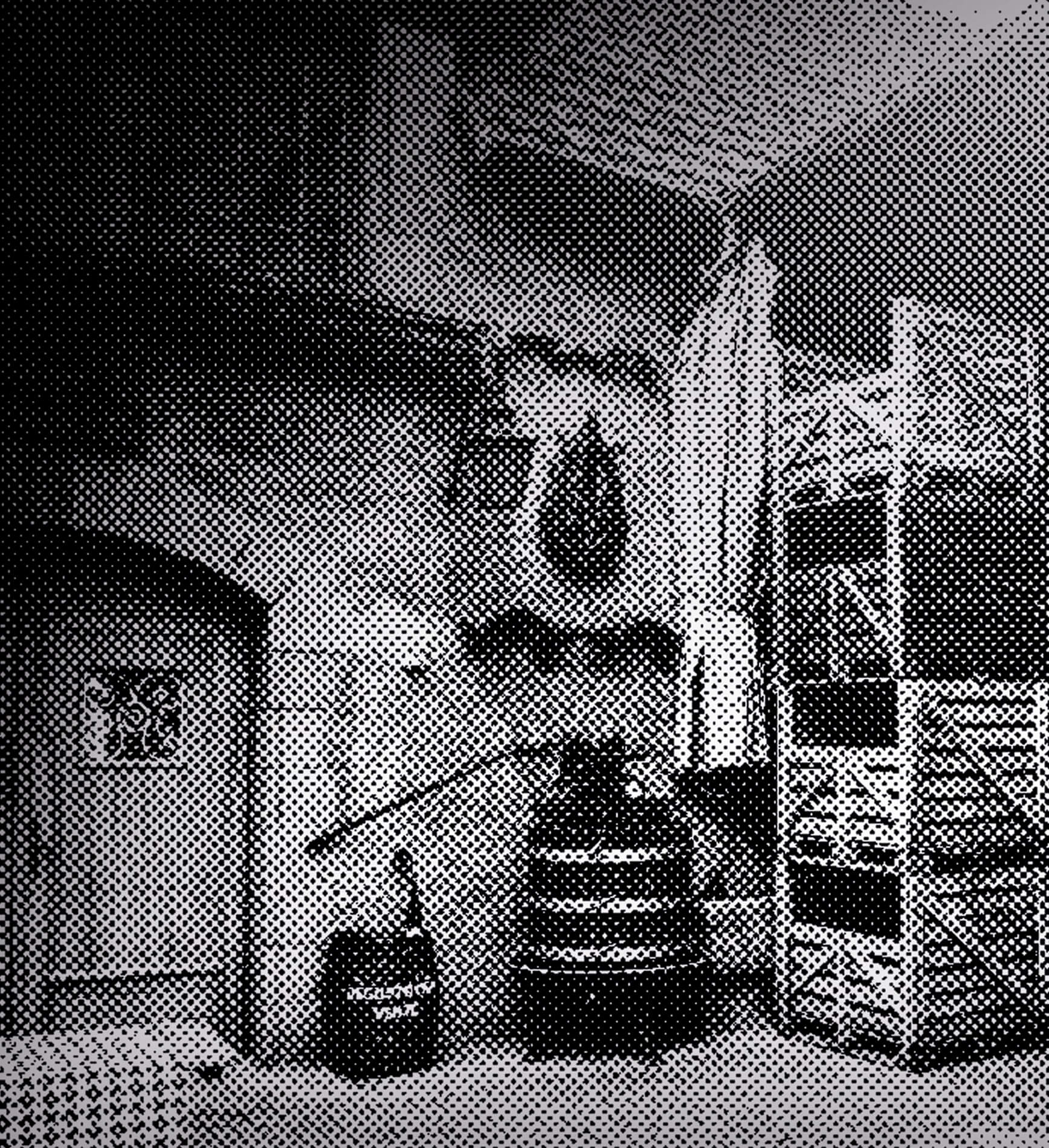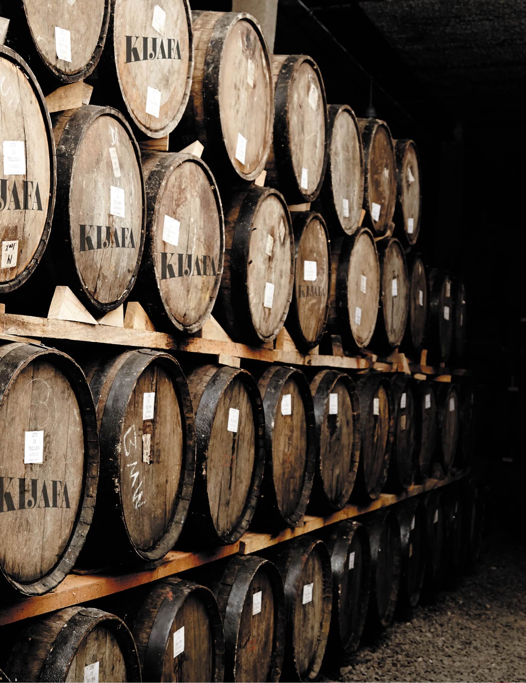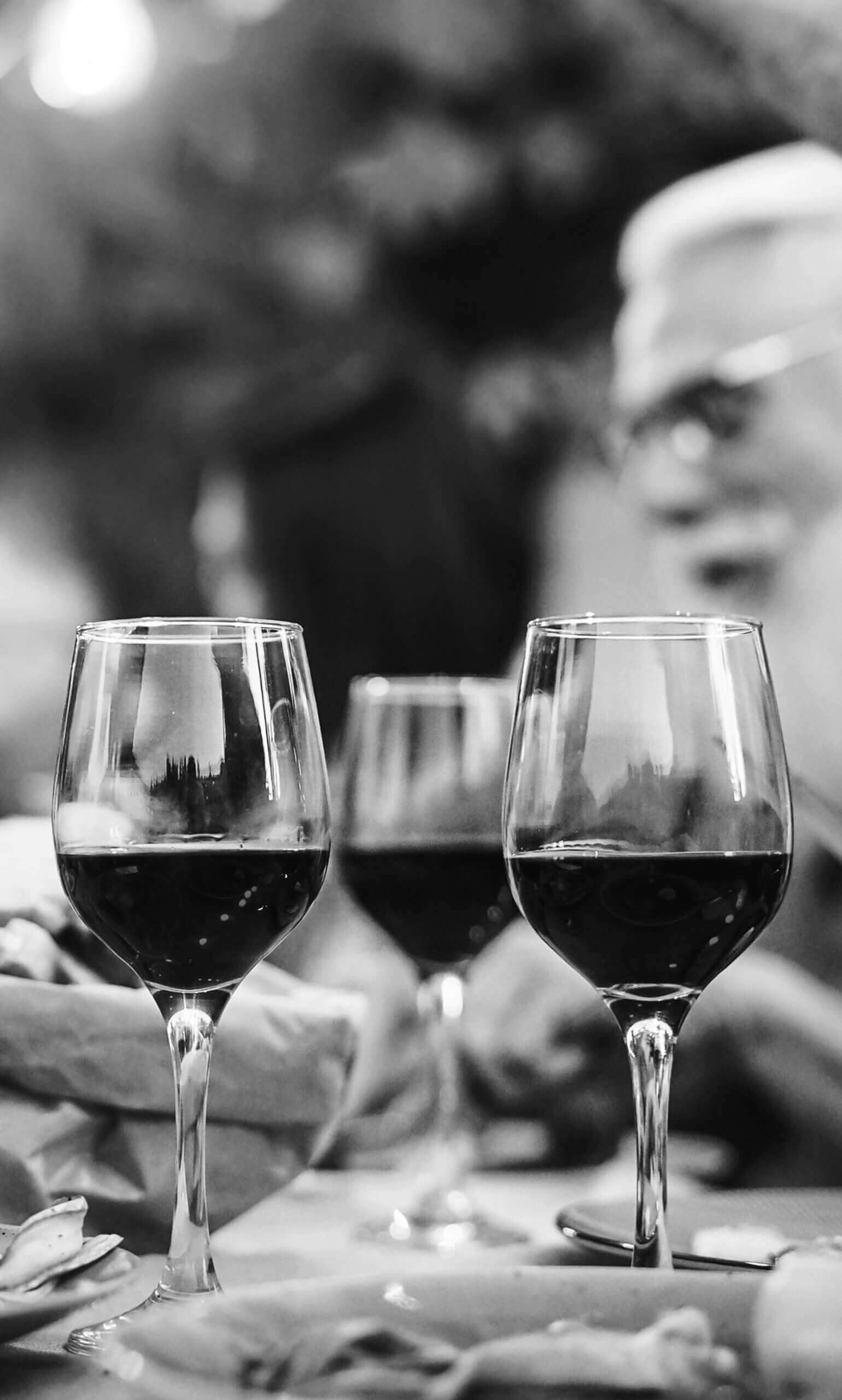
Sipped from crystal glasses… Highly appreciated by our aunties and grandmas… Witnessed afternoon gossiping… Led young people into the world of liquors… This might be an intro to the puzzle about the brand, we were ordered to apply rebranding to.
Kijafa is a delicious, sweet and not expensive wine, that has been associated with a classical, dark bottle with a birdie sitting on a cherry fruit. This Danish brand has been successfully traded in Poland, Denmark and the US.
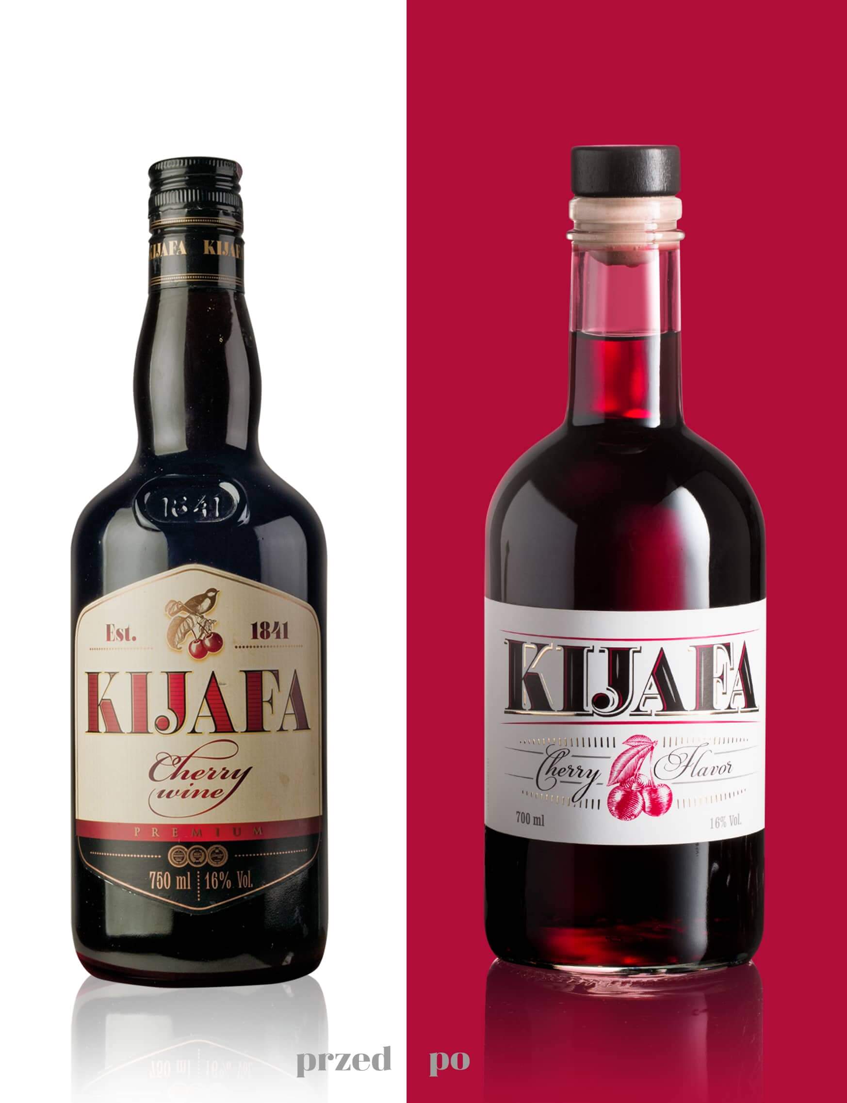
When several years back Kijafa was taken over by United Beverages, we were invited to do a slight lifting, aimed at updating, yet keeping in mind the traditional character of the brand. In 2018 we made another step further that resulted in launching of a new packaging, introduced in the spring 2019. We were to conduct the redesign, that would consider current Kijafa lovers, but also keep up with the current trends and be attractive to younger consumers.
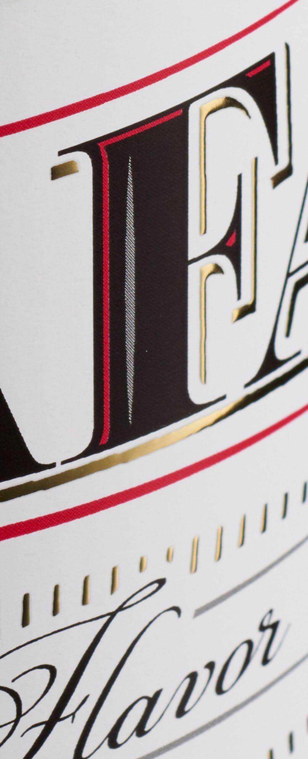
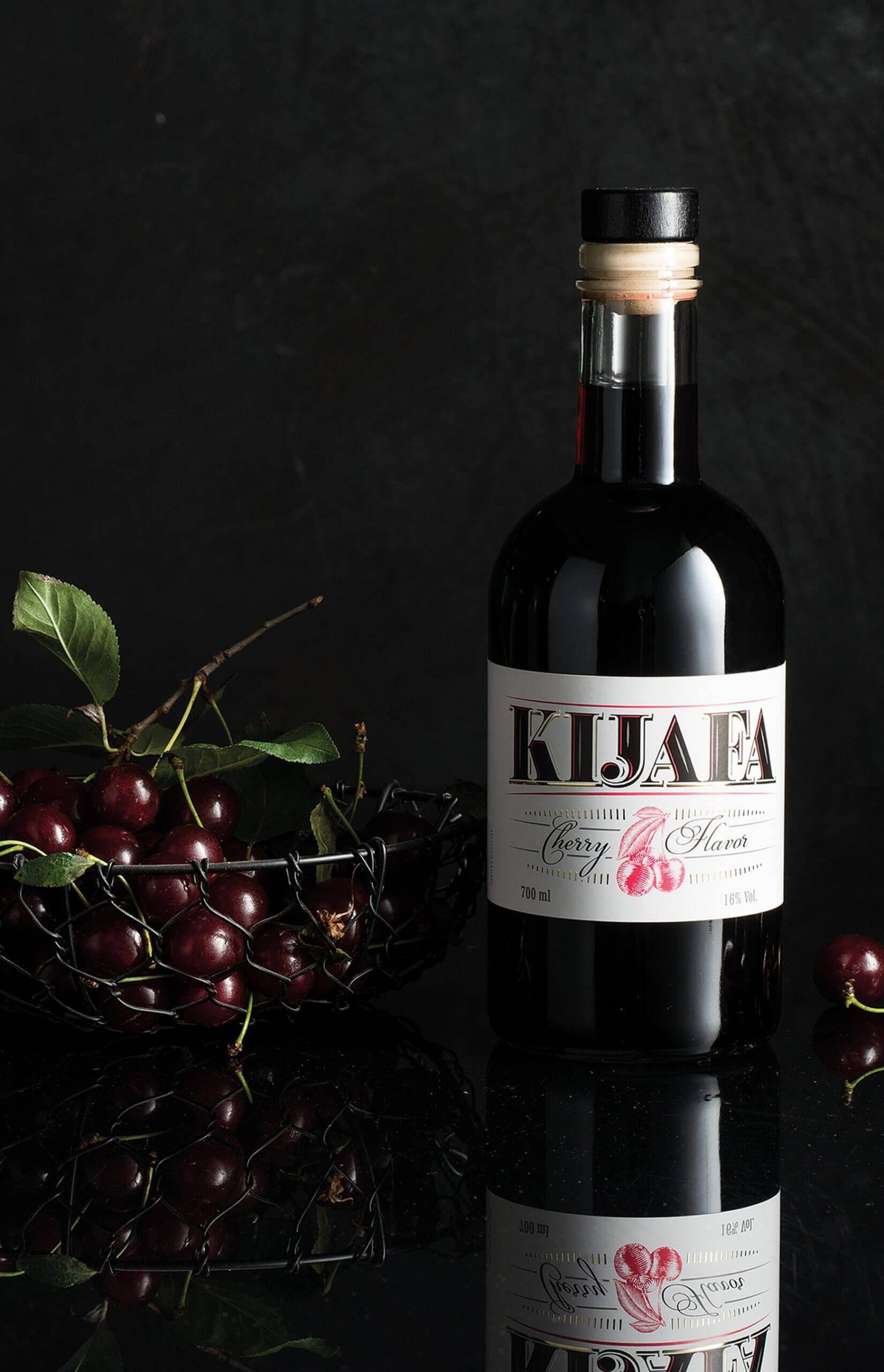
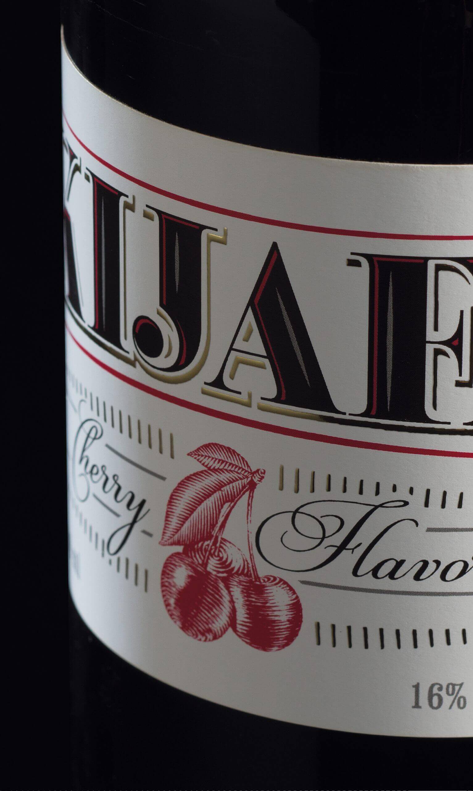
We think that the logotype – that has always been a bit of the crafty style – is the most precious visual heritage of this brand. Therefore, we were careful while modifying it. However, we have designed a new form, underlining the logotype with an arch and elevating the quality as well as adding the letters with some space and alcohol-related flavors, typical for this particular category.
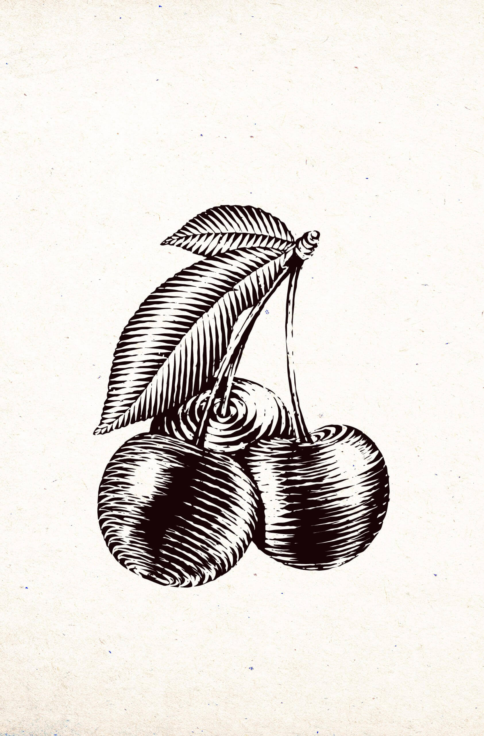
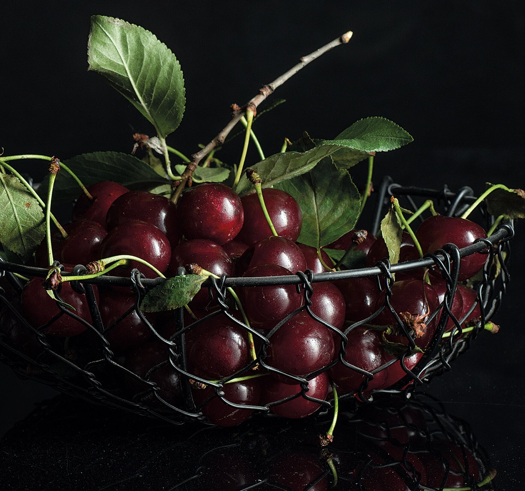
At the same time, we have been trying to clean out the label area to the maximum extent, so to let the picture describi the taste be exposed properly. We decided to go for a white background, that contrasts with the dark glass of a bottle, providing it with far better recognition on the shelf. The project has also benefited from the change of the bottle into a much simpler one, that made the brand look more up-to-date.
