A long-awaited change
With this rebranding our agency has won Bronze at the 2019 KTR Awards and a distinction at the Polish Graphic Design Awards. Our client has gained a whole new visual language to communicate their brand.
Not every brand needs rebranding. It is not necessary, since this is not a routine task on the #10YearsChallenge list, yet a demand for change, that gains a visual effect. That’s why it has been so fruitful to work on the brand with the people, who consider it a part of their life and who have grown up for a transformation along with the 40 years + history of this very organization. The brand was ready for transformation. A huge one.
HSH Chemie is a leader on the chemical distribution market in CEE. Operating within 11 segments of the chemical goods, ranging from supplements, solid construction chemicals, to feed livestock, it imports top products from all destinations worldwide and distributes them across CEE countries.
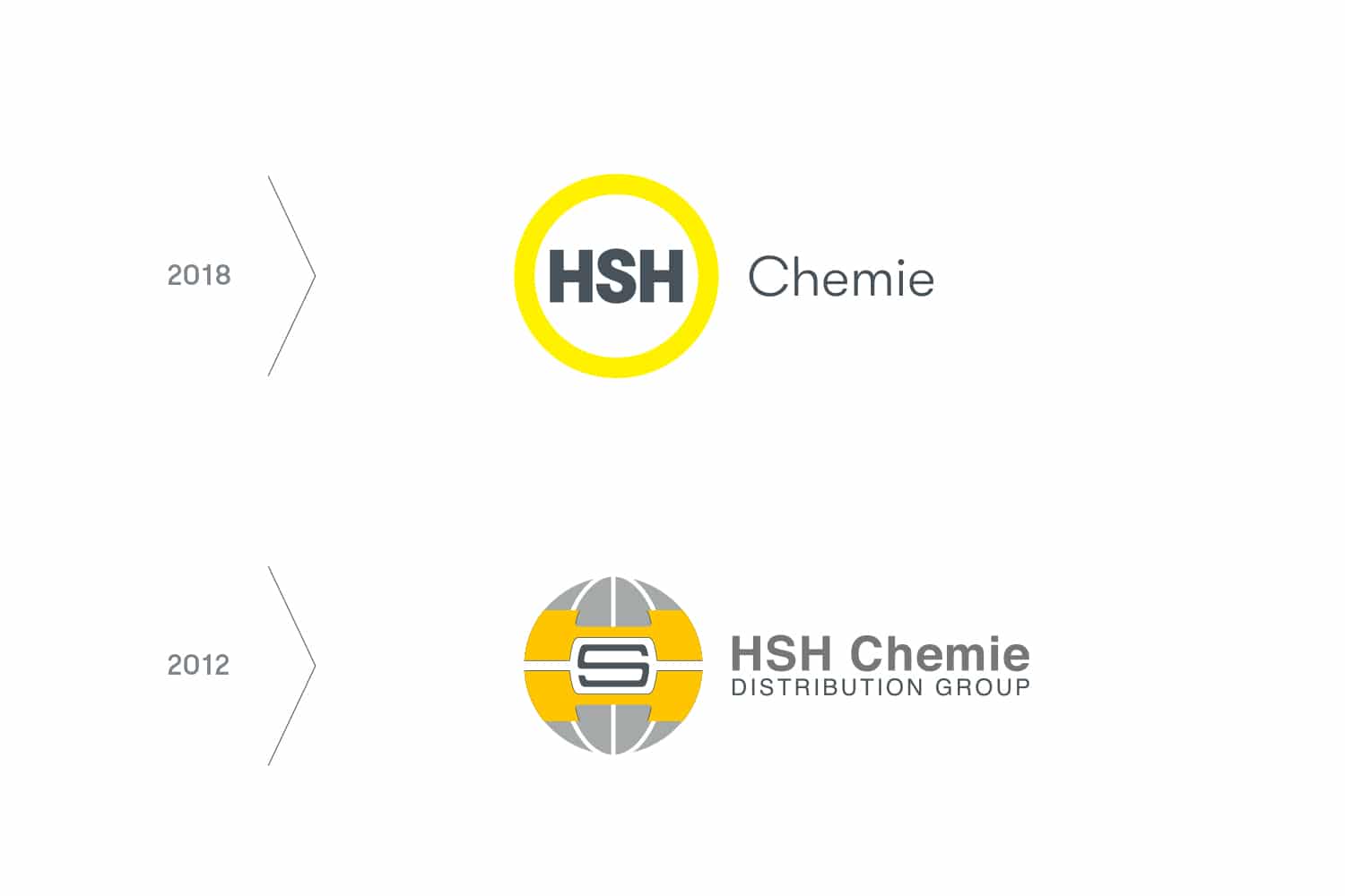
The previous sign of HSH Chemie was set up 20 years ago and it has survived in a nearly unchanged form until today, regardless of time and trends. A multi-element and complicated logo no longer reflects brand identity. It is high time for the brand to become state-of-the-art, tailored to the rising demands of the market and to express the company’s value in a more efficient way.
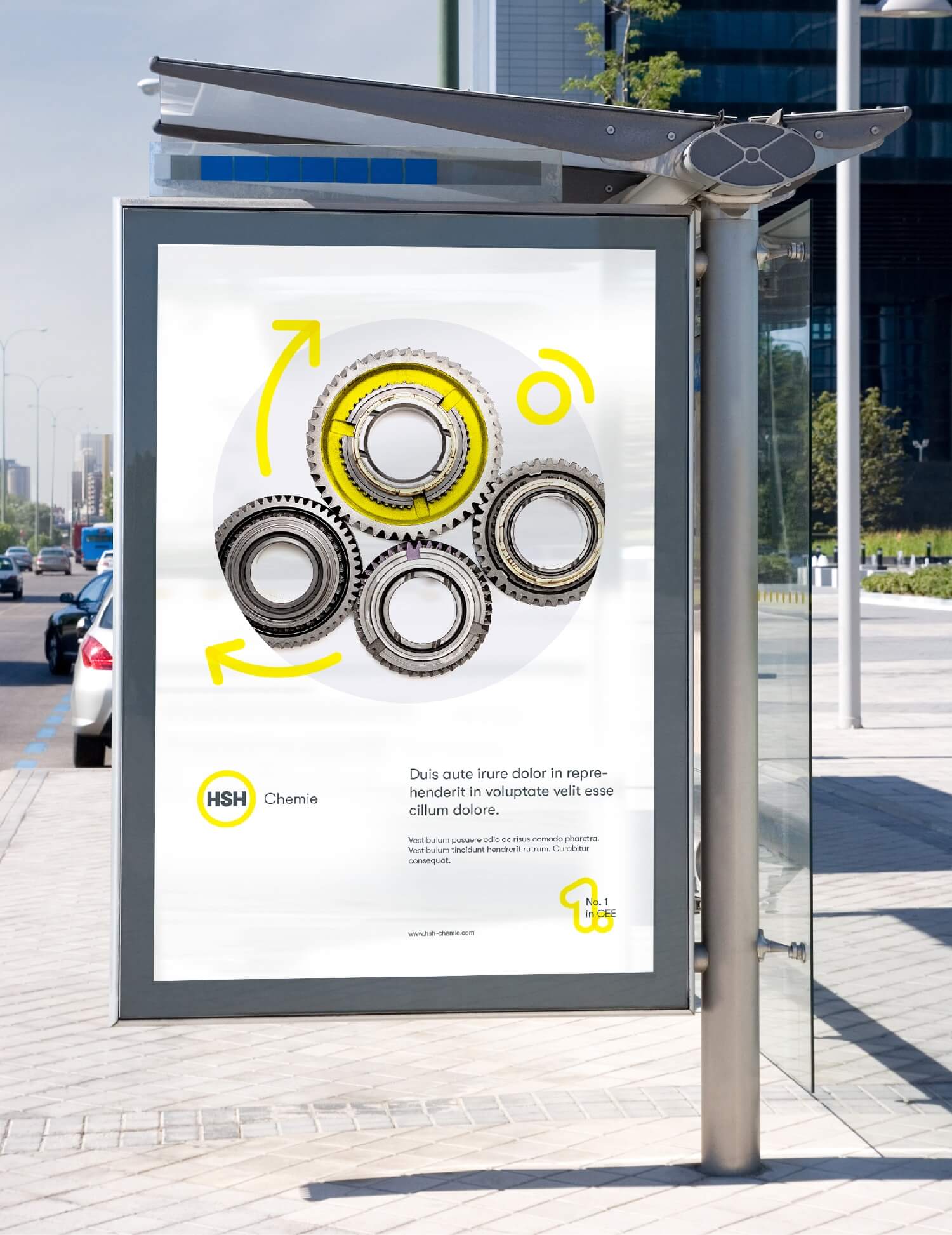
While searching for the proper measures, that would smartly present the HSH competitive advantage and its unique ambiance, we have created its own language to communicate values and principles we respect in business, but also in an everyday life. We have established a family of icons, that are an extension of the logo idea, gained through applying the yellow ring’s line when building up certain symbols. The core visual value
is using the contour to construct simple and easy-to-decode shapes, that will maintain soft character of device’s lines. Transparent, intersecting lines, correspond to transparency of relations, which is an important trait of work and business standard applied in HSH
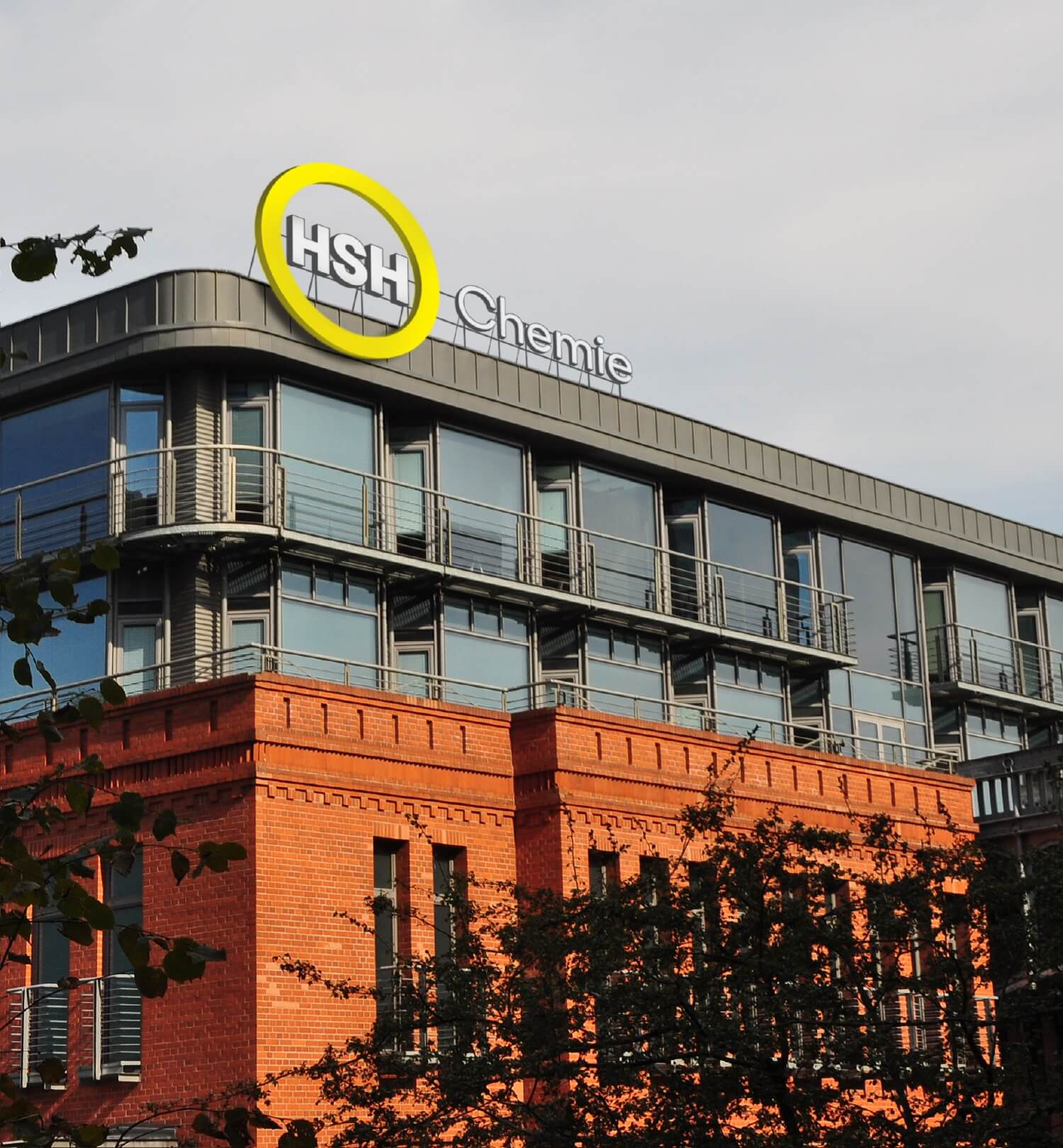
Working synthetically on brand identification, we managed to build brand identity upon its simple leadership values: a refreshed shade of yellow and gray, a wheel shape that is characteristic to the emblem, strong typography and a rich world of icons, the world enhanced by HSH Chemie.


