Dress up in a noble navy blue. Sprinkle with gold. What else can we do to show everybody that Krakus means not only over 60 years of tradition, but also top quality goods?
Do you realize that the Krakus brand was registered in Poland for the first time as early as in 1959?
Krakus is the oldest Polish sausage brands and its highly recognized among the consumers. This is a great asset. So great, that Animex – the brand owner and the largest food manufacturer in Poland – back in 2014, decided to return to the old-school packaging layouts… However, nostalgia is not enough. Considering the ever-changing market, a bit of sustainability and visual continuity might be of course an advantage. Yet, is it a real response to the consumers’ needs and does it translate into their everyday choices?
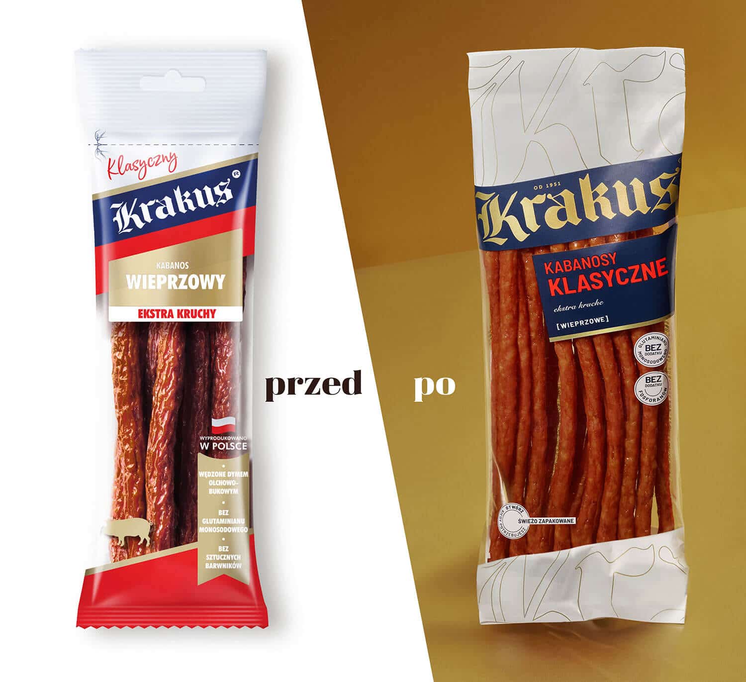
Well, for those 60 years the river has run through it and many things have changed – both on the market and in the design world. That’s why it turned out that actually branding of old-school packagings neither corresponds to the price bracket, nor reflects high quality of Krakus products. 2019 was the time to introduce the redesign, that, maintaining precious components, will convey the brand into the future and bring it the state-of-the-art profile.
What have we actually done? Or, what have we not done?
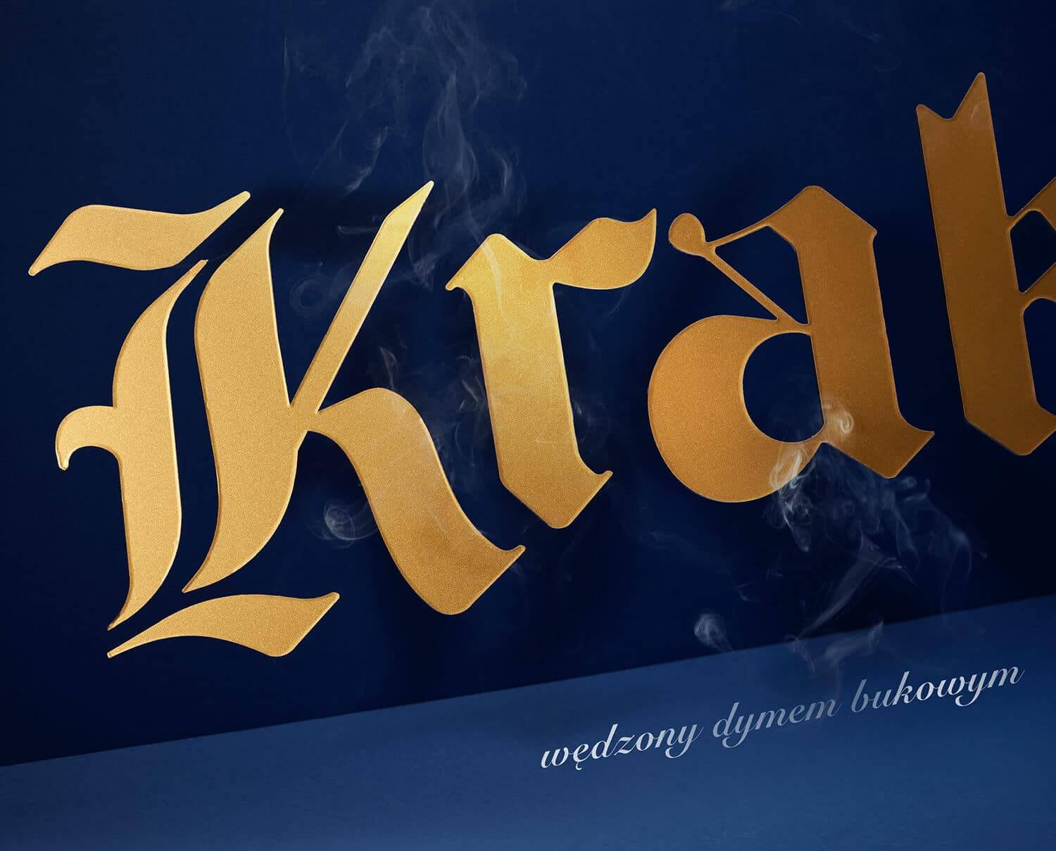
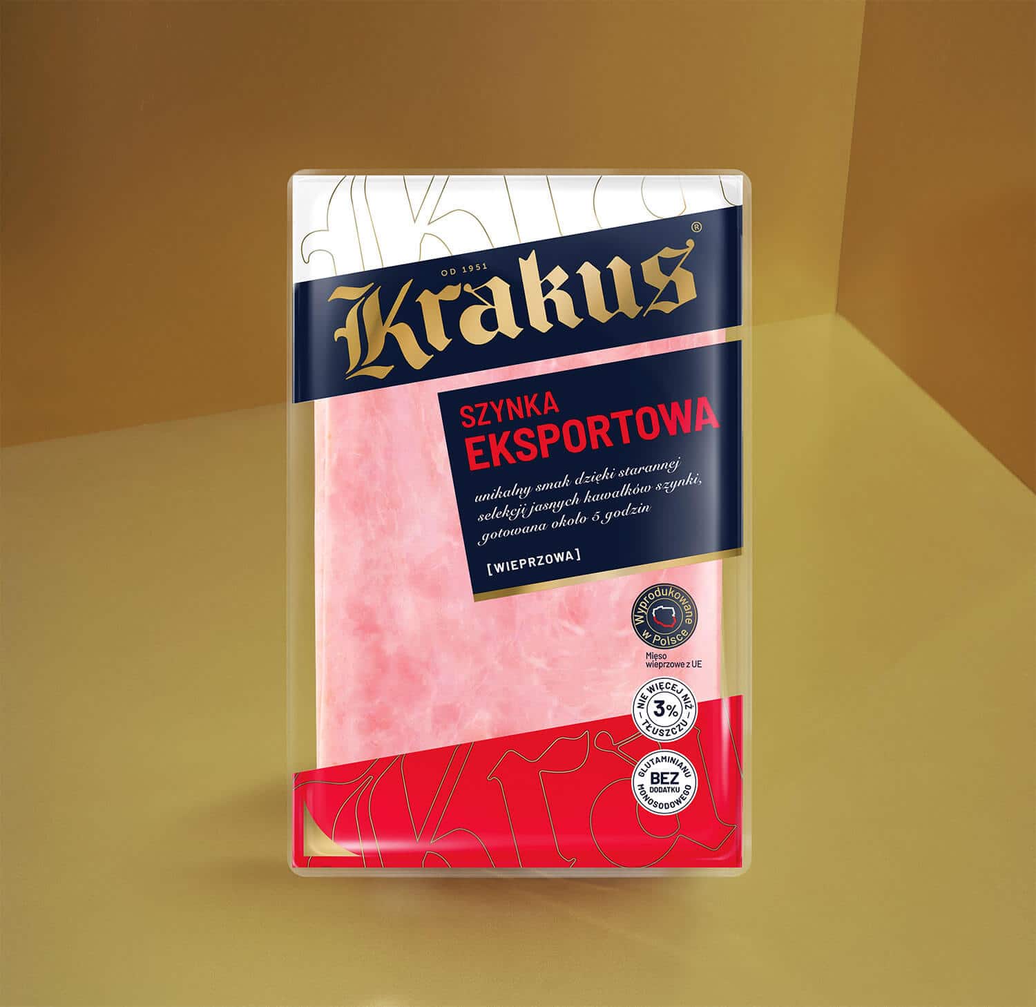
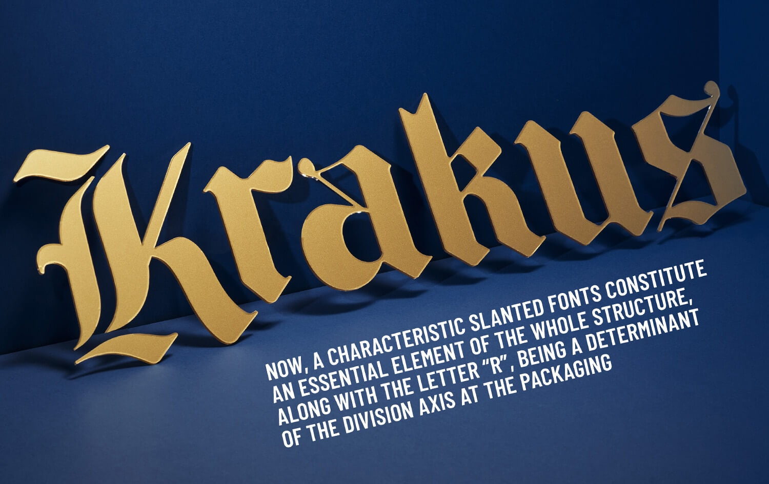
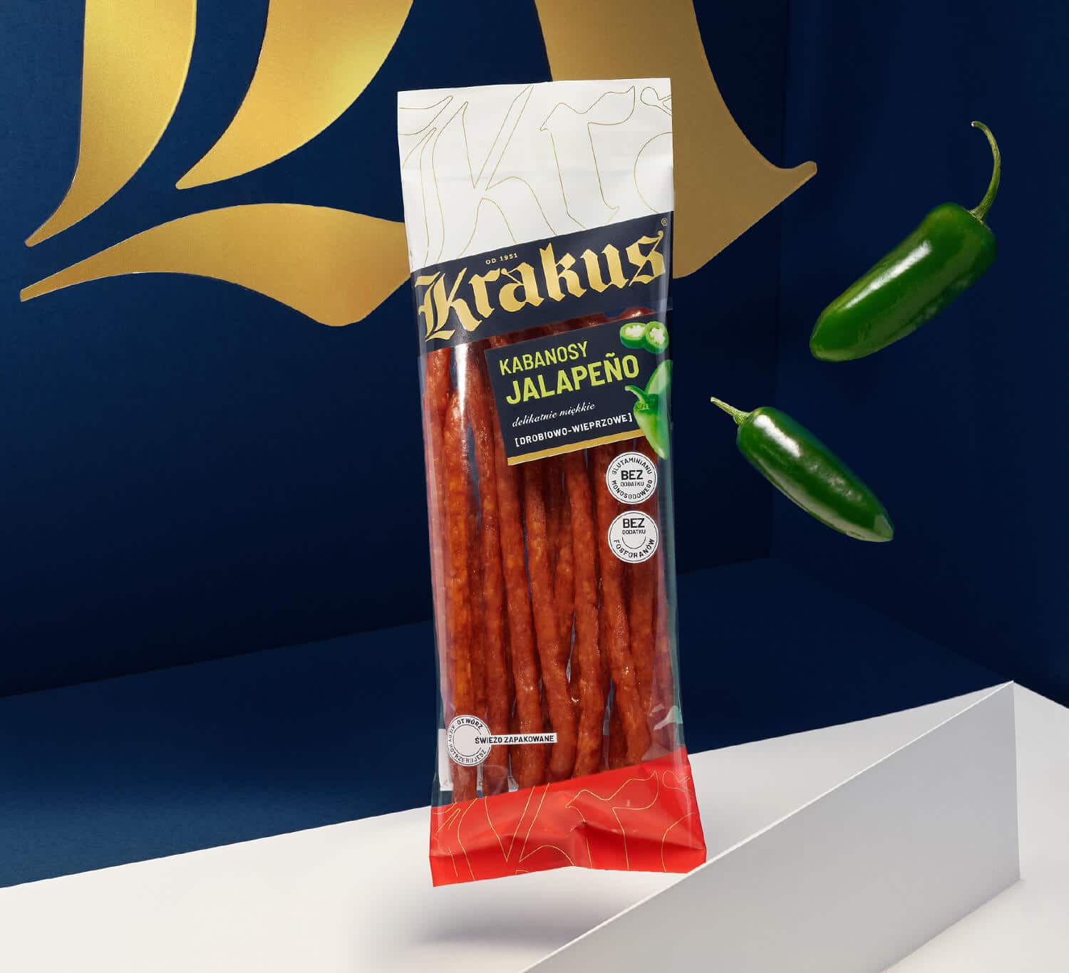
For example, we haven’t changed drastically the historical logotype, considering it a definite advantage of the brand. It had been subject to a minor modification and then sprinkled with a gold it deserved…
We have also kept characteristic slanted fonts. Moreover, it constitutes an essential element of the whole structure, being, along with the letter “r”, a determinant of the division axis at the packaging.
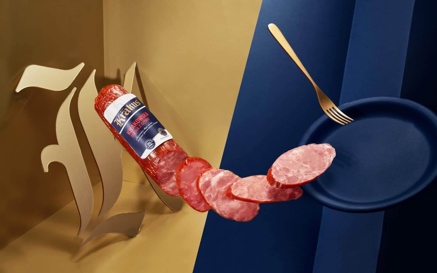
The resized logo has also become the starting point for the pattern, that gives nobleness and prompts associations with craft products. To be honest, Krakus represents the butcher’s craftsmanship, having been promoted by the brand for many years now.
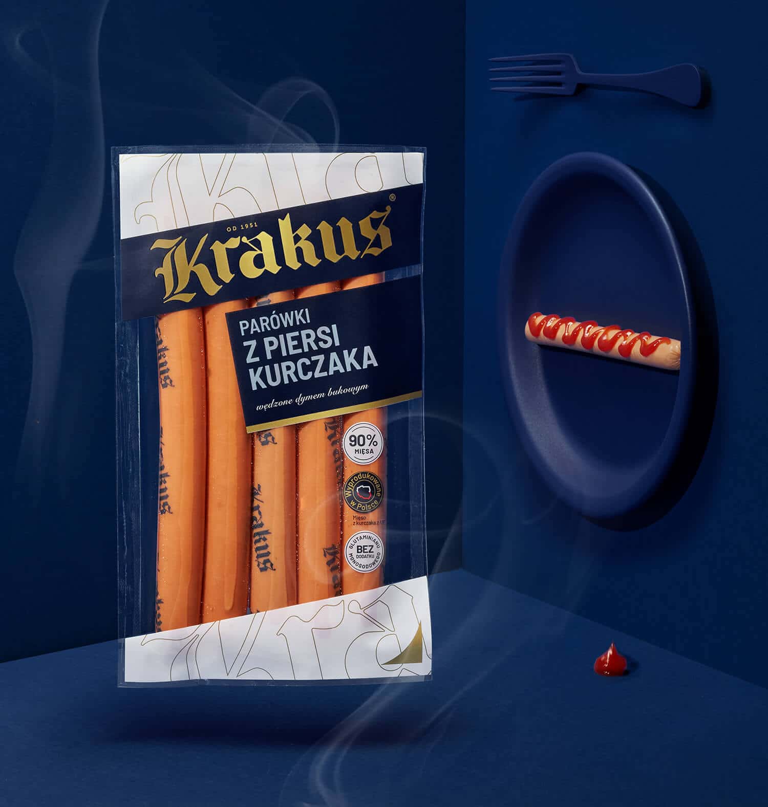
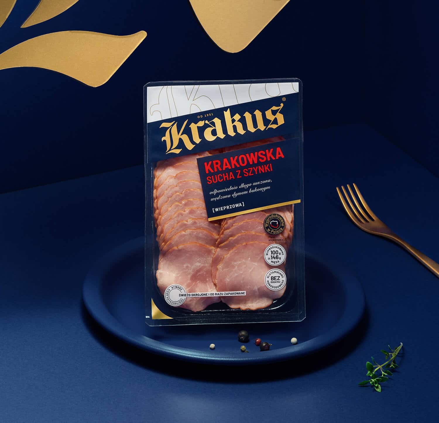
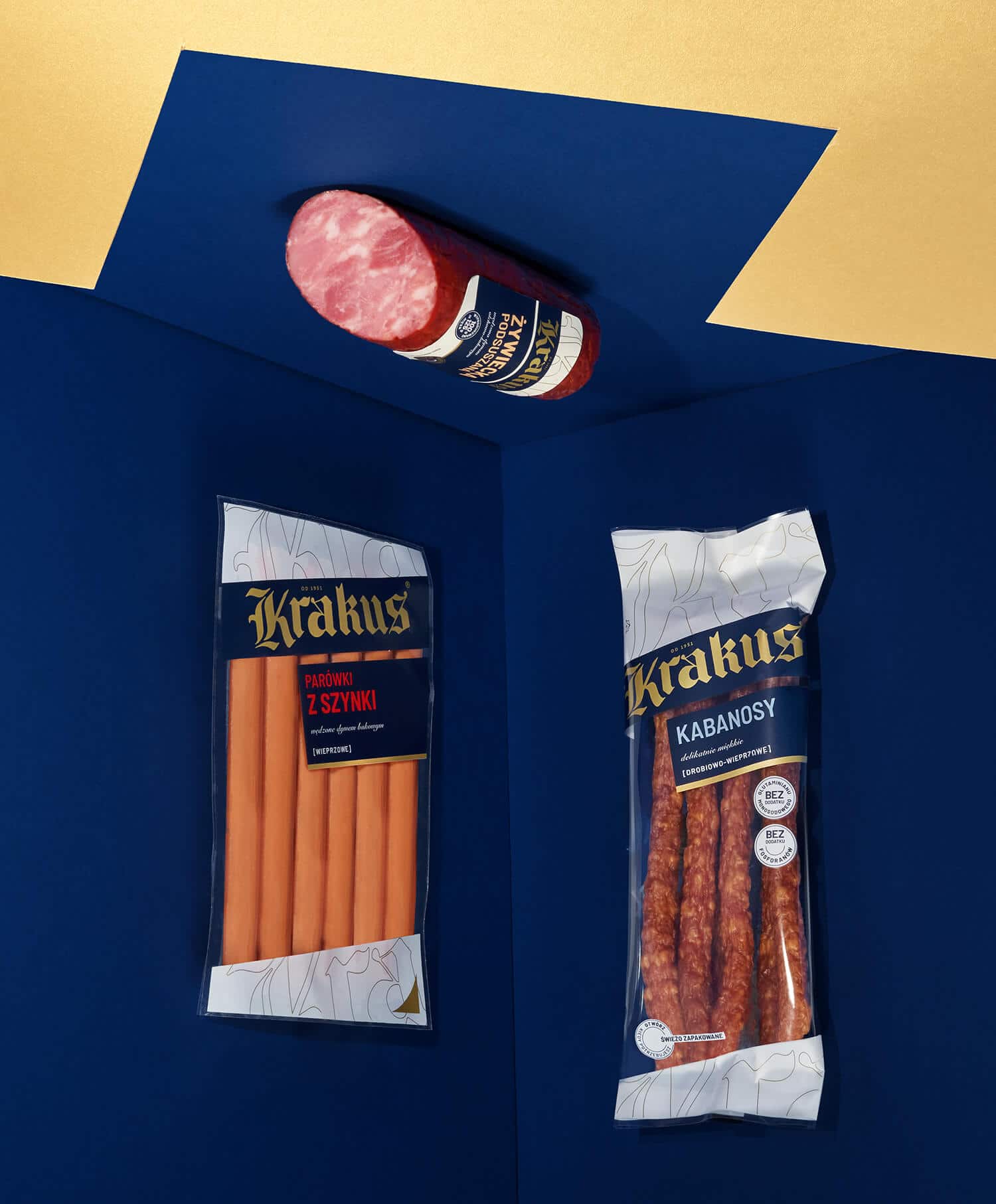
While designing the packaging, we also put a greater stress upon transparency, so that the consumer could see what’s inside. Transparency matters. Now, instead of photos of sandwiches, we are able to see what might be actually put on them.
And, eventually, we come to selection of colors – so essential for a final effect. The Krakus brand provides top quality products. Therefore we quitted white-red-blue color range in favor of a noble, nearly satin navy blue and gold, that demonstrate association with the premium goods.
The results of the evolution of Krakus packagings could be seen in numerous retail shops, as suggested solutions have been implemented in ca. 90 SKU. How does this new design look like? It is pure and modern, standing out definitely with its taste.