Can a corporate identity system be simple, yet meaningful? It can, and even should.
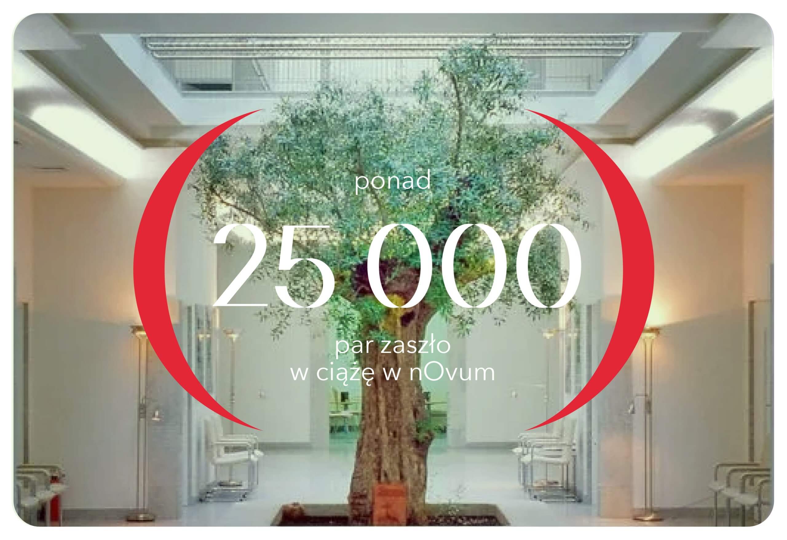
nOvum is a center for assisted reproductive medicine, where comprehensive diagnosis and therapy of problems with getting or keeping a pregnancy begins. To celebrate the clinic’s 30th anniversary, we gave the logo a facelift and created a comprehensive identity system.
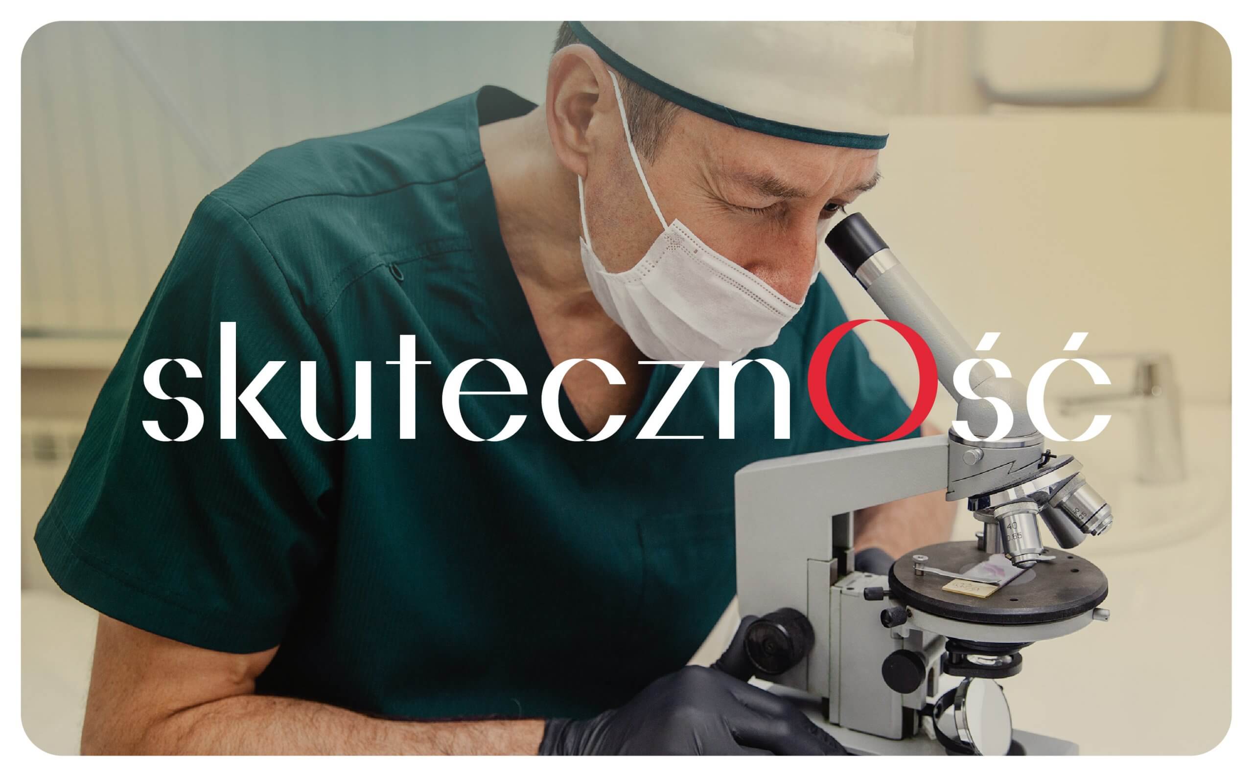
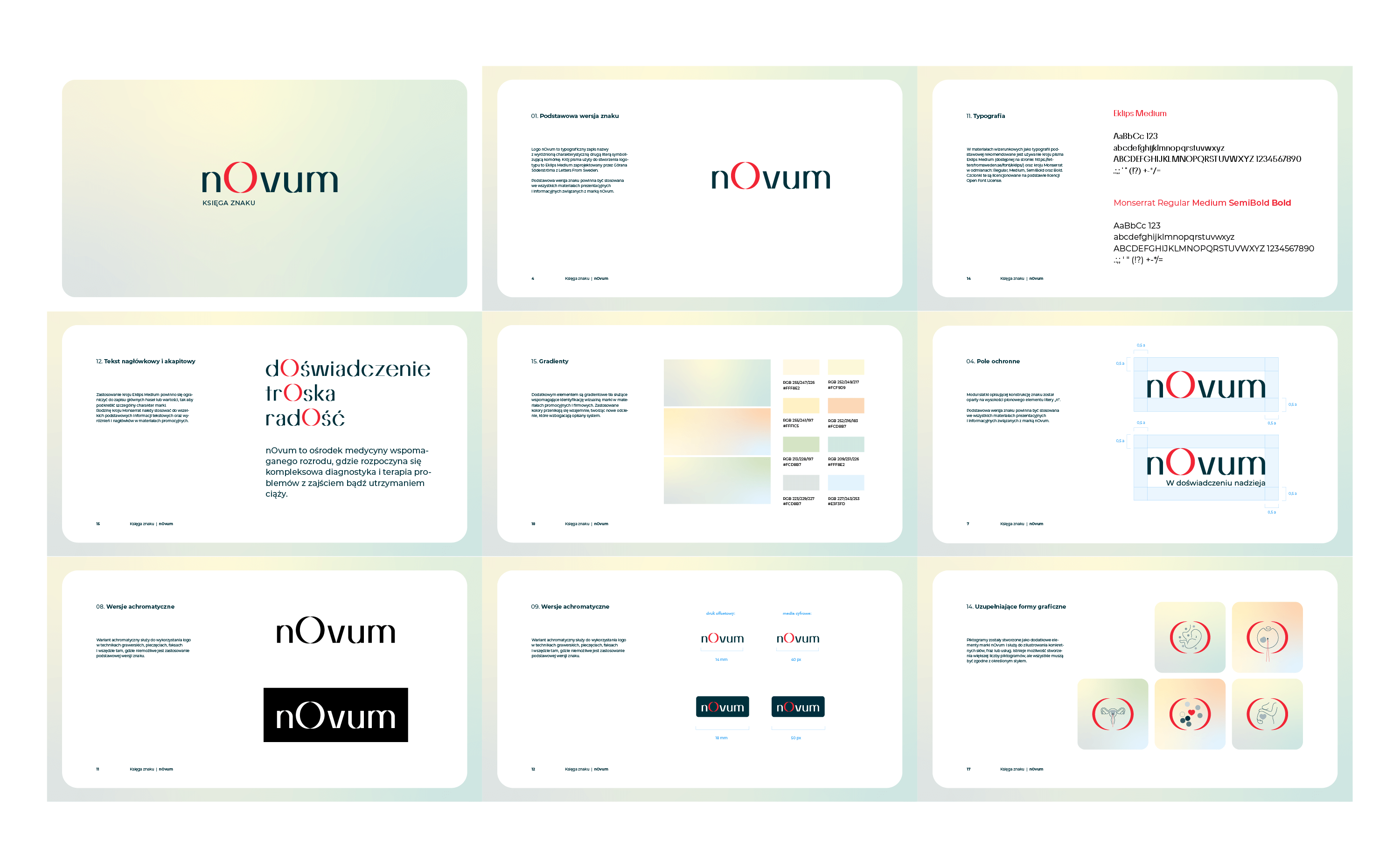
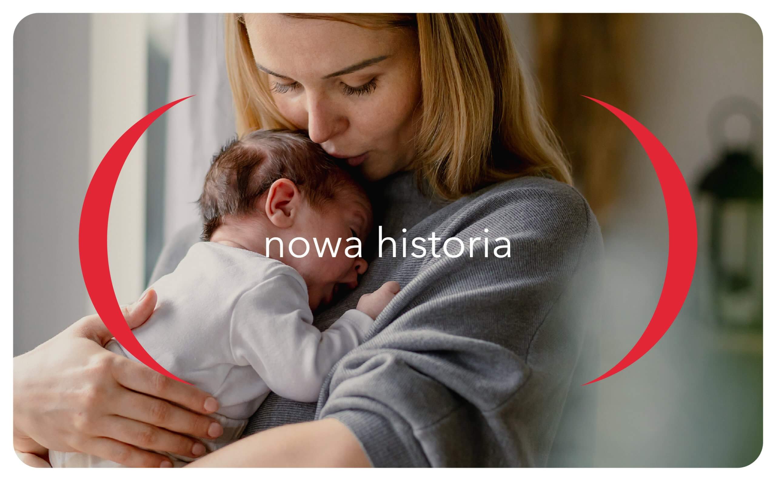
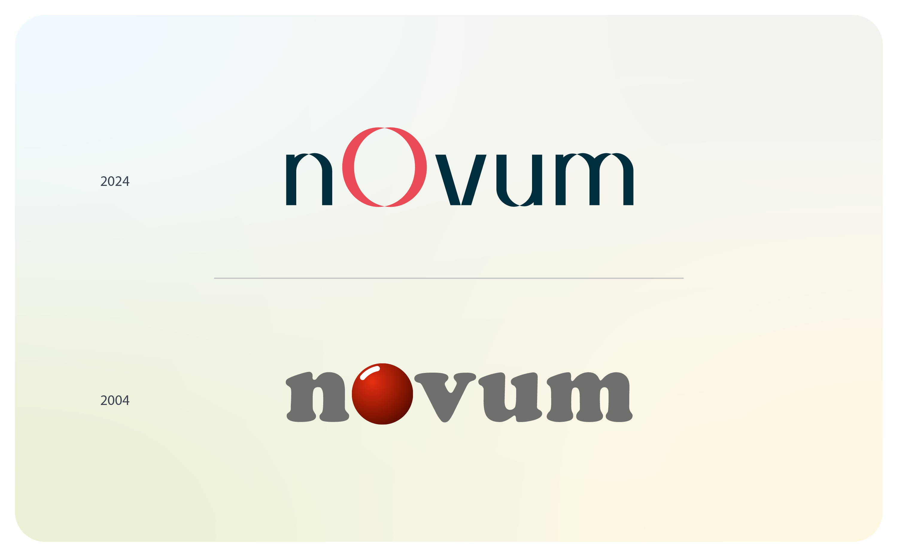
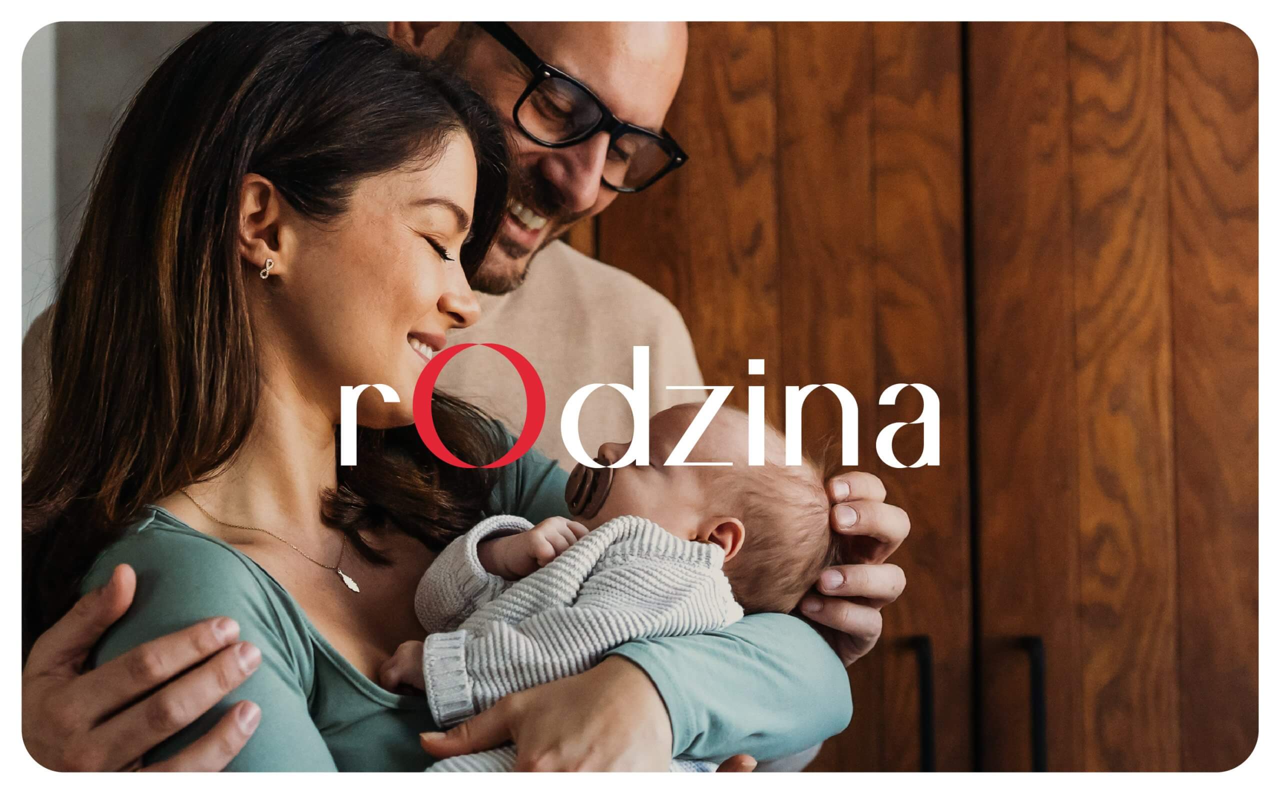
The nOvum logo represents the philosophy of the clinic, which combines professionalism and care. The shape and colors of the font build associations with modernity and innovation. The accentuated size and color of the letter “O” in the logotype draws the viewer’s attention, while at the same time alluding to the previous mark, thus emphasizing the continuity of the brand. The red letter “O” symbolizes a cell, which can be seen under a microscope and from which hope for happiness begins. The “O” shape can also be associated with enveloping arms, bringing care, peace and understanding.
Customized typography along with the distinctive accent on the letter “O” is the leitmotif of the new identification. The letter itself can also be read as the joined arms of a parenthesis, in which the most important thing is always found.
Meaning-rich, yet simple and functional, the system allows flexibility in shaping the image of the clinic in the next decade.