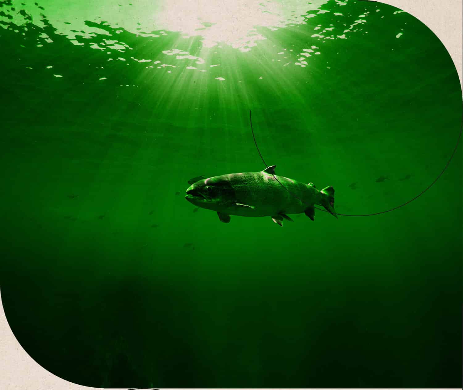
Here swims in a better fish. We made sure that it was presented proudly on the shelves in stores. Ecological, of course.
Quality and ecology usually go together. That’s why we’re very happy that we had the pleasure of co-creating Better Fish – a specialized brand in the category of certified products of aquaculture and fishing (fish and seafood). Better Fish products are made based on raw materials originating exclusively from BIO or MSC (Marine Stewardship Council) certified sources.
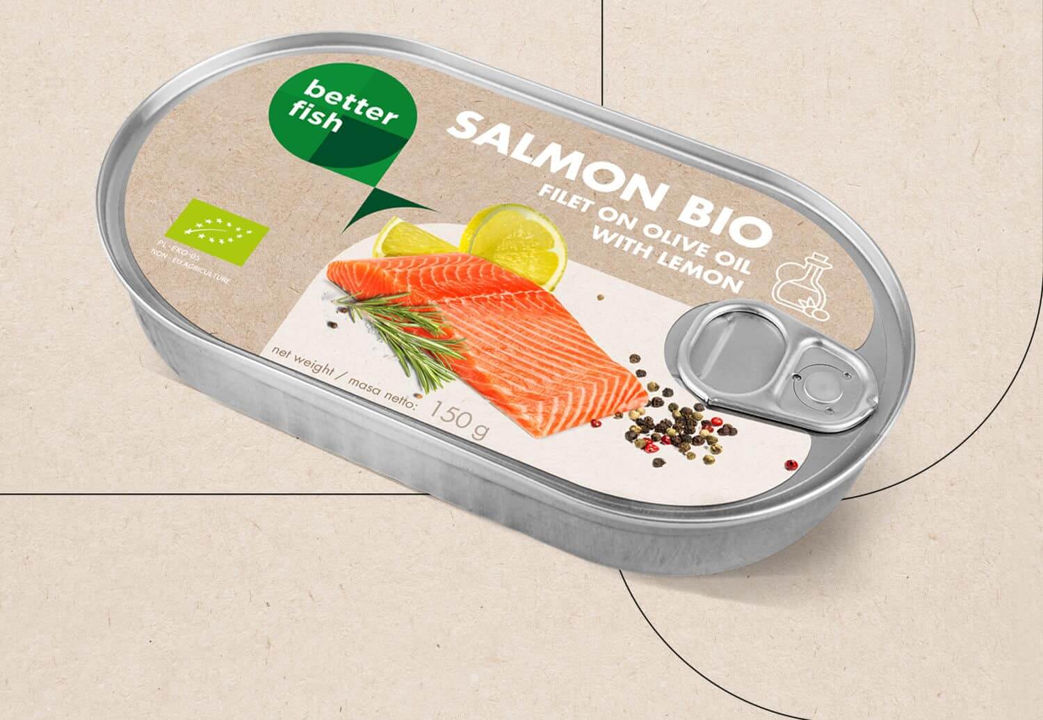
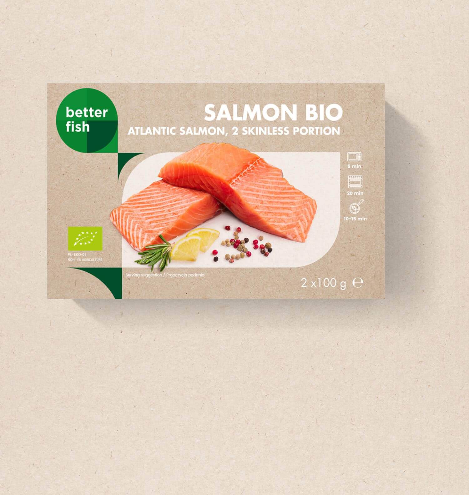
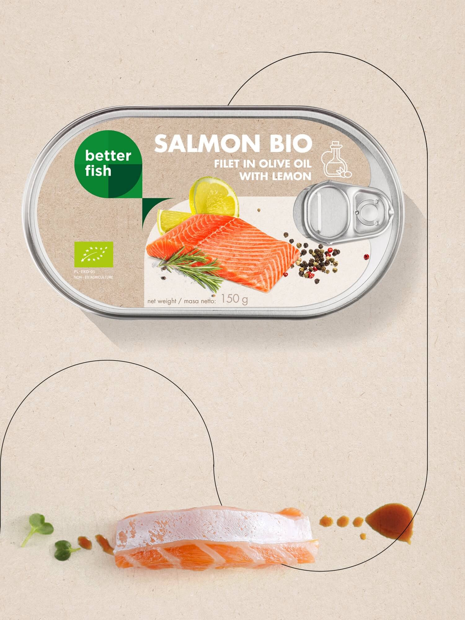
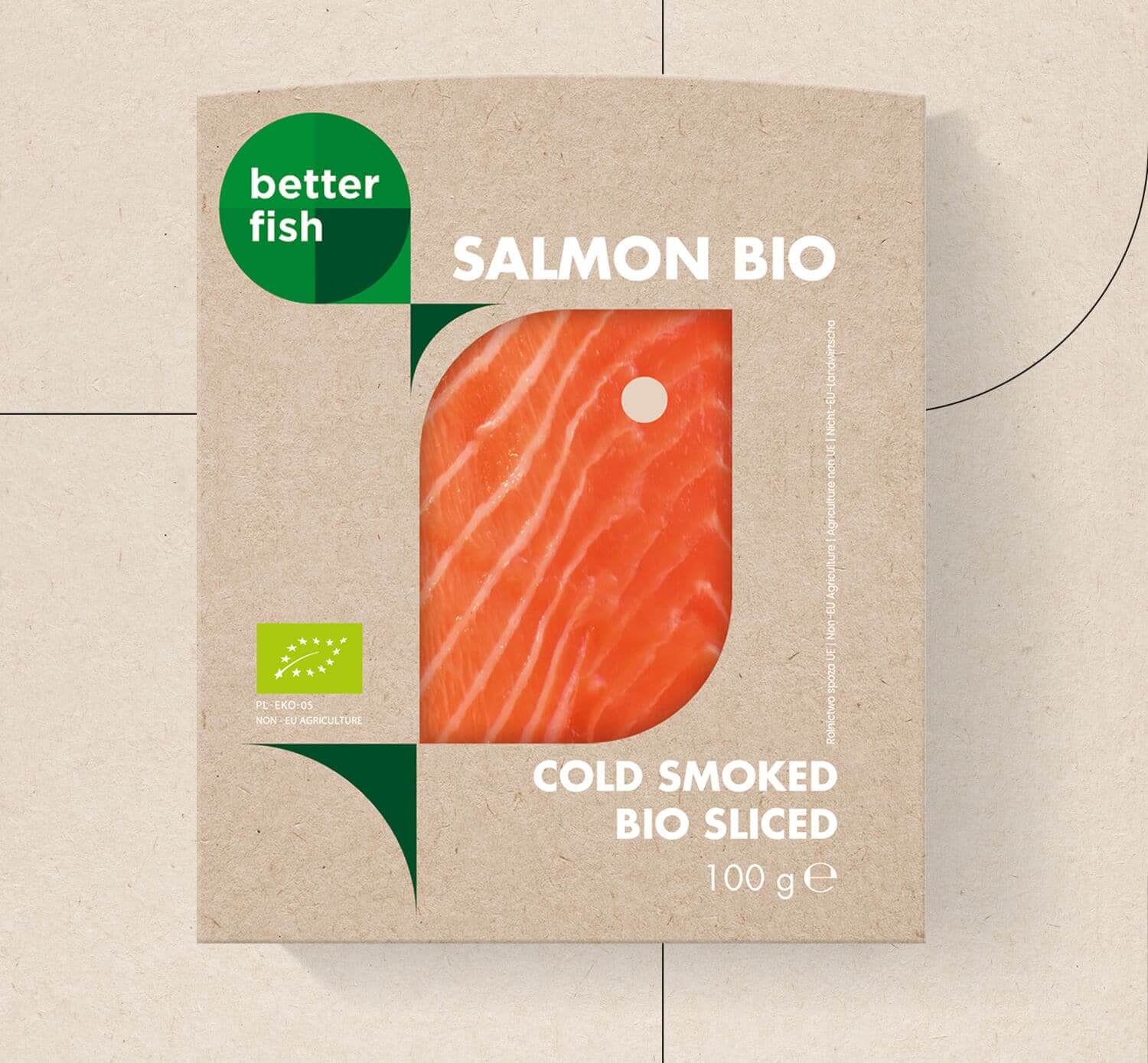
Our design team created the logo, a visual language describing the brand, and packaging for fresh, smoked, frozen and canned products. We have designed minimalistic packaging consistent in the area of the entire line – BIO and MSC/WILD, and we have proposed complementary colors to help tell apart the two categories.
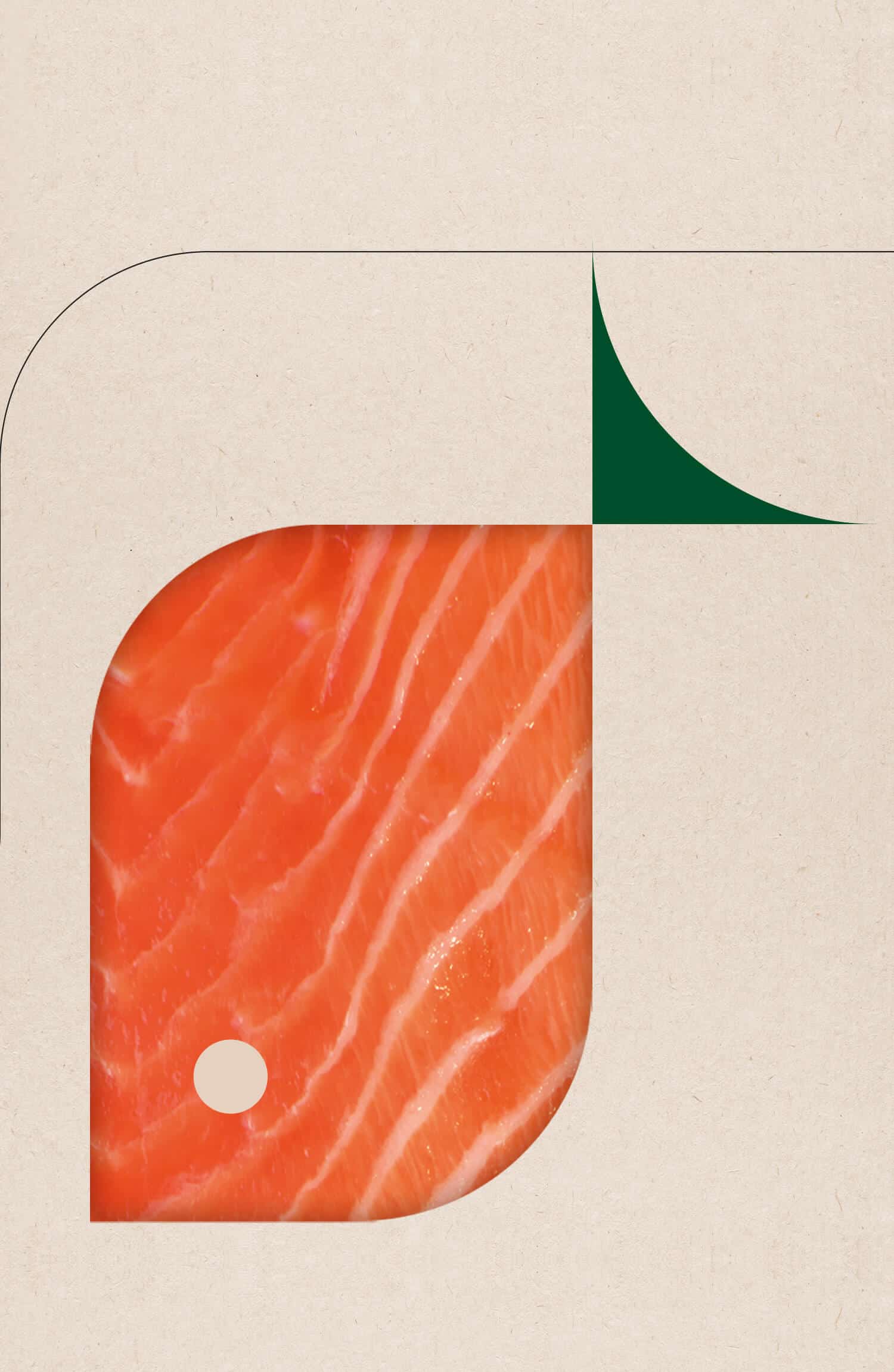
Additionally, to make the packaging more attractive, we created pack cutter guides in the product’s shape. Repeated in the bottom part of the packaging, they create a unique graphical theme while enforcing the customer’s perception by associating with the product. The shape of a fish is also visible in the logo. The sign is built from simple circle intersections, symboling perfection and harmony.
We liked the consistency with which the brand approached the entire process – not only are the products from certified, ecological sources but also the packaging material uses recycled resources. We acknowledged this aspect in the visual layer – graphics and colors perfectly complement the raw form of the ecological paper.
You can find Better Fish products in the best organic stores in Poland because, say what you will, we simply have better fish.
