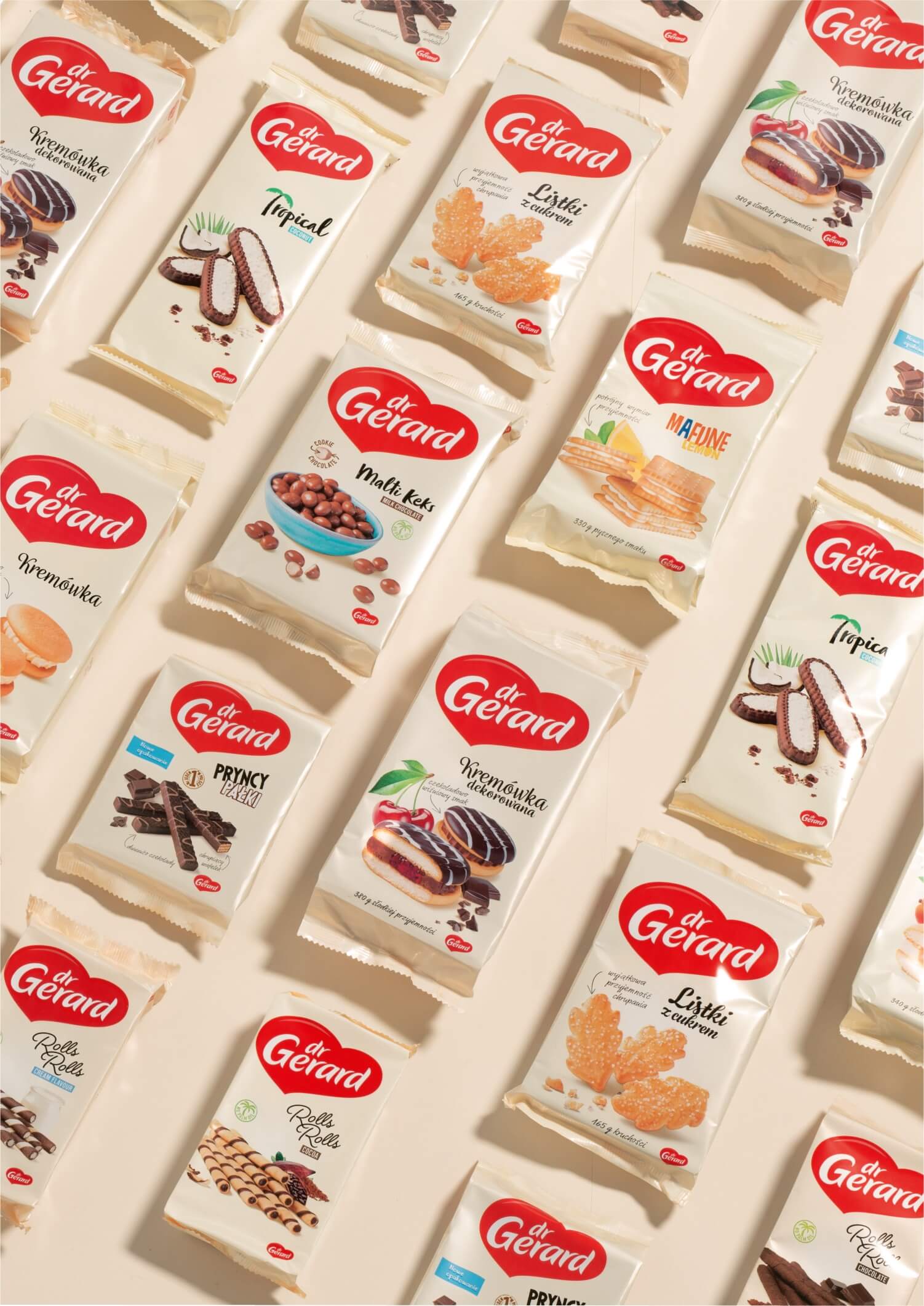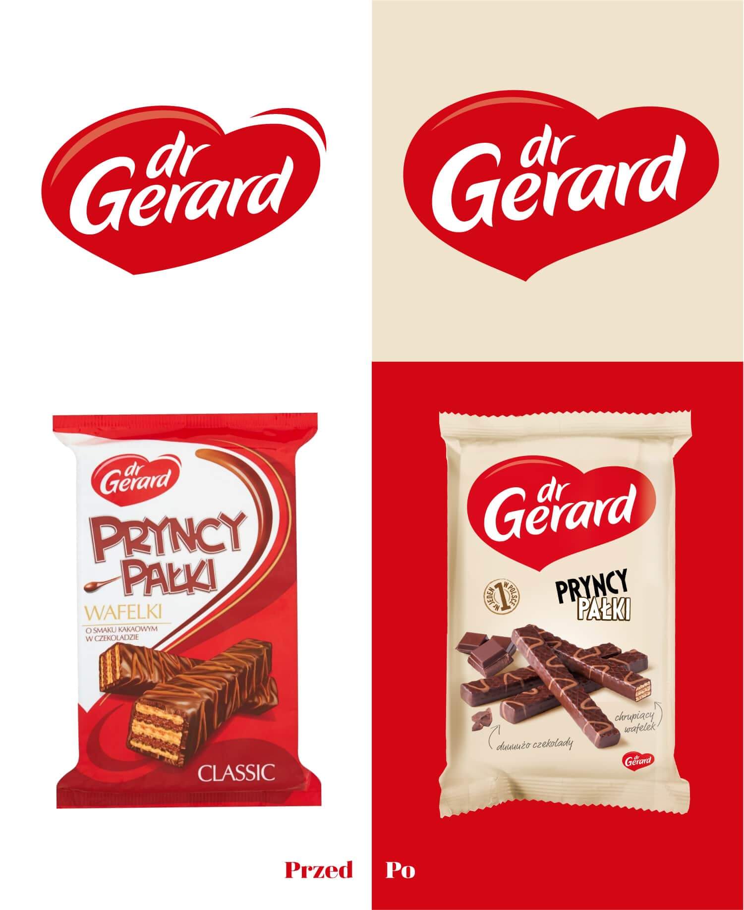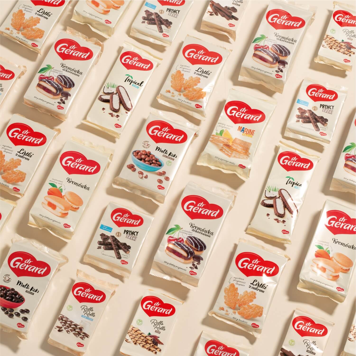
Let’s face it: we put our heart into this rebranding. Results? It fills our hearts with joy to see how well it looks on shelves.
It’s good to be successful on the market. And it’s even better to combine this success with building a strong brand. Dr Gerard company took such an approach. With future growth in mind, they decided to go for a spectacular rebranding.
When consumers describe a product only with rational benefits, it is time to take care of emotional image as well. Brand recognition and distinctiveness are also the features which one of the biggest confectionery companies in Poland surely deserves.
Czteryczwarte was challenged to develop a clear and consistent design strategy for an entire product range. Our core focus centered on building a strong umbrella brand with a distinctive, emotional image that increases perceived quality at the same time.
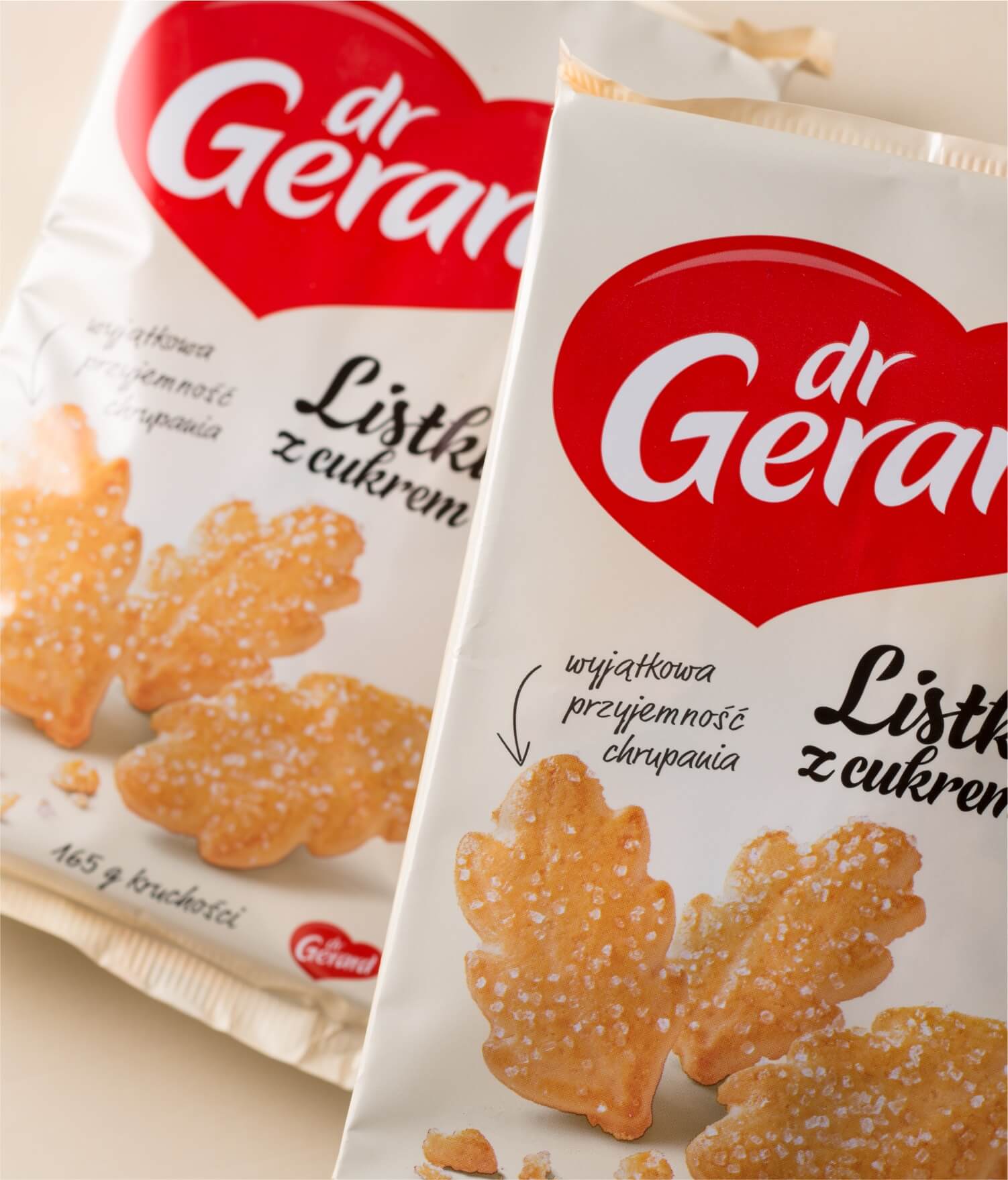
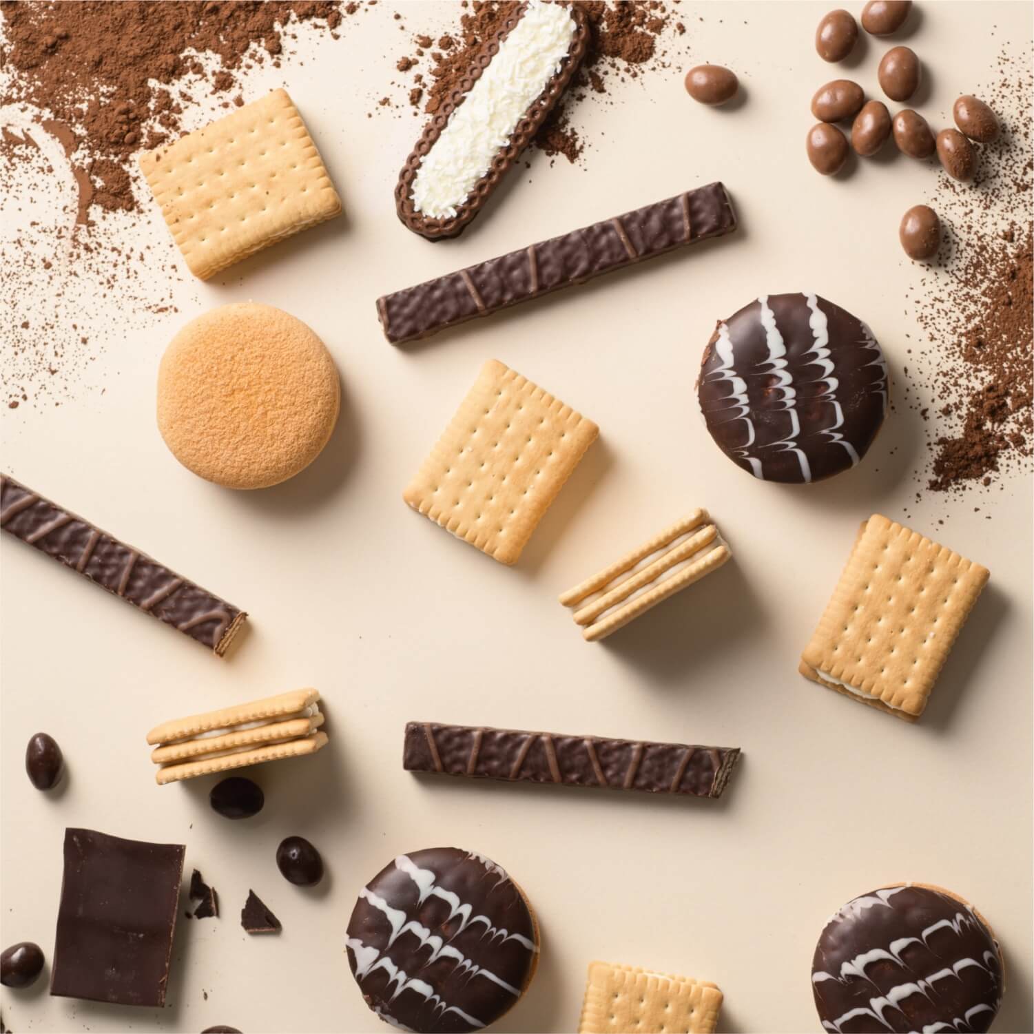
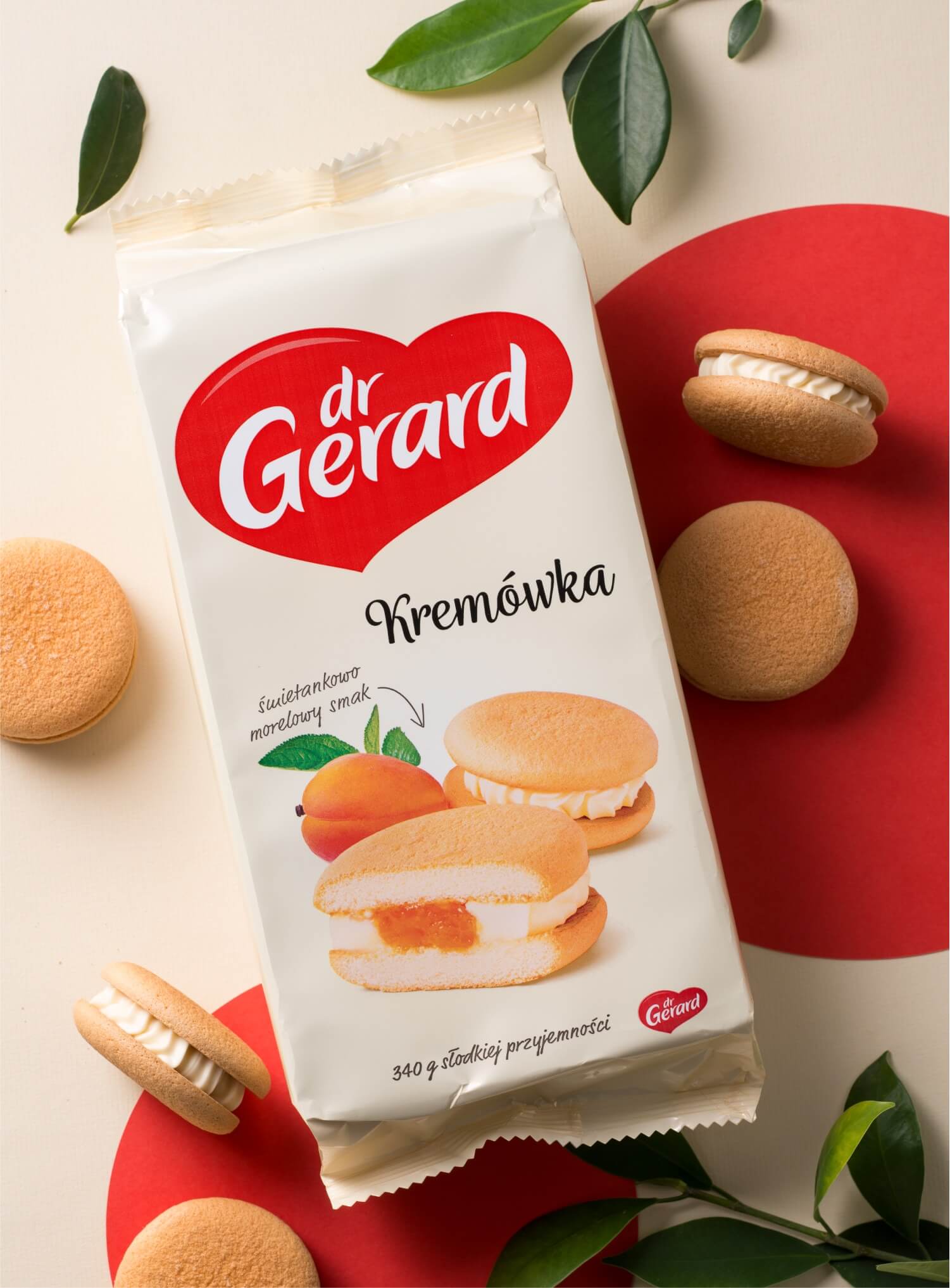
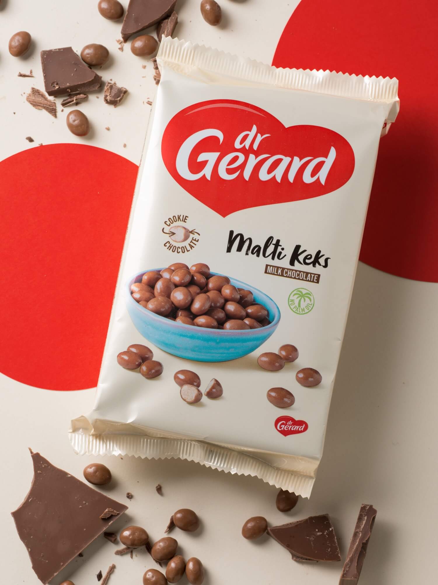
We kept it simple and came up with a design in which the brand and a cookie play two leading roles. Evocative, indulgent pictures show the final product in a natural way, which reflects the brand values dr Gerard holds dear. To draw customers’ attention to each cookie variety, we use different fonts visually related to the products’ characteristics.
A big, heart-shaped logo serves as the layout’s focal point. It builds a strong umbrella brand, all while suggesting that dr Gerard is an offer for people who appreciate authenticity, pleasure and spontaneity. For those who follow their heart when they reach for cookies…
