Time means change? For us, change means rebranding: making time work in favor of the brand.
Time Trend, a network of stores within the Zibi Group, is a renowned distributor of watch brands such as Atlantic, Casio, G-Shock, and Bulova.
Market research conducted by the client inspired a redefinition of positioning, focusing on masculine camaraderie, the joy of sharing time, and the freedom to express oneself.
When the decision for rebranding was made, we developed a refreshed identity that reflects the brand’s new vision and serves as the foundation for its communication strategy.
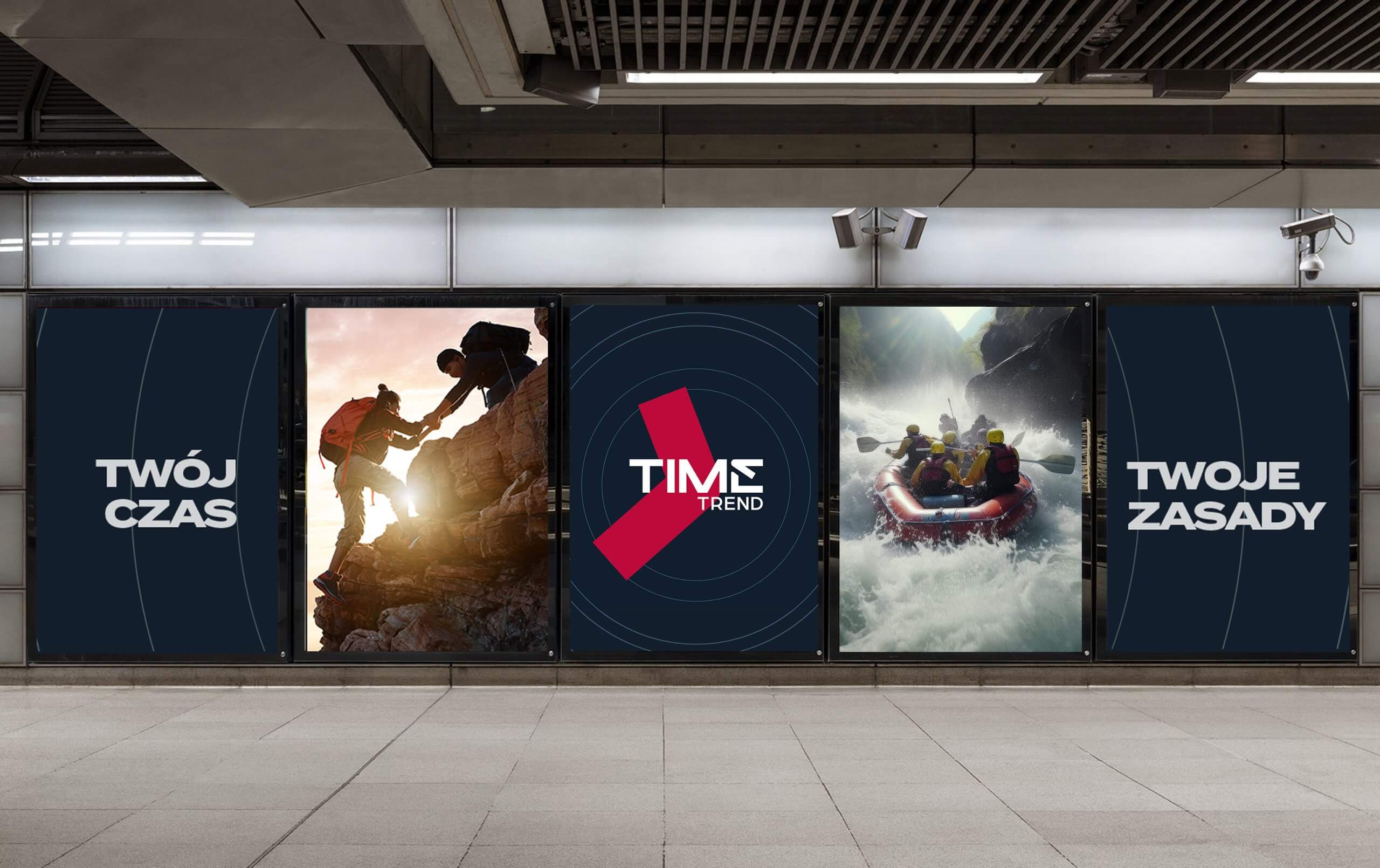
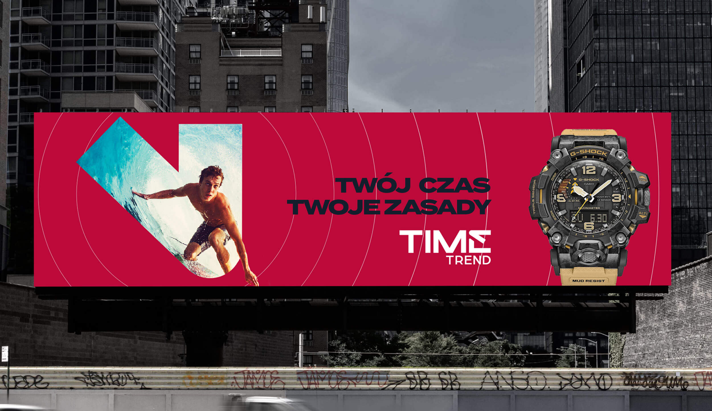
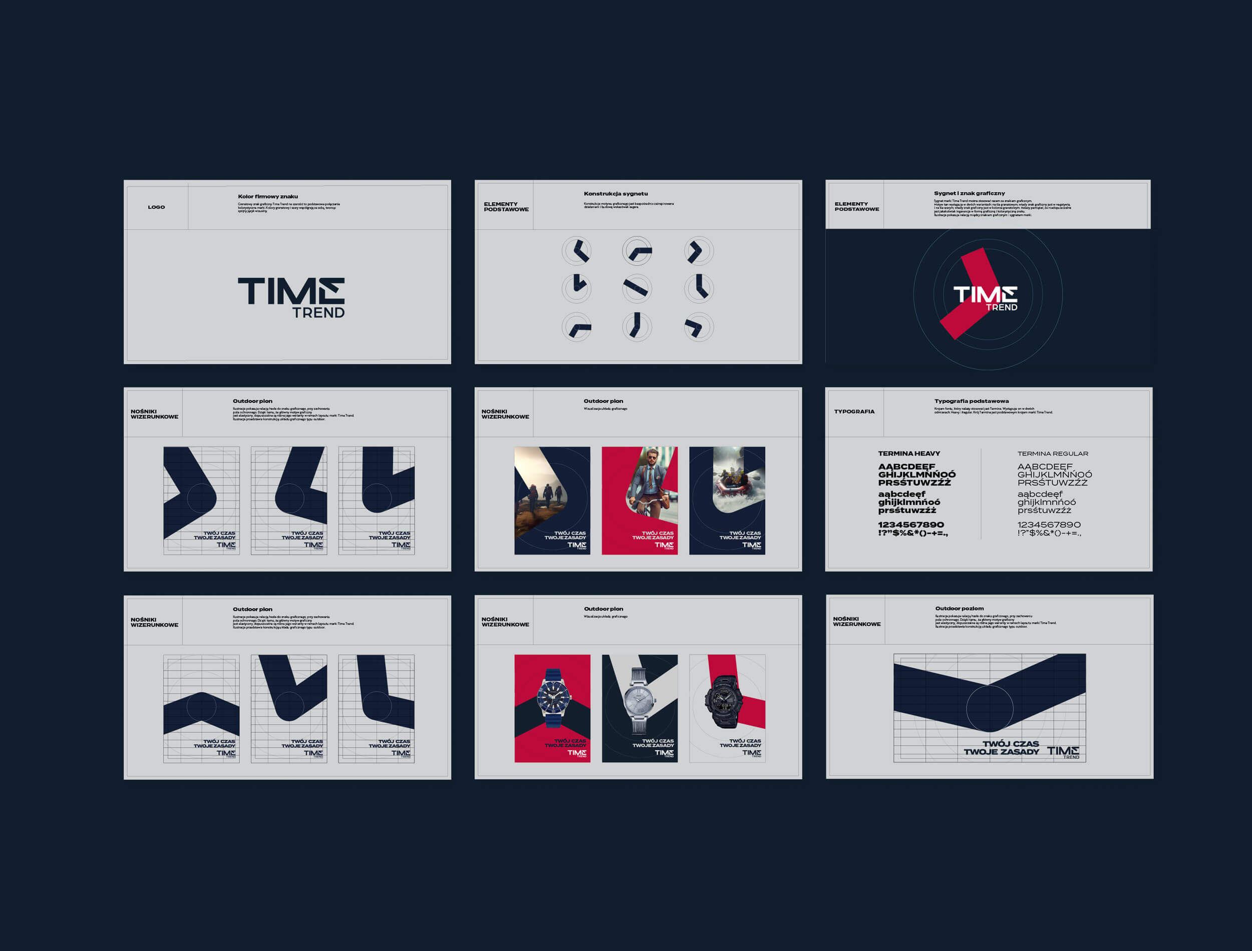
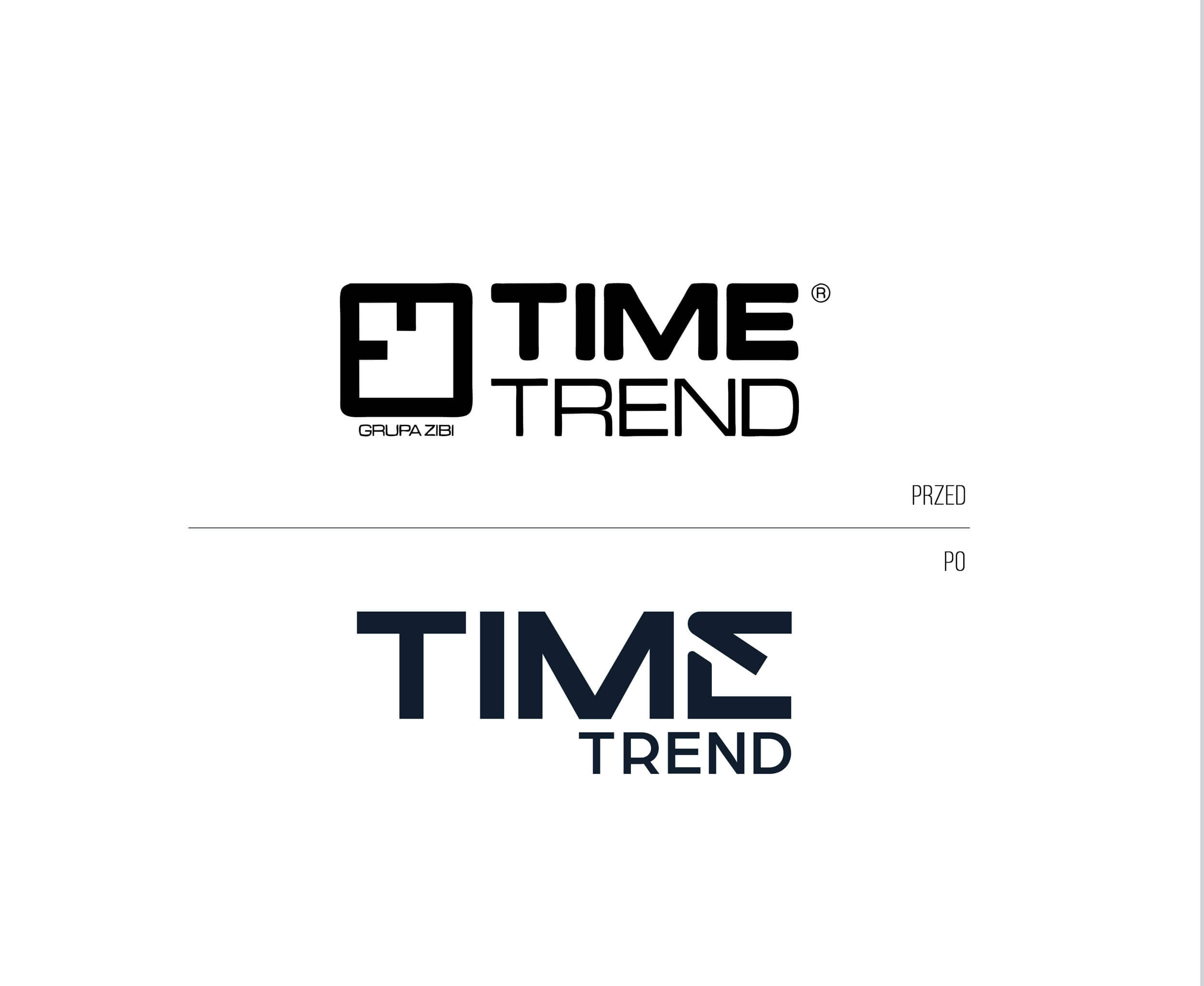
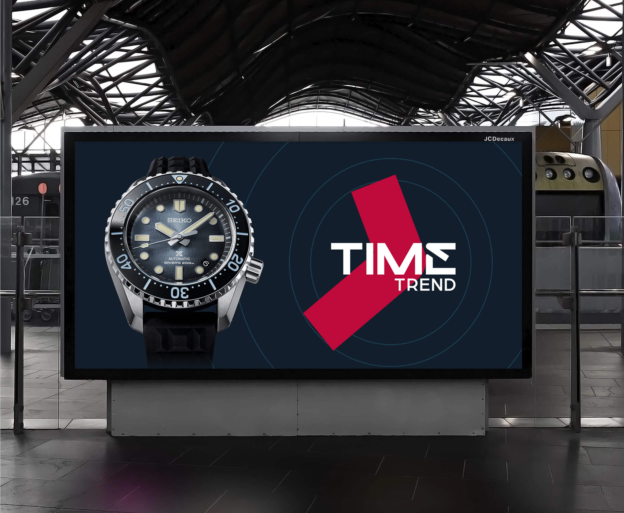
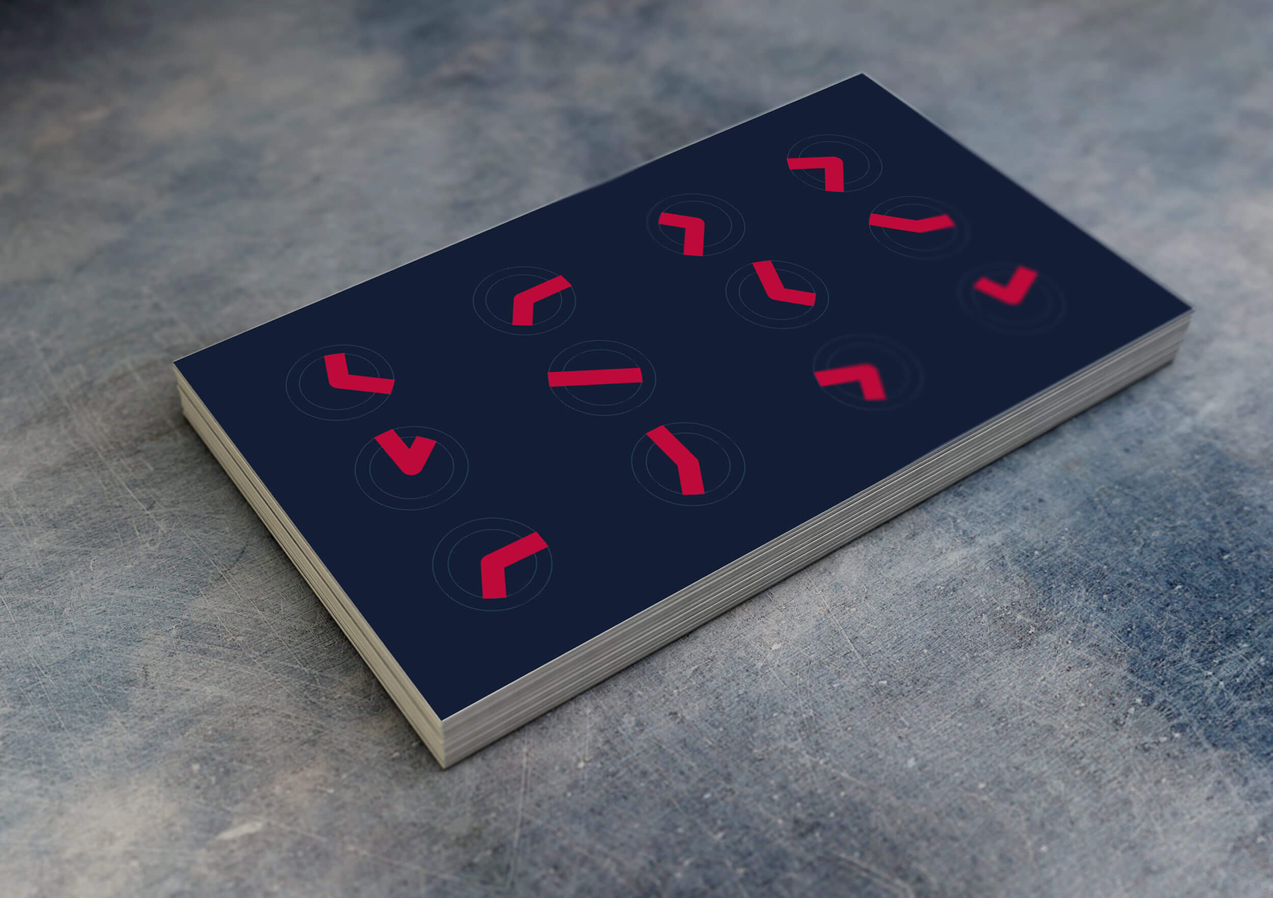
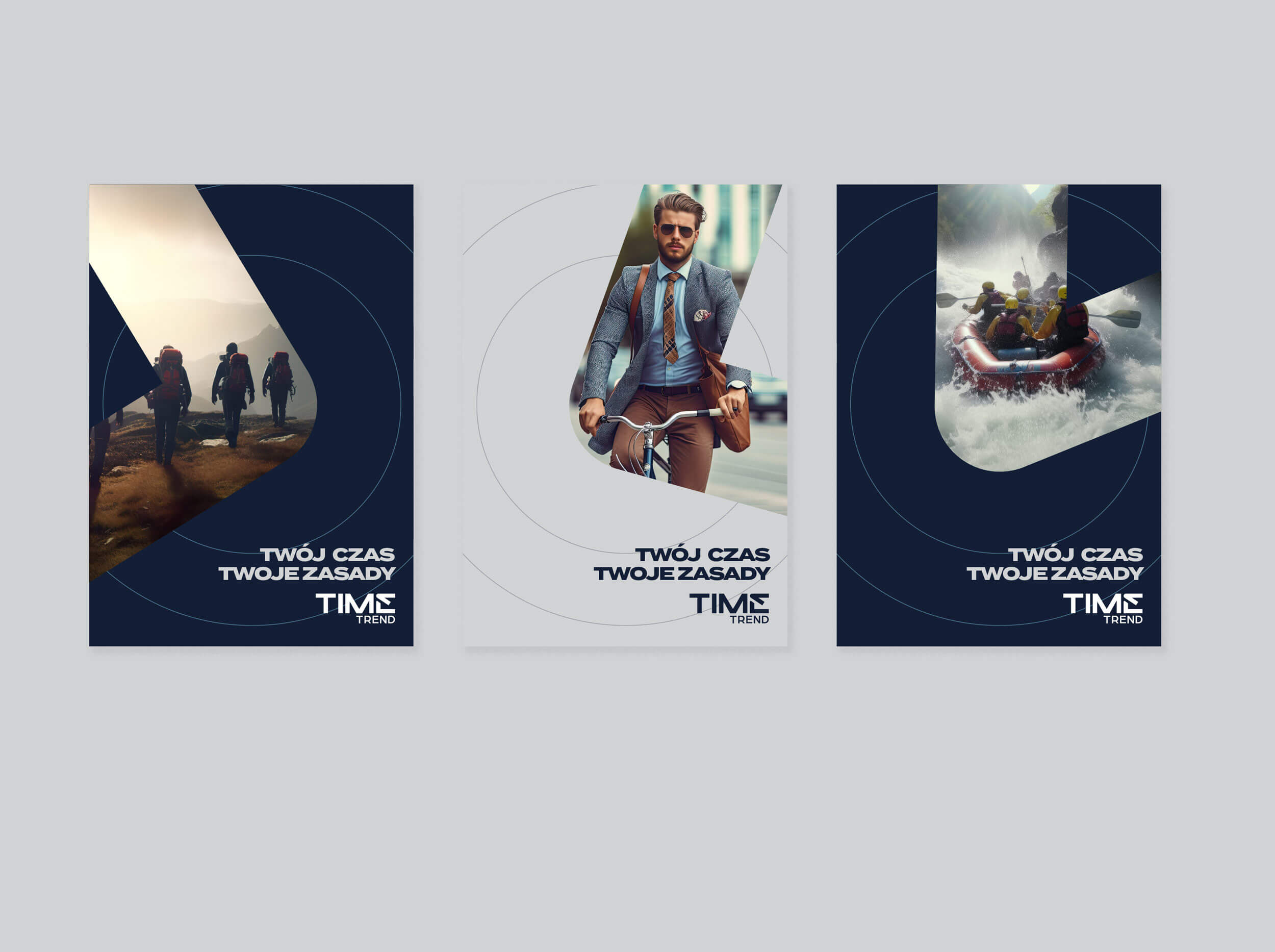
In creating the new visual language, we focused primarily on modifying the Time Trend logo. We simplified the design by removing the emblem. The letter “E” was enhanced with a distinctive graphic element inspired by a clock hand, symbolizing the concept of time. This motif is used throughout the identity, with its variations allowing for the creation of different brand assets.
We also updated the color palette, which had become outdated in relation to the brand, its target audience, and current trends. Instead of the previous pink, we introduced a deep navy blue as the dominant color, complemented by vibrant red accents. This color combination brings elegance and adds energy to the brand.
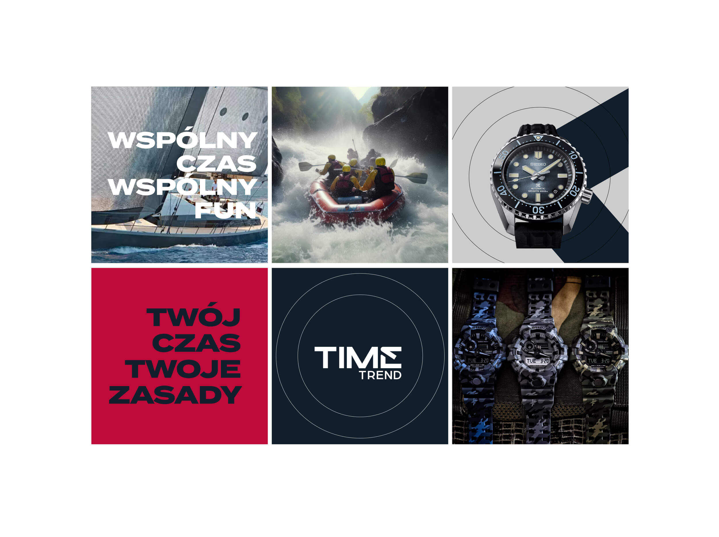
The new visual language is also reflected in the choice of photography, which plays a key role in the communication. The imagery we proposed takes viewers on a journey through a masculine world – from the realm of sports passions to the world of business. In this context, every moment is unique, and Time Trend becomes a symbol of freedom and style.
Our rebranding effort also includes redesigning the appearance of company stores and the brand’s websites.
