While working for Mieszko S.A., we proved that a visual identity system can be like a box of chocolates that skillfully blends different flavors. Why this comparison? Because visual identity must also reflect many diverse values. And we transform those values into solutions that build the desired brand image.
Mieszko S.A. is not only a renowned confectionery manufacturer but also an excellent business partner that is growing dynamically. Our task was to develop a cohesive and strategically planned visual identity specifically for the B2B area. The goal of the project was to strengthen Mieszko’s image as a reliable partner and employer offering stability, growth, and long-term prospects.
In B2B communication, the brand’s key attributes – taste and pleasure – had to be part of the story. We also wanted the proposed solutions to convey the company’s long-standing tradition, as well as its experience and innovation, which translate into both product quality and strong business relationships.
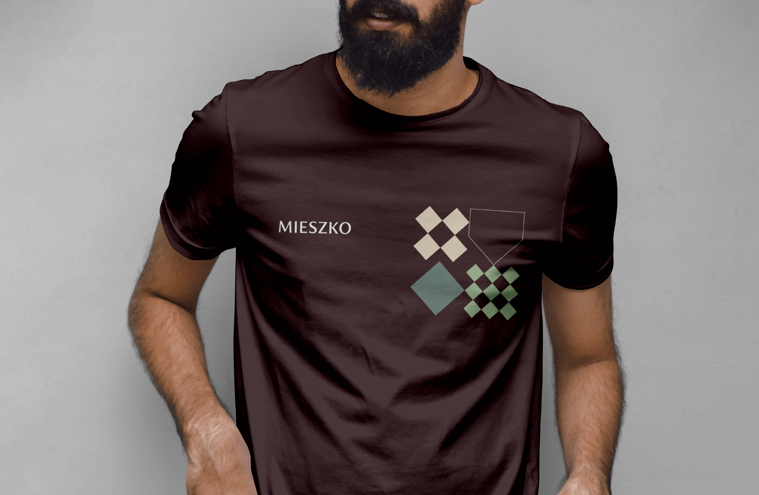
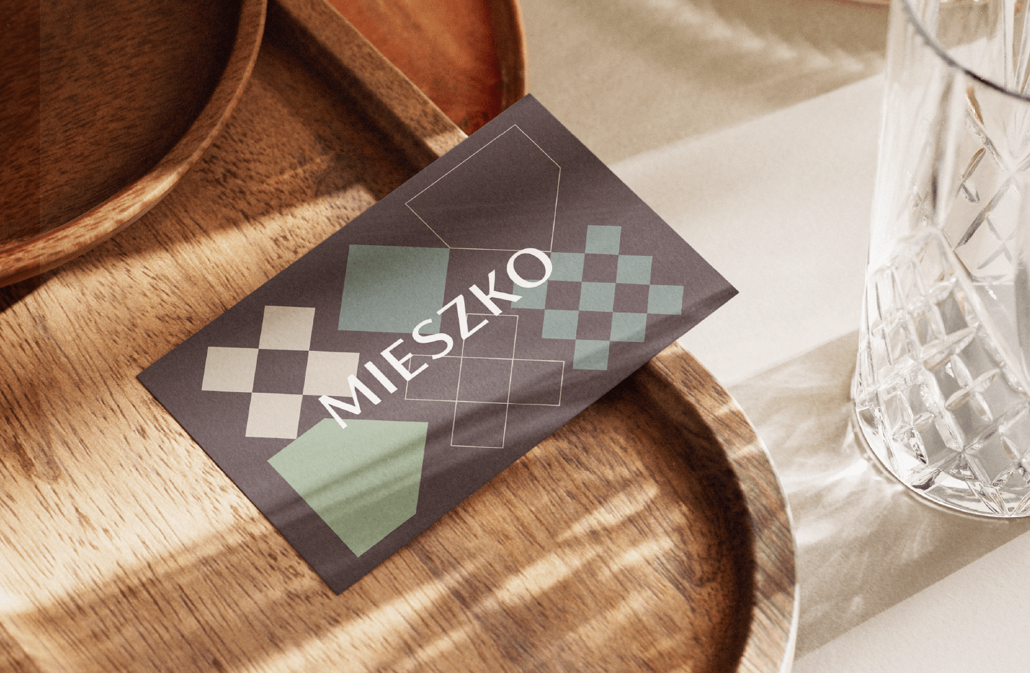
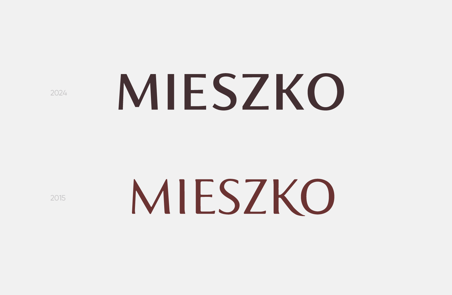
One of the steps we took to emphasize the brand’s professionalism was the subtle revitalization of the logo, in which we reinforced the typography.
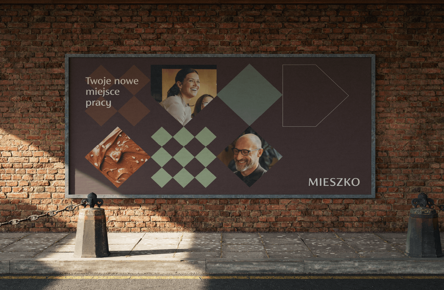
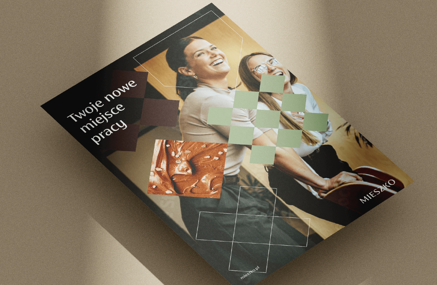
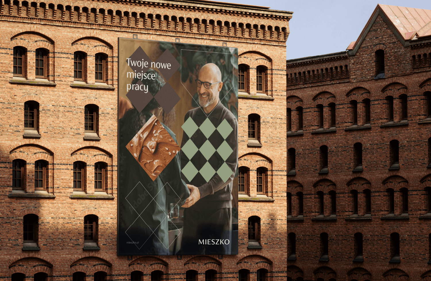
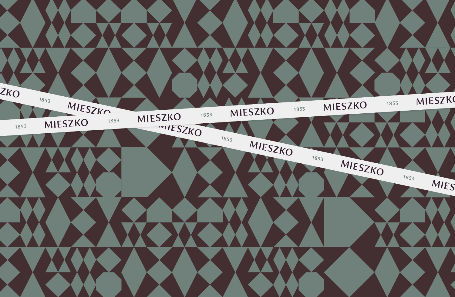
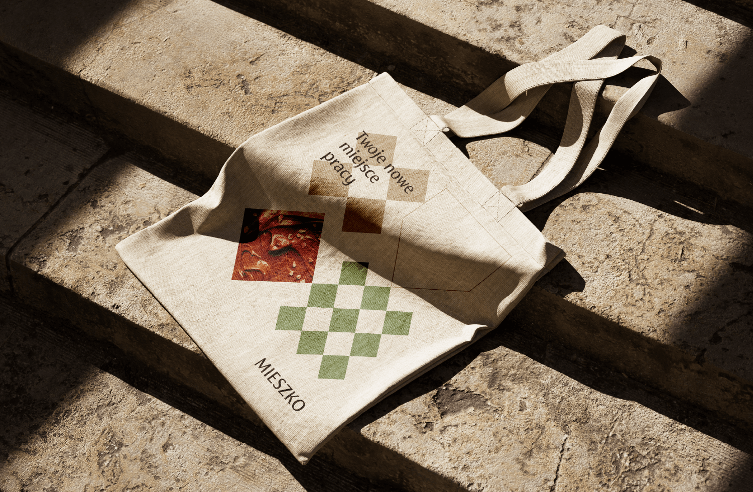
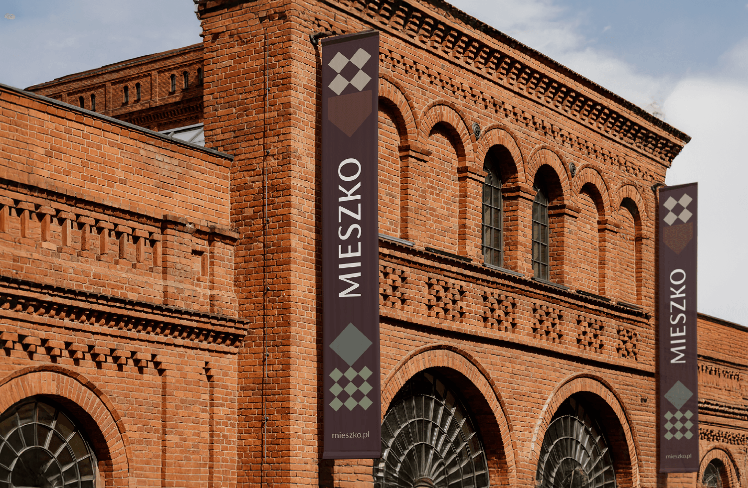
We also created an updated visual language based on geometric forms inspired by the aesthetics of chocolate box packaging. This approach refers directly to the nature of the business while evoking associations with craftsmanship and attention to detail.
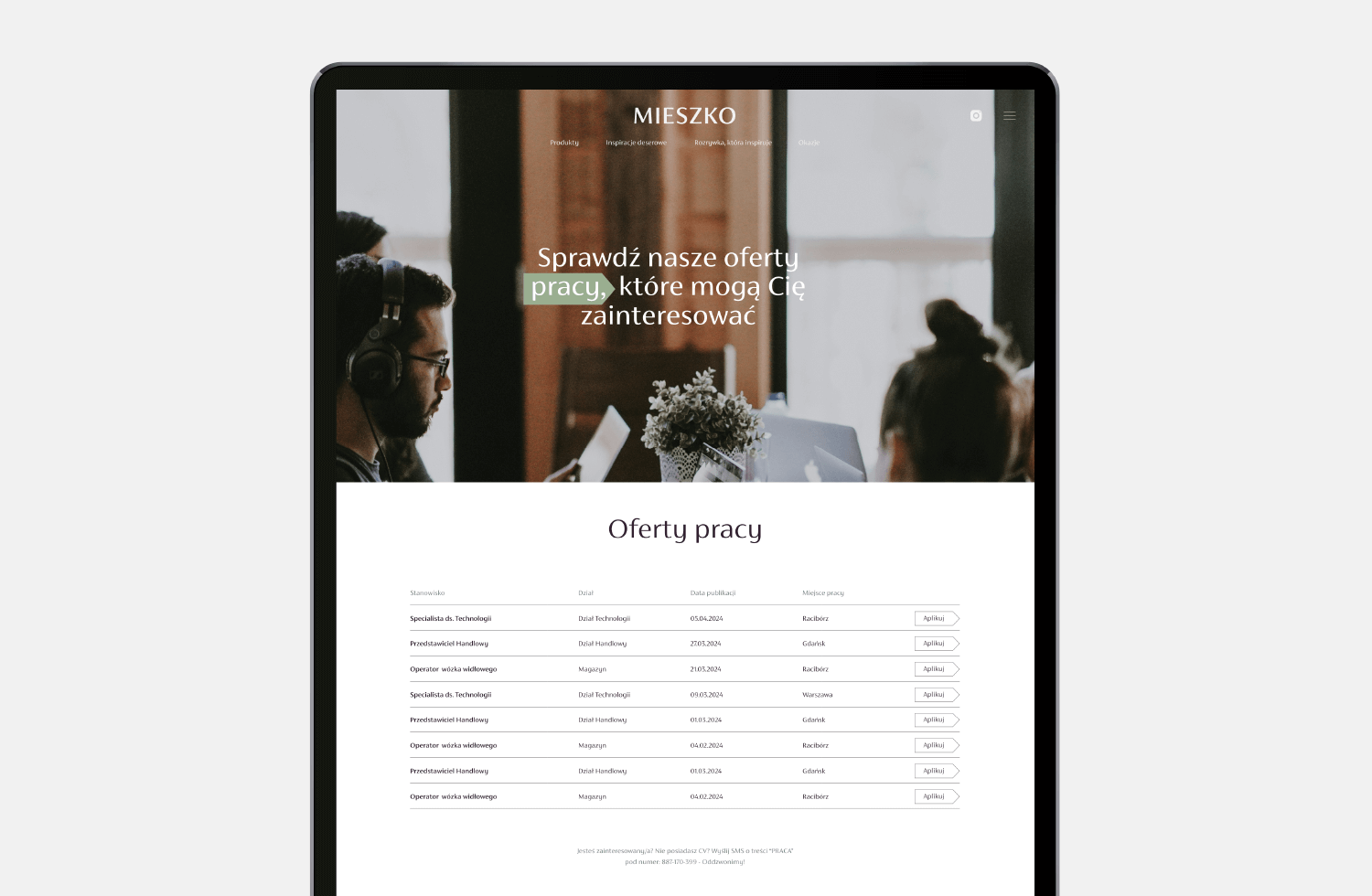
These dedicated graphic forms serve as a key visual motif used in brand identification and product presentations. The various patterns and geometric shapes can be complemented with photos, slogans, and copy, while additional elements support navigation or microanimations.
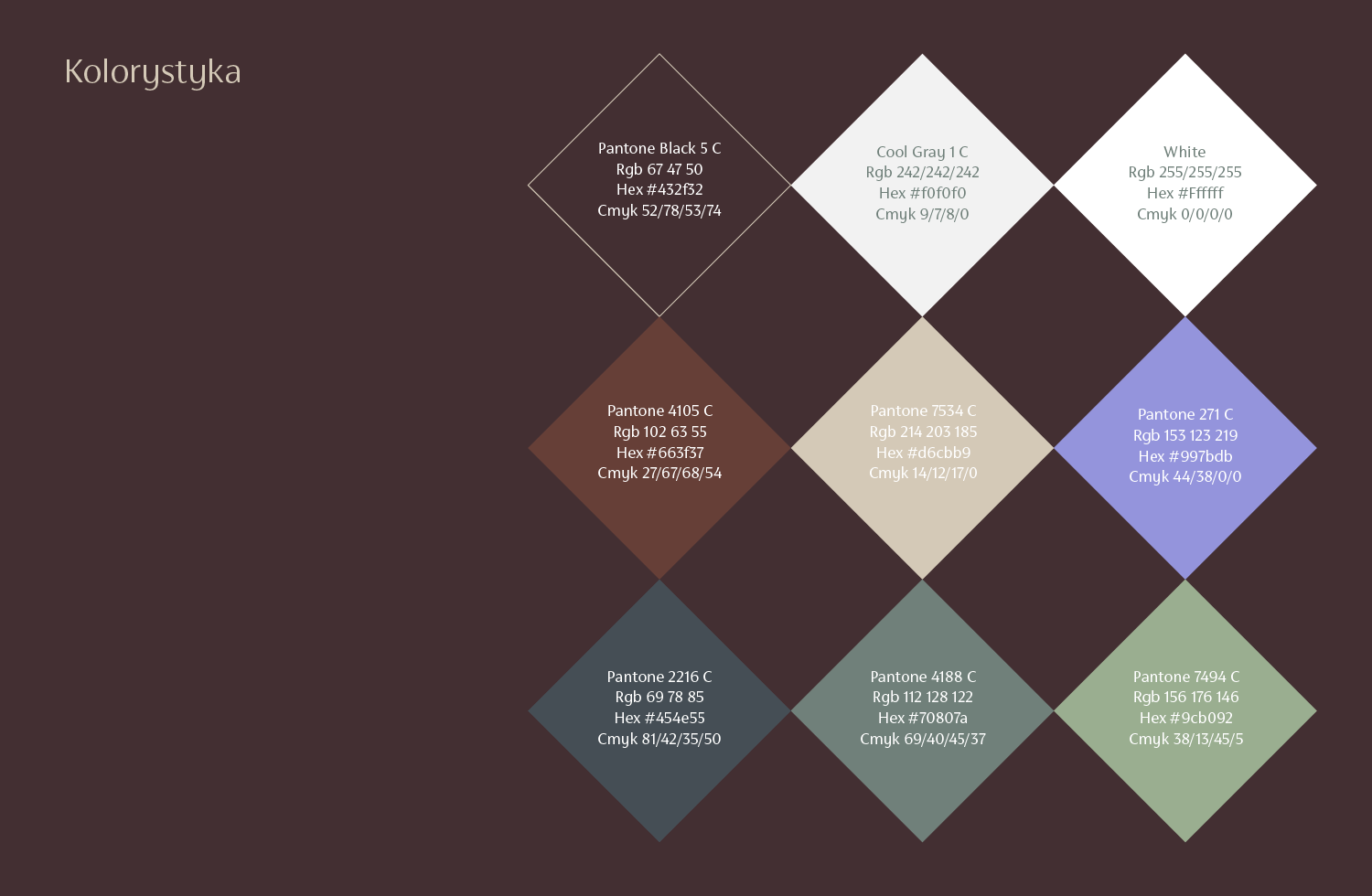
We paid particular attention to color selection – opting for subdued elegance that harmonizes with the tones of delicious sweets. Altogether, the system creates a striking yet professional brand image.
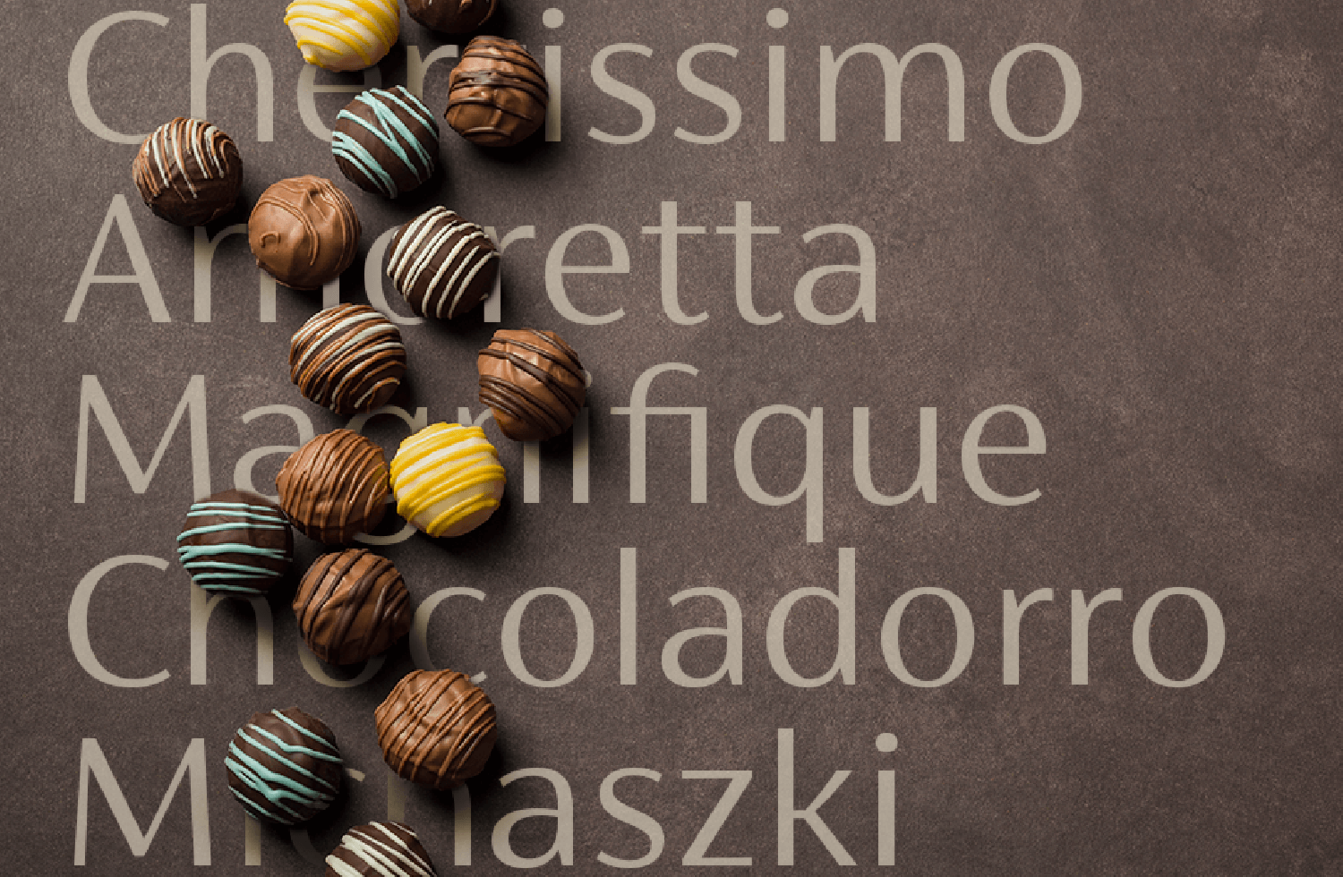
The practical application of the developed principles is illustrated, among other elements, by the key visual, which combines appetizing product photography with images of people in various situations.
The entire visual identity system was designed to be easily adaptable across different formats, media, and especially social media content. It is functional and fulfills its purpose – helping the Mieszko brand strengthen its position in the B2B market. It shows that the company is a dynamically growing international corporation that nevertheless retains the image of a close, trusted partner – both a neighbor and a friend.