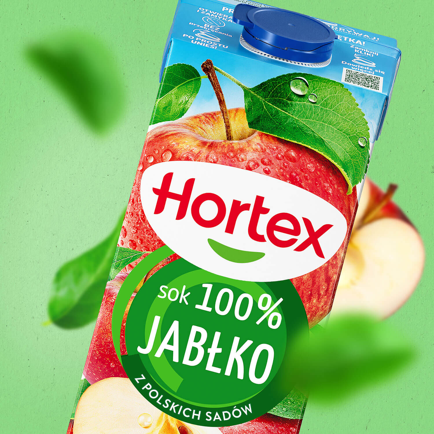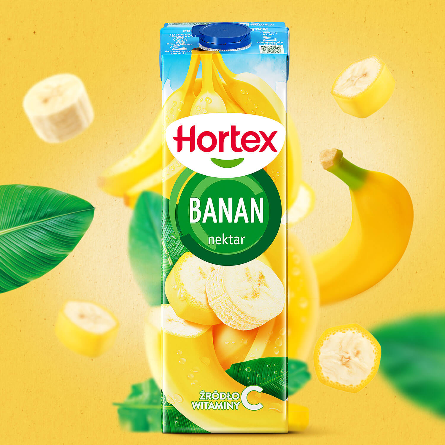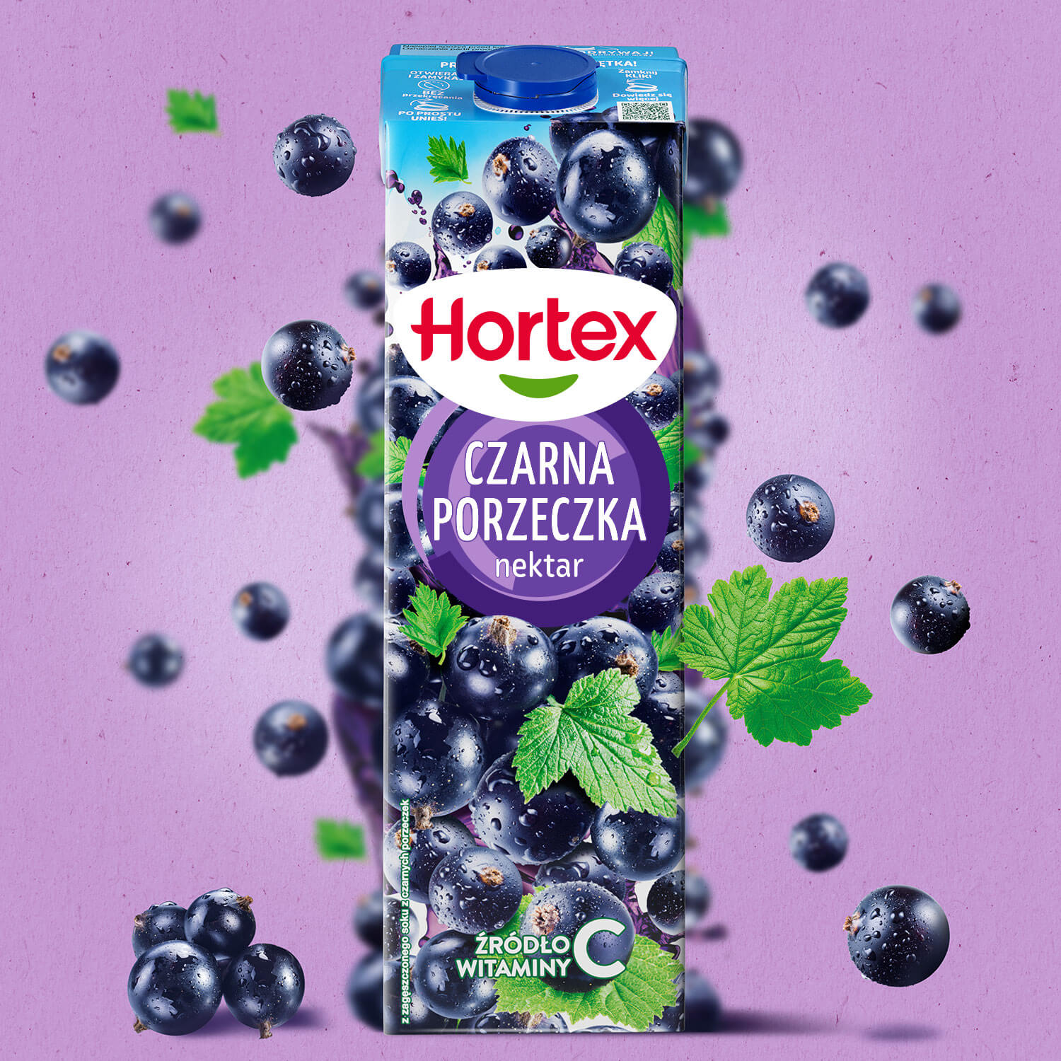
In the world of Hortex juices and nectars, everything naturally revolves around fruit and its flavor. We made sure it spins even more...
Hortex is one of the best-known food brands in Poland. In opting for a redesign, the brand aimed to strengthen its position in the juice and nectar category.
The changes were intended to shift the brand’s perception: to attract a younger target group and emphasize product quality, but without creating a sense of distance.
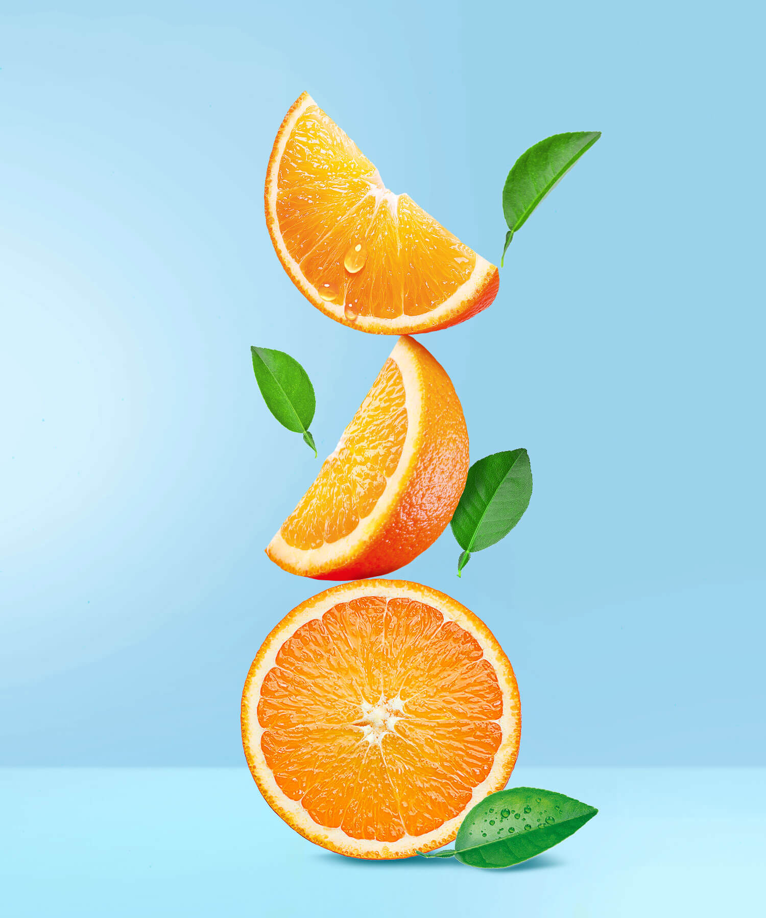
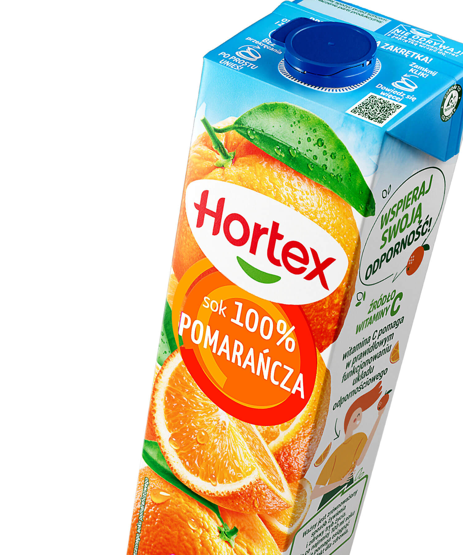
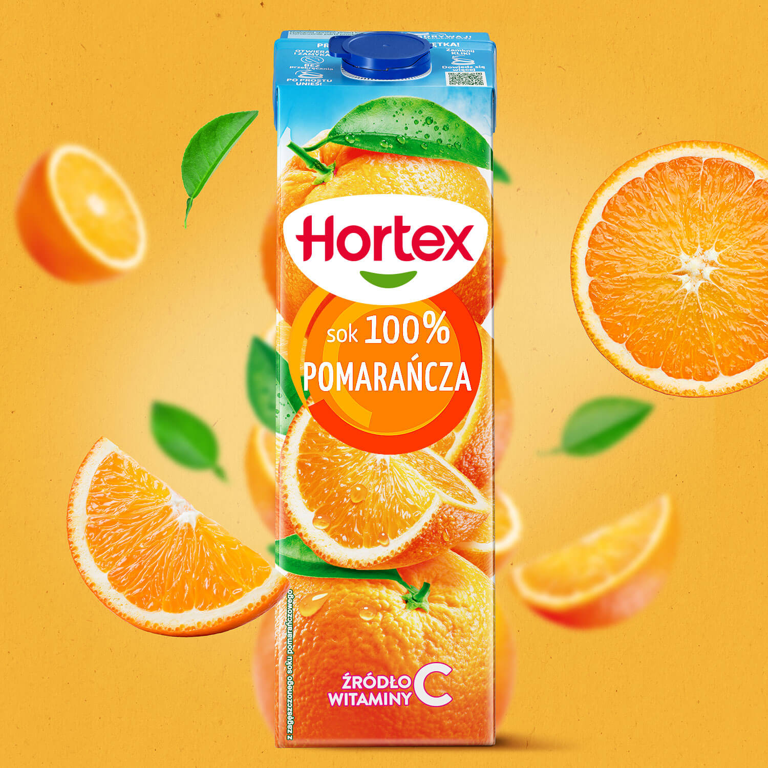
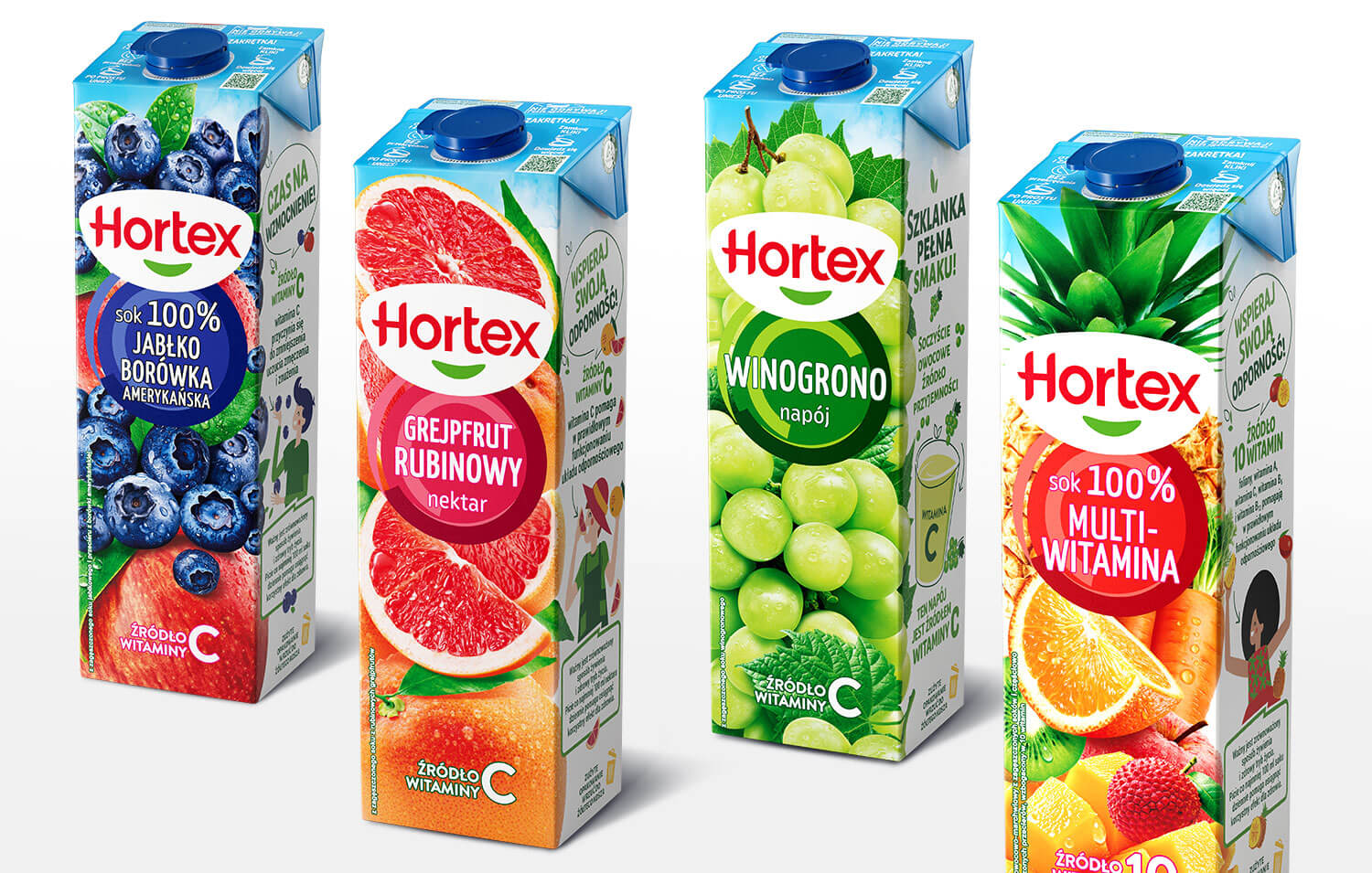
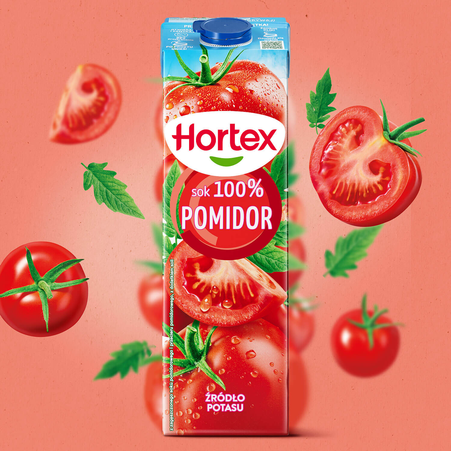
Juices and nectars are a category deeply rooted in the world of nature, which, in the context of this project, involves the need to showcase fruit. And of course, we do just that in our solution – presenting it as juicy, appetizing, more natural, and flavorful… Yet we go even further: we squeeze the fruit into a glass and transform the result into a bold graphic motif.
The concept is built around a single, centrally placed visual element showing a top-down view of a glass of juice. The shape of the motif also evokes the fullness of nature and flavor.
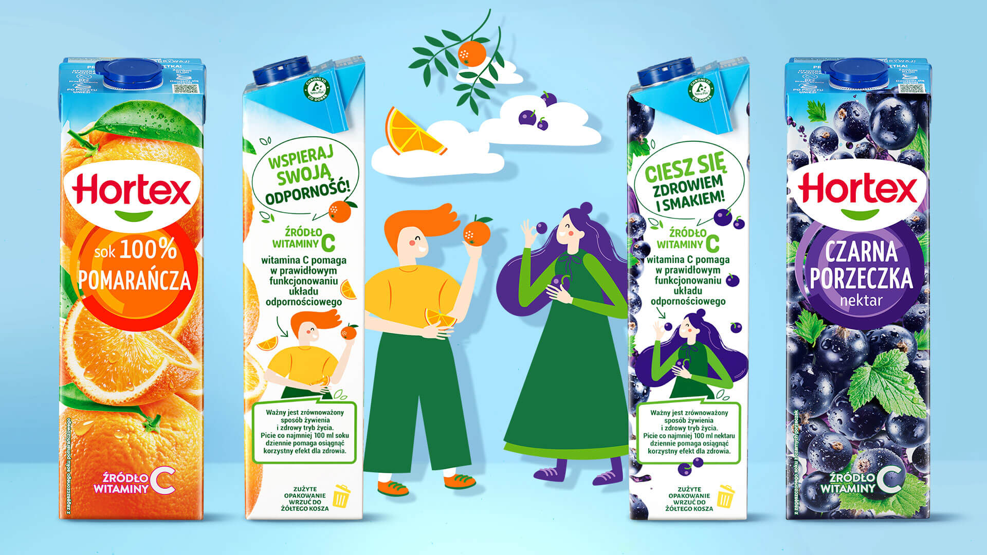
Consumers choose juices and nectars not only for their taste but also for their vitamins and health benefits. To highlight this, we also utilized the side panel, which in our design takes on an important brand-building role. On the sides of selected packages, colorful, joyful characters interacting with fruit appear, assigned to different variants. Thanks to the illustration style, the entire design gains a light, lifestyle-oriented character.