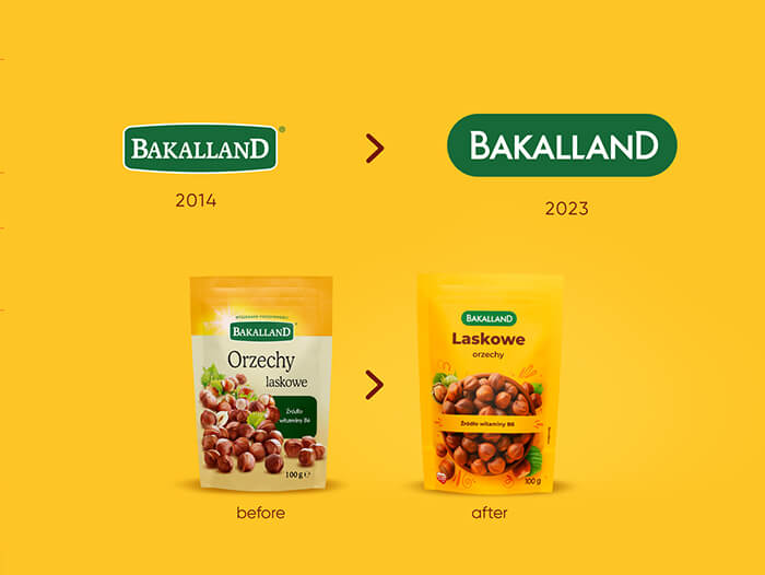
How to create a fresh, distinctive design, and at the same time maintain the brand's DNA? When working on Bakalland's new visual identity, we opted for an impactful rebranding, in which the reinforcement of color codes and a distinctive graphic theme play an important role.
In the Polish market for dried fruit, nuts & seeds, dominated by private labels, Bakalland maintained its leading position among producer brands. To strengthen it, it decided to join the trend of conscious eating and shift towards natural and tasty snacks. Our task was a redesign that would emphasize the new positioning and modernize the brand, while maintaining its visual assets.
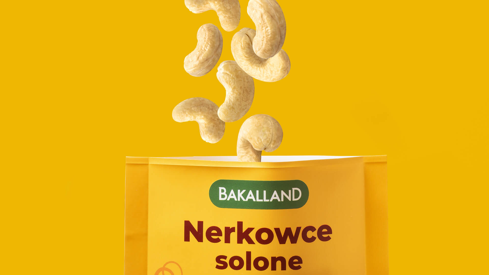
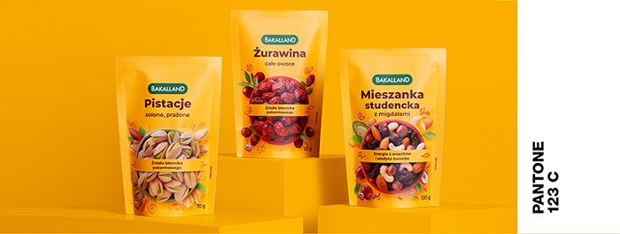
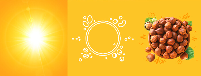
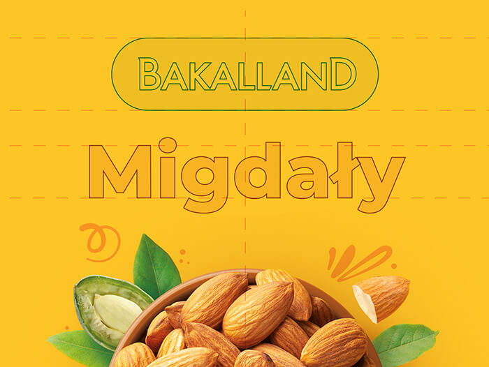
We decided on a revised branding: we replaced the pastel yellows with a crisp yellow color, and gave the logotype a facelift, with the single-element, well-drawn typography that added a contemporary touch to the brand.
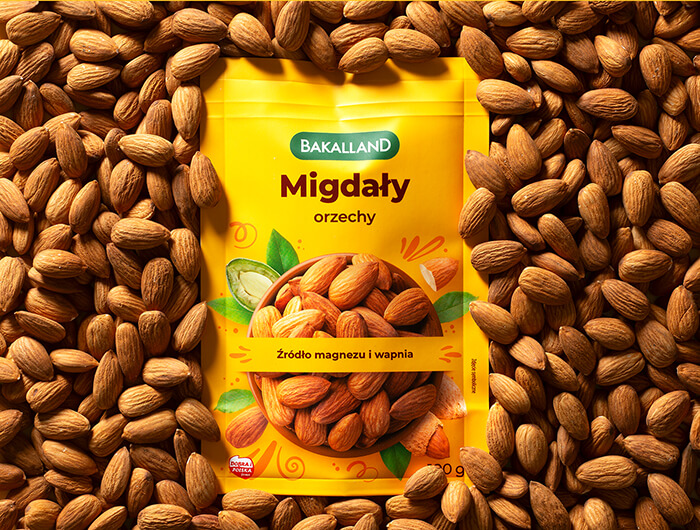
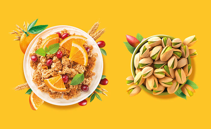
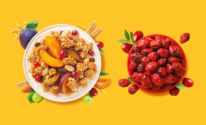
When showing the dried fruit, nuts & seeds, we opted for a simple and appetizing shot from above. By placing them in a bowl, we emphasize the snackable nature of the product. A distinctive element is also the division of the visual in half with a message about the most important benefit.
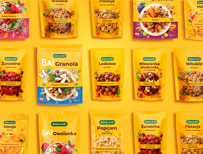
The packaging we designed creates a strong and clear spot on the shelf, realizes the brand’s strategy and fits in with current trends.
We applied the new design to nearly100 packages in a very short time, which required efficient organization of the work of our team: project managers, designers, photo studio and dtp department.
