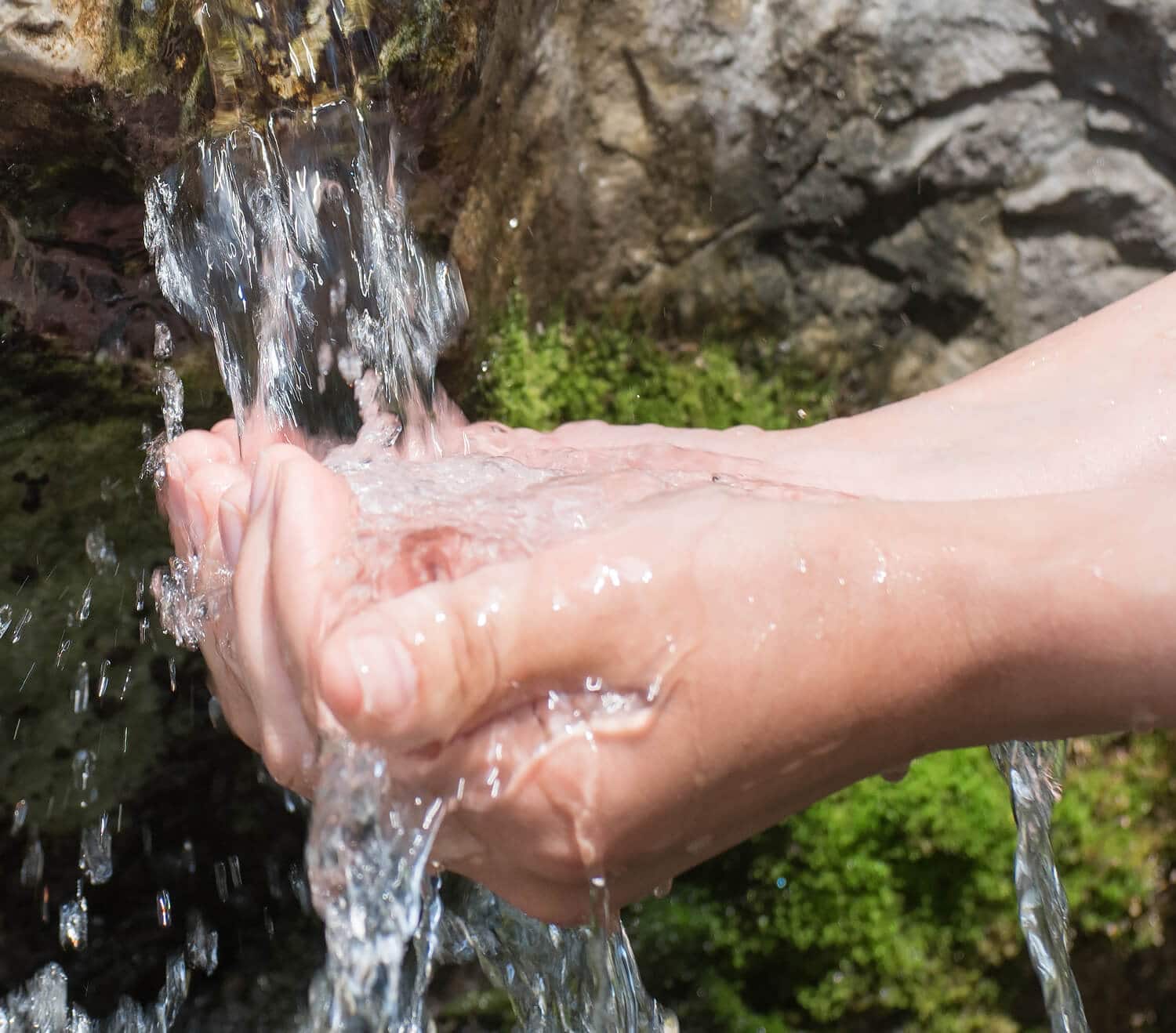
Żywiec Zdrój is the leader in the category of waters and finds it essential to take care of nature and popularise a healthy lifestyle and the importance of water in everyone’s life.
The brand has been consistently implementing its campaign “On nature’s side”, involving consumers in actively supporting the cause of nature protection and promoting a healthy lifestyle at the same time.
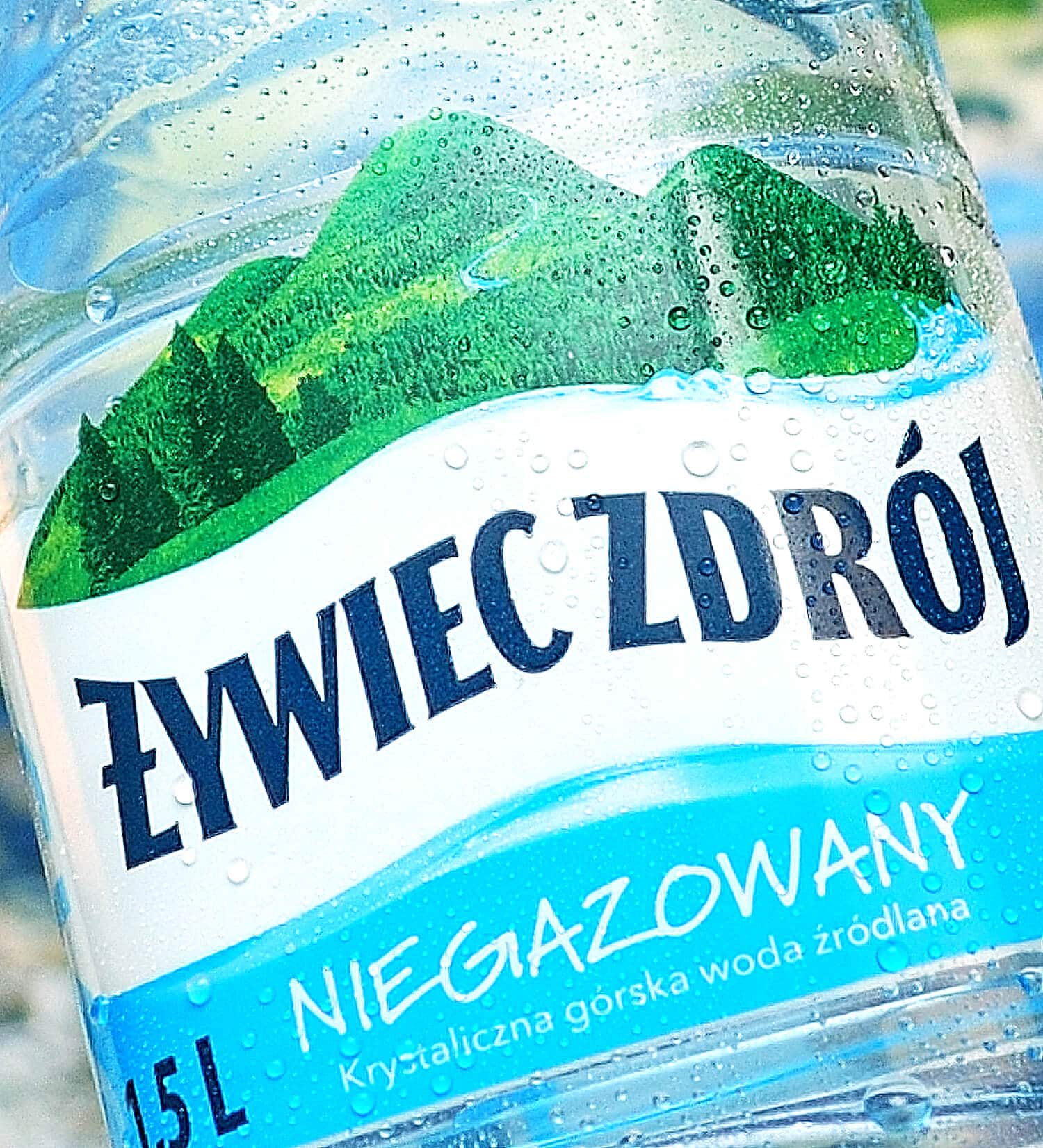
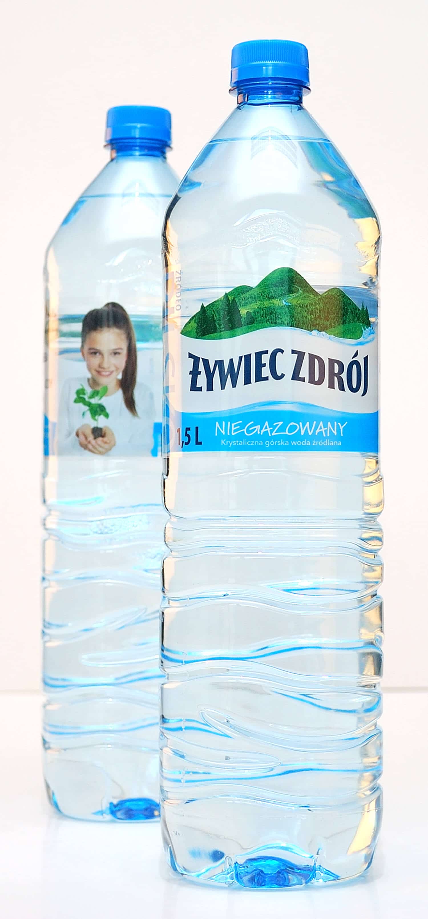
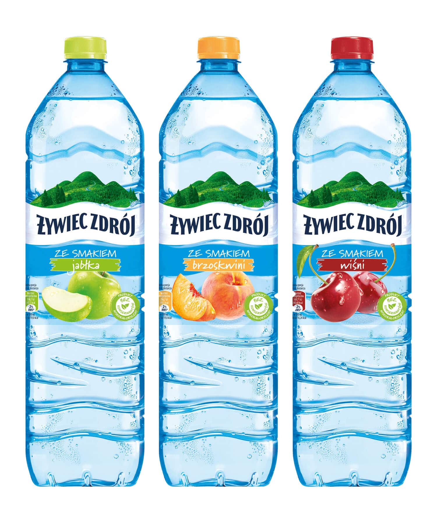
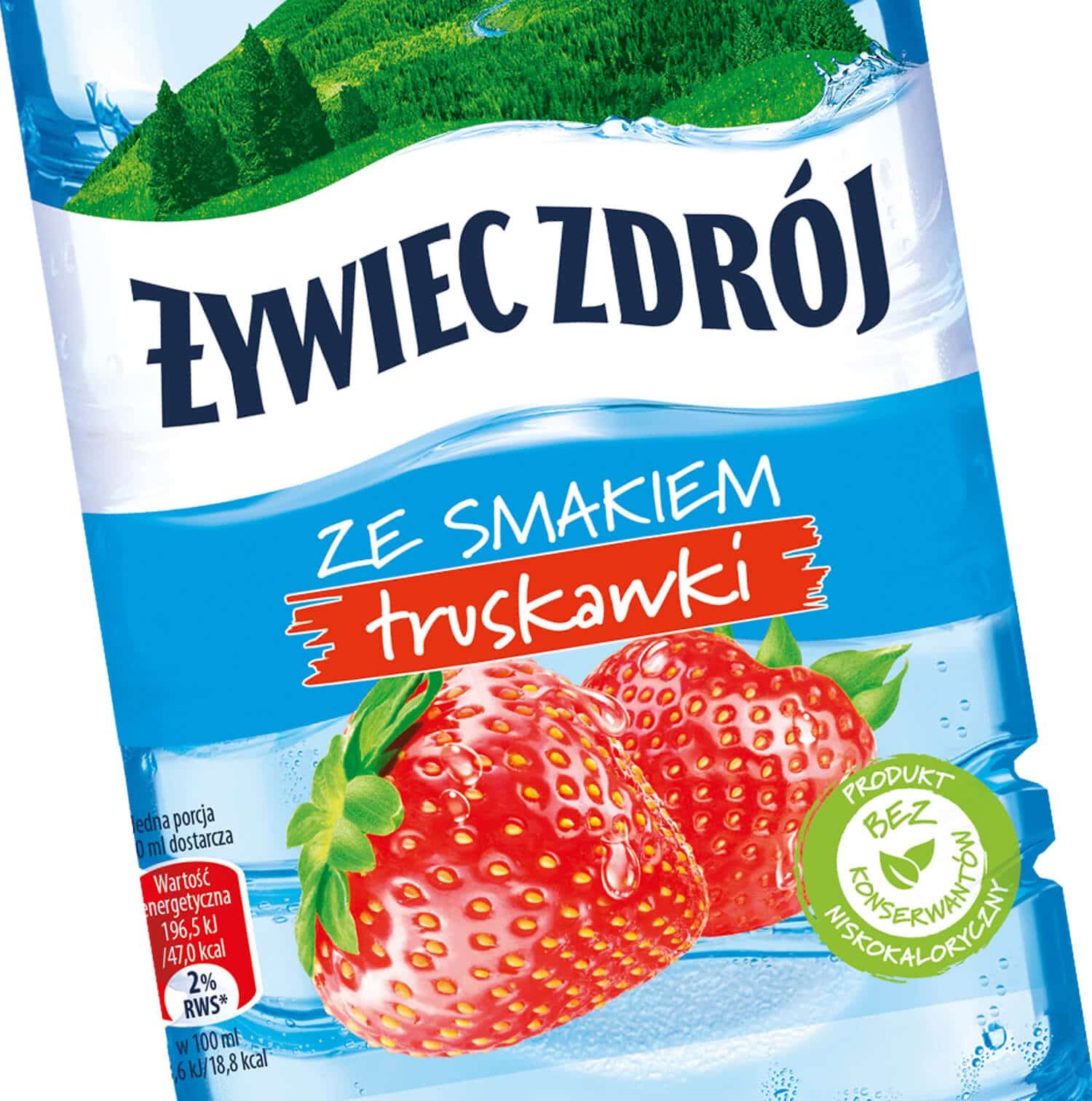
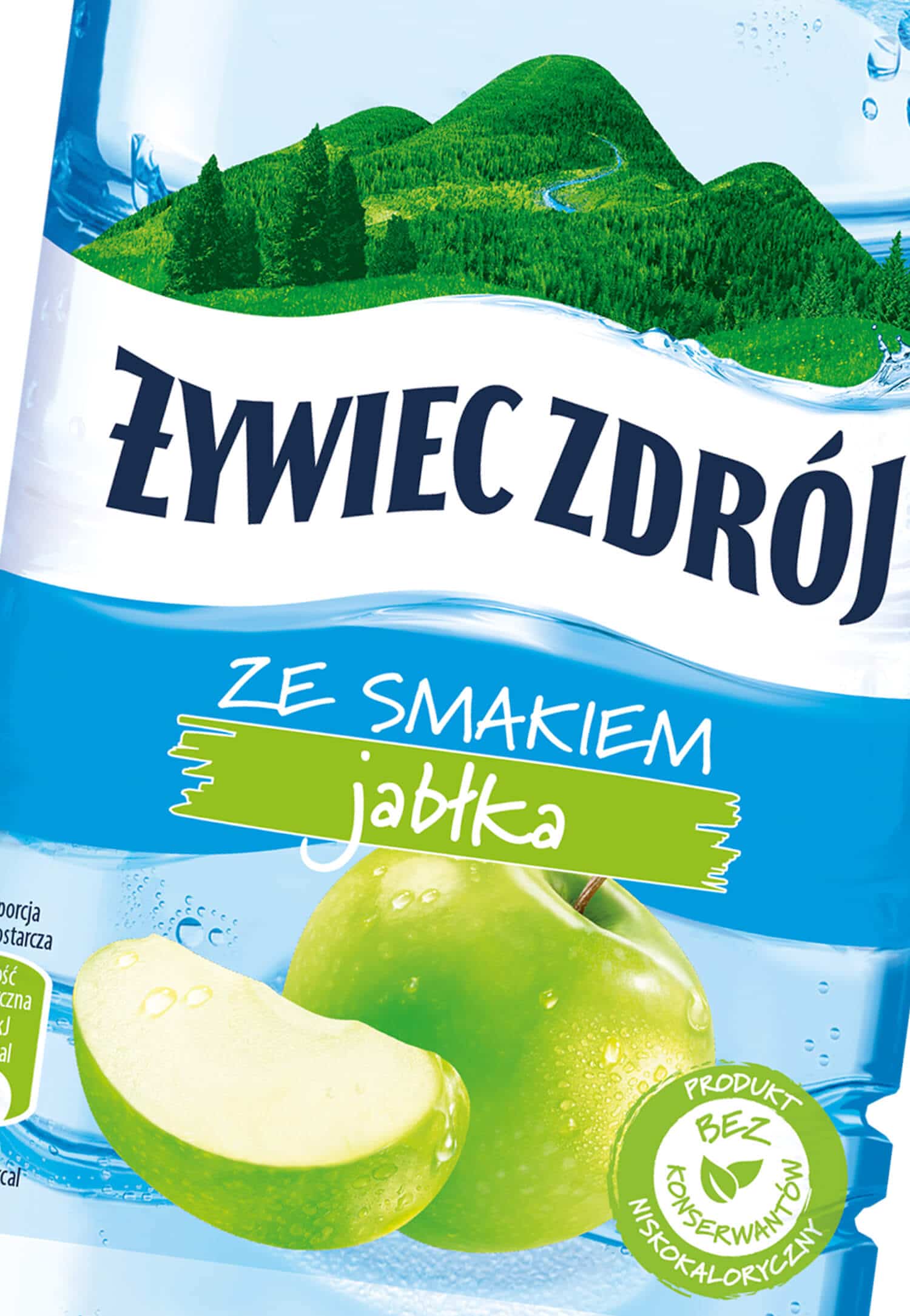
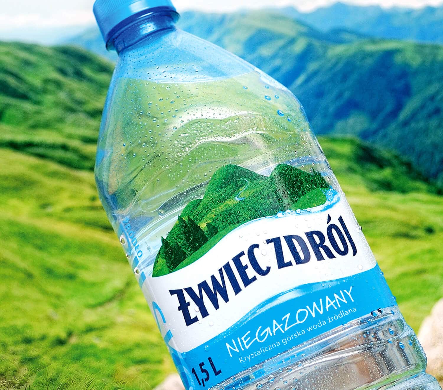
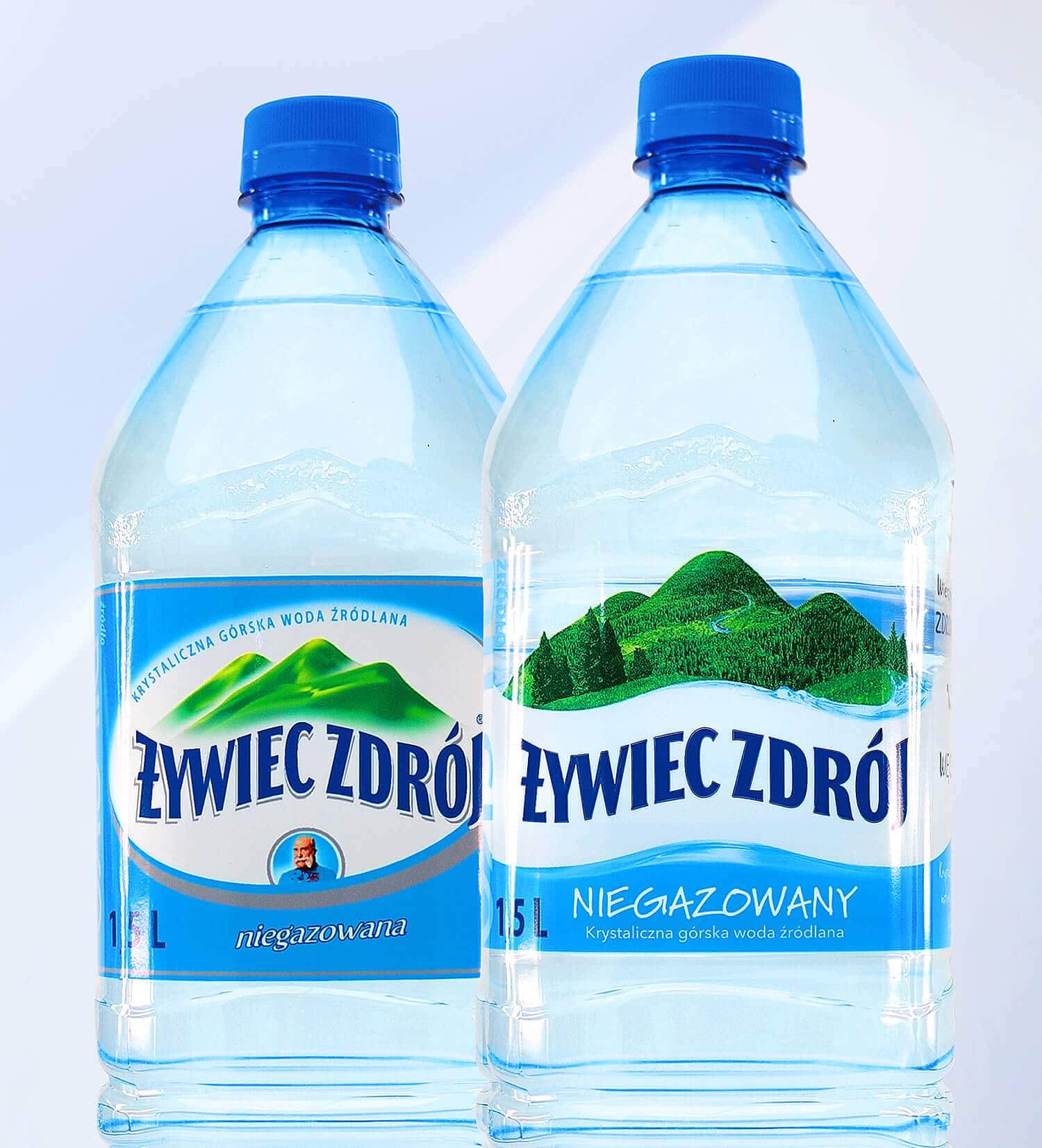
The aim of the project was to redesign the brand to reflect its mission, while maintaining the existing identification. What were the assumptions behind the project? Żywiec Zdrój has nothing to conceal, thus the need to create clear and transparent packagings. The very water comes from immaculate nature, and the brand is engaged in nature protection, hence the idea of the natural state.
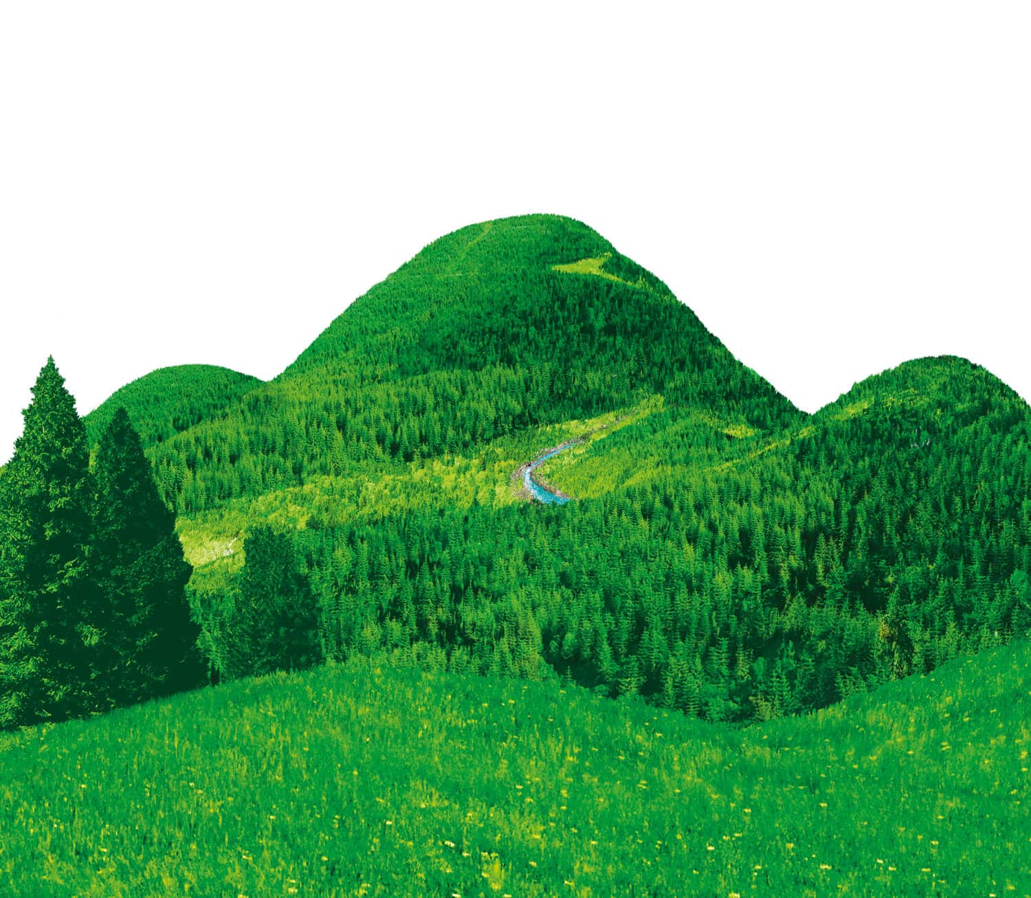
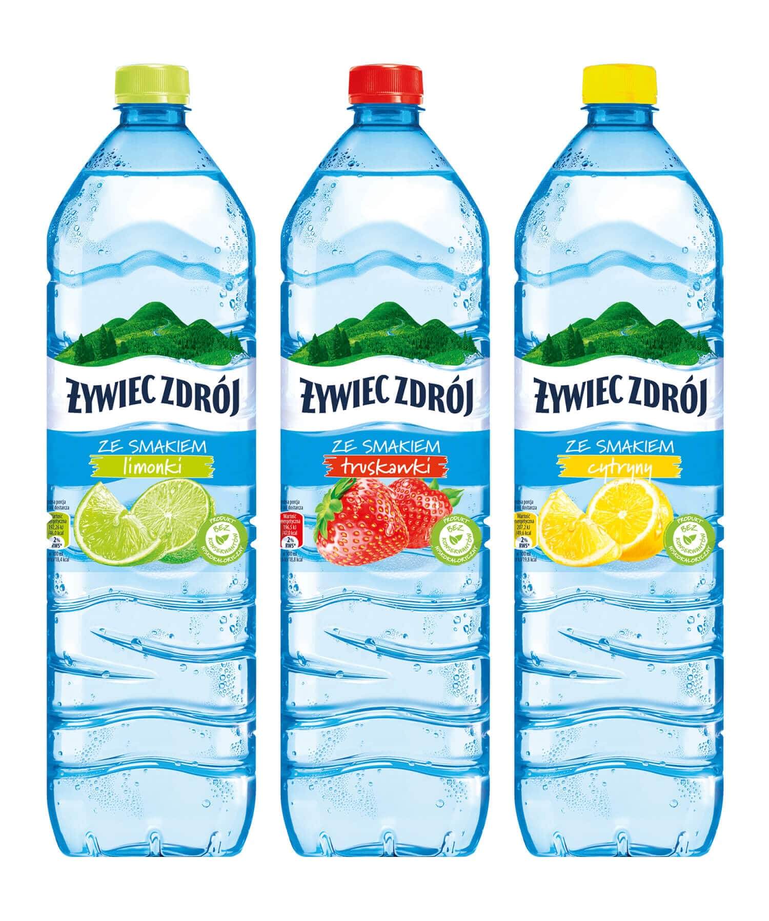
We worked on both the still Żywiec Zdrój water and still flavoured waters. The redesign we carried out involved introducing a sequence of changes, and most importantly creating a realistic illustration featuring mountains as the key element of the label. While working on the logotype, we decided to reinforce it and open it, which meant we had to give up the idea of the closed oval. However, we kept the colours, as white, blue and navy blue are the colours coding the Żywiec Zdrój brand.