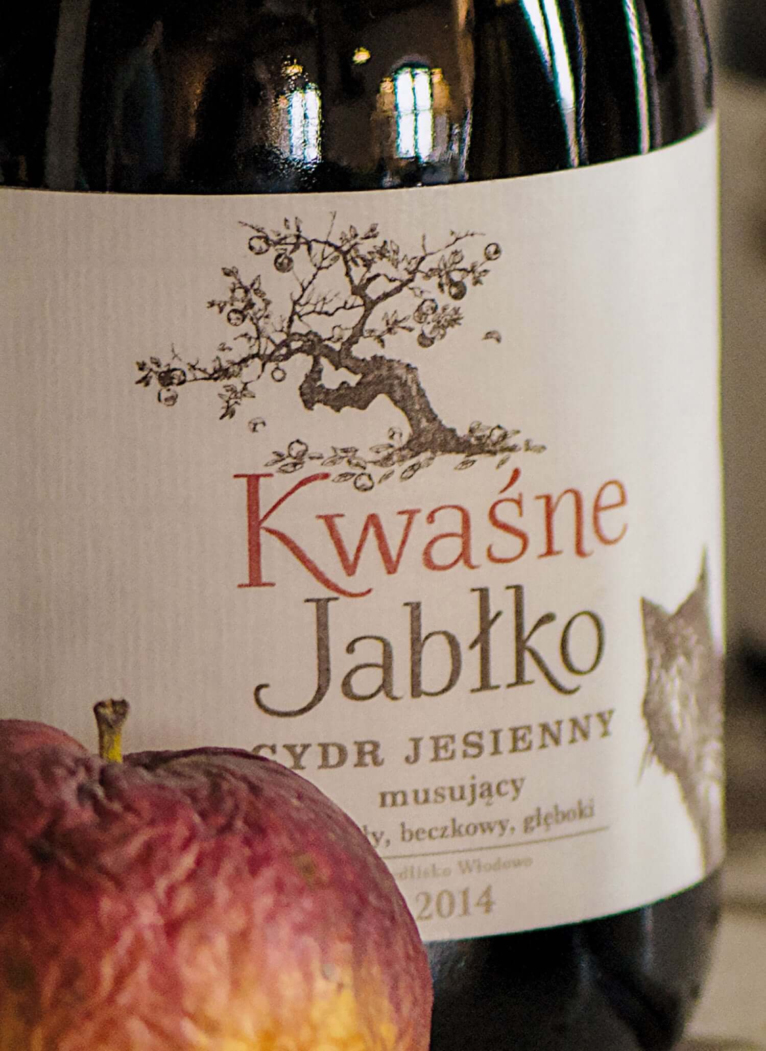
Kwaśne Jabłko is a craft cider, the fruit of love and passion to the land of Warmia and its orchards.
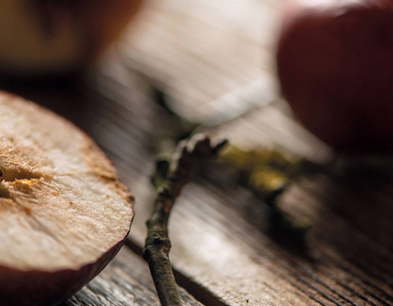
Picturesquely scattered over the Pasłęka River plain, often wild, the old apple trees bear fruit which is then carefully selected for making the cider.
Since the cider is made in accord with the timeline of nature, no stage of that process is pressed for time. The process is overseen by nobody but nature which defines when to pick the apples, press them, bottle the cider and finally drink it.
Our task was to create the logo, system of visual identification and to design packaging for the cider Kwaśne Jabłko.
The design was assumed to reflect the craft quality of the cider as well as to imply that it is an upmarket product. Premium, yet not bombastic – all in all, it’s a cider not a wine.
The design is supposed to capture the natural pace of the four seasons, as it is Nature that creates this cider, with the humans as her humble assistants.
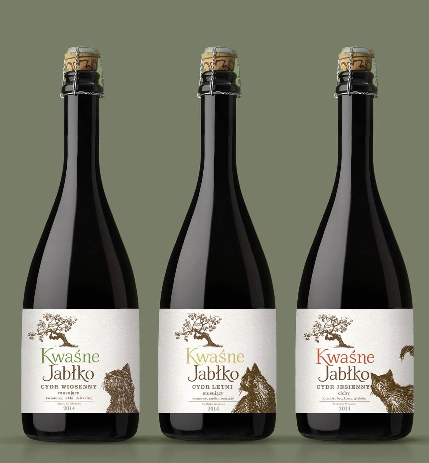
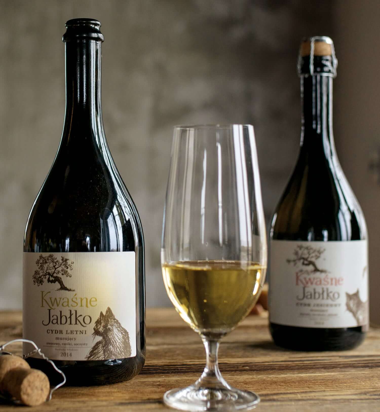
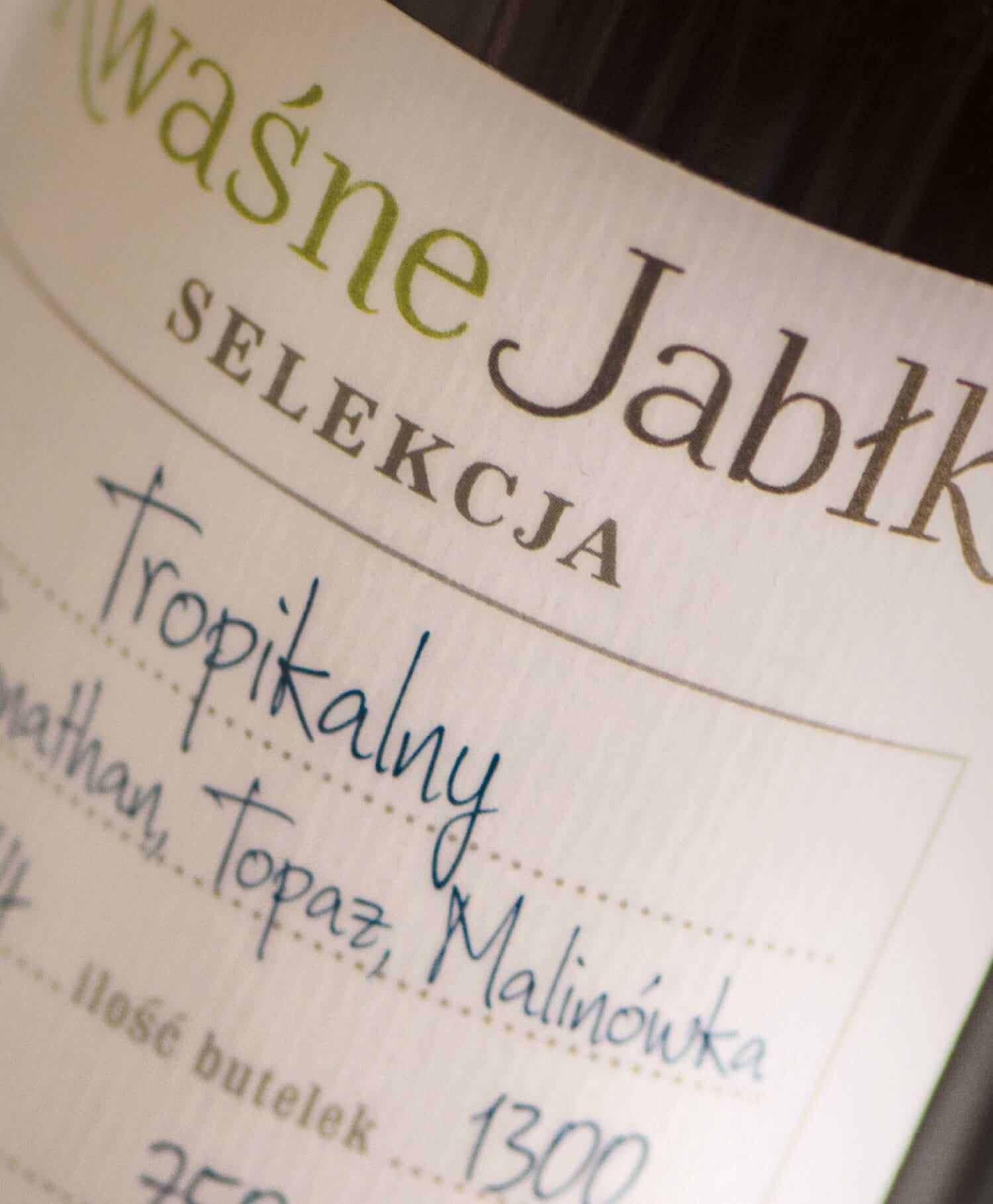
Two lines of ciders have been designed: a sparkling line in the Spring, Summer, and Autumn Editions, and a still cider line produced from each of these cultivars: Reserva Kloben, Reserva Waltersdorf and Tropical.
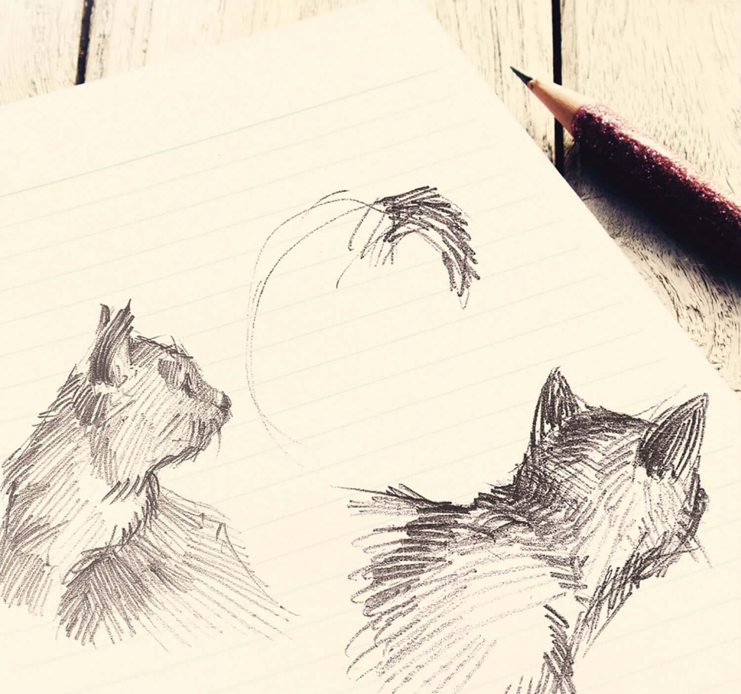
The craft quality is transposed at the branding level (typeface, illustrations)
The design of the sparkling cider features a symbolic rendition of the poetry of the place.
A cat is gazing at a wild apple tree. The apple tree changes from season to season – it blossoms on the Spring cider bottle, it fruits on the Summer one and goes autumn-like on the Autumn bottle. The typeface used and the nature of the illustrations emphasise the craft quality of the Kwaśne Jabłko cider.
For the still cider the label looks like an excise band filled in by the pressing master’s hand and each bottle bears his signature.