We faced the challenge of reinventing by means of design the original spirit of the brand Dermika – elegant, classy, with a mist of mystery.
Dermika is a cosmetics premium brand established over 20 years ago, providing Poles with the latest western technologies at affordable domestic prices. Over years it was built as an upper-market brand, yet with time the brand’s uniform character and image started to wear off.
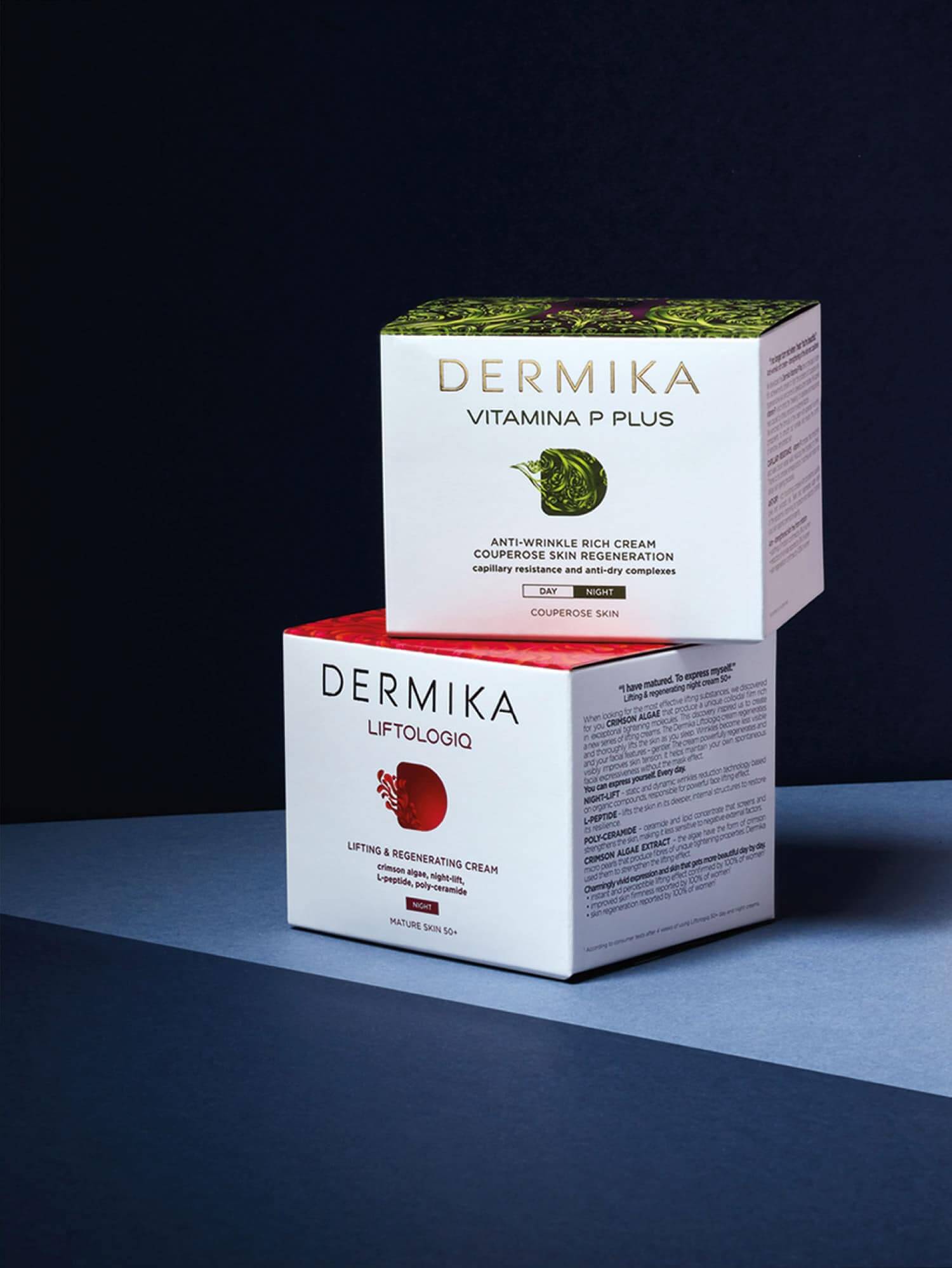
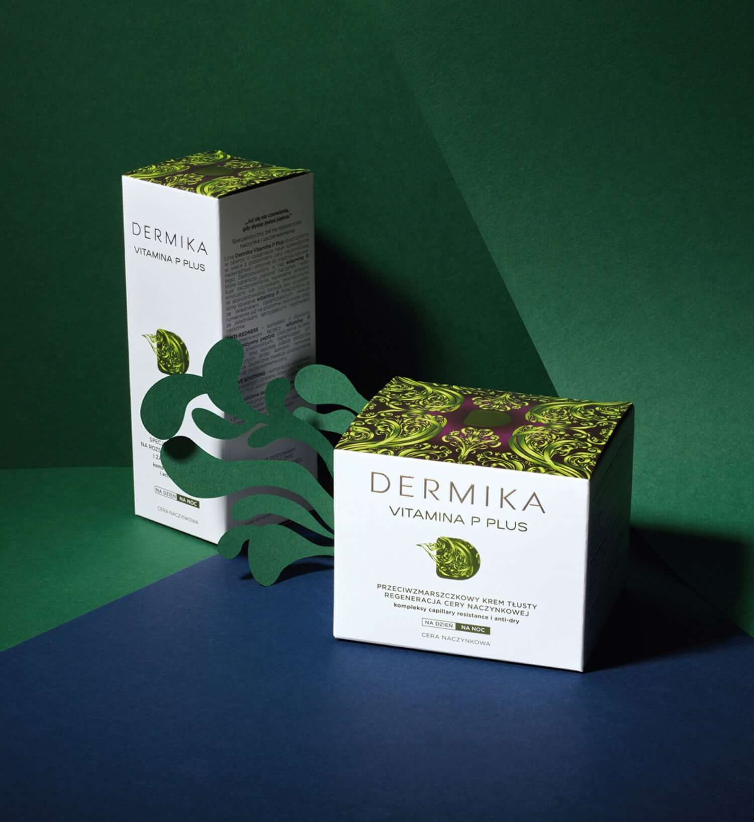
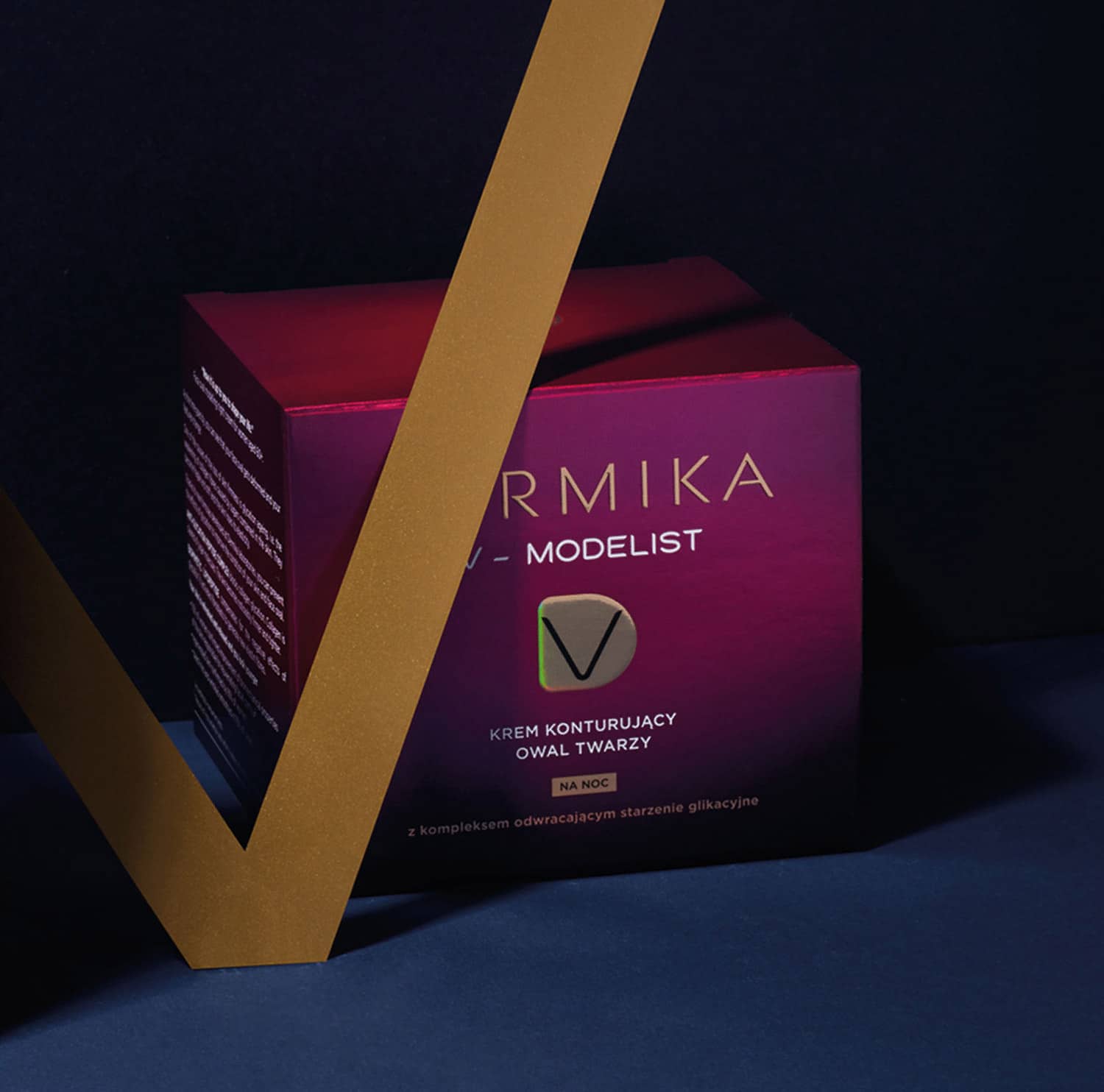
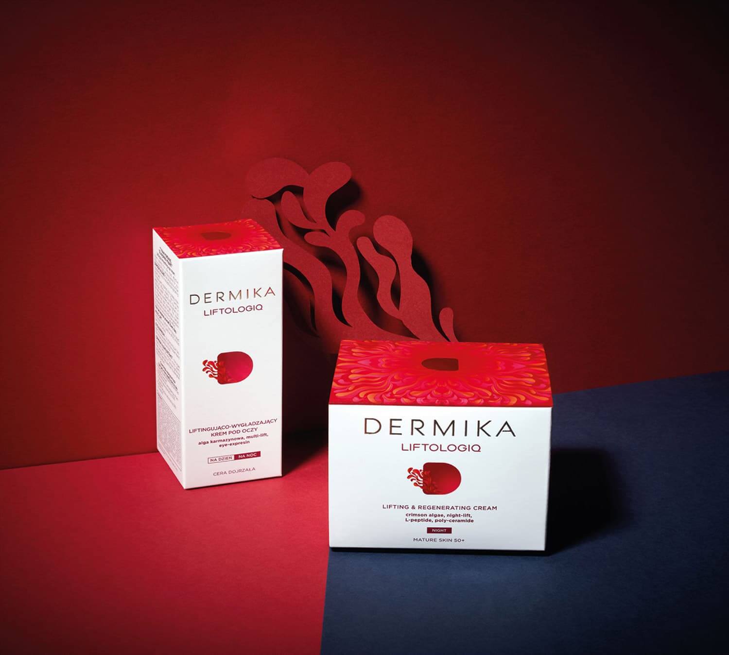
We faced the challenge of reinventing by means of design the original spirit of the brand – elegant, classy, with a mist of mystery; as well as to unify the packaging design. The project’s objective was to develop a visual identification to reflect the new brand’s positioning and to create a coherent architecture as the base for the individual lines packaging.
The concept developed by our designers meets the brand’s strategic assumptions in full. The project is worked out around the letter “D” that takes progressively new forms, transforms into a subtle ornament to finally crown the design. At the same time, it makes Dermika’s products unique and distinctive on the shelf.
Considering the brand’s previous achievements, we have created a new orderly architecture to make creating elegant feminine packaging possible. So far we have also translated it into 15 lines of cosmetics in Skin Master and Skin Expert Segments (exceeding 80 SKU in total) which are being successively introduced into the market.
